What do you think

mwcfarms

No longer a newbie, moving up!
Joined
Mar 16, 2010
Messages
2,655
Reaction score
179
Location
Southern Alberta
Website
www.deannachambers.com
Can others edit my Photos
Photos OK to edit
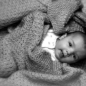
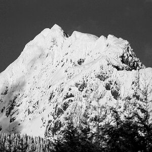
A picture I am going to get printed and was wondering which edit is best. Thoughts?


5008961581_aa3aec6404_z.jpg


and the initial edit I did

4940681744_b45e9b7f64_z.jpg
 
Last edited:
I think the first image looks more visually interesting,and will probably be the better printed file, although it does look a wee bit "flat" to me, for a print file. (I do realize that we're looking at a greatly-reduced image on the web, and not the actual print file.)
 
I like the first picture the most.
But both photos look like paintings, very cool.
 
I think the first image looks more visually interesting,and will probably be the better printed file, although it does look a wee bit "flat" to me, for a print file. (I do realize that we're looking at a greatly-reduced image on the web, and not the actual print file.)

Flat howso. What would you adjust to make it not so flat? Sorry Im not arguing with you. I agree than this edit lacks the punch of colors in the first but Im not really sure in editting how to fix it. And I think I should fix the grain bins. I have lost a lot of the right side with the shot I didnt notice before.
 
I agree with Derrel, the first one look better to me, but still looks a little flat.

I know...'flat' isn't really a very descriptive term, and doesn't help you much.
If I was my photo, I'd boost the saturation/vibrance, and also the contrast. But rather than using a contrast slider adjustment, I'd use levels & curves.

I'll take a quick stab at it, if you don't mind.
 
Ah...I see that your image has an ebbed color profile of ProPhoto RGB. You should change that to sRGB before you upload it or send it out for printing.
 
Woops I forgot lol. I have the other on my flickr let me fix it quick.

Should be fixed. I always forget to do this.
 
OK, here is what I came up with.
Dee_Barn-1.jpg


First I created a levels adjustment layer. The histogram looked pretty good already, but I dragged the end sliders in from either end just a little bit. I think I moved the white point (right side) slider a little more.

Then I created a Curves adjustment layer and made a slight S-curve to increase mid-range contrast. Command Primer

Then I created a hue/saturation adjustment layer and boosted the master saturation. I also boosted the blue saturation and tweaked the hue by a point or two. I took the yellow saturation -2 down as well. I'm not working on a calibrated screen here, so take that for what it's worth.
*edit* I maybe should have toned down the cyan, as the sky near the horizon looks really cyan...but oh well.

I'm working on an older version of Photoshop here, otherwise I might have tried to adjust the Vibrance, which is a cool feature of the new versions. It's like saturation but also different.

Next I used the dodge tool to lighten the barn a little bit. Then I used the burn tool to darken the edges (vignette) but also to darken the sky and other select parts of the image as I saw fit. I do this with a very low opacity and treat it like I'm freehand sketching, with many loose strokes.

On a larger image, before printing, I might also take some time to selectively sharpen parts of the image.
 
Okay, the first image is flat...meaning local contrast is not high enough. The overall tonal range is broad, so the "total" or "overall contrast" range is fine. WHat it lacks is differentiation between the closely-related tonal values, so the phrase is that this file "needs a boost in local contrast". To do that, you could use Unsharp Masking at 10 percent, 150 Pixels, Zero threshold, and run that simple operation and literally see the degree of added contrast that I would suggest for a print file, to render the scene the way I think it would look best. One could also tweak the curves,as Big Mike suggested, but that can sometimes change things a bit too much, or not--it depends on how skillfully you adjust the curves. MY suggestion of USM at 10 percent, 150 Pixel Radius, Zero Threshold will literally show you about what I mean by flat, and what degree of local contrast enhancement I think it needs, to fit my idea of the scene's rendering via inkjet output.
 
Thanks, I am going to go play now and see if I can get close to that playing. Will try both ways and see what I come up with.

I havent used Levels/curves as much in PS as I have the adjustment brush in lightroom and I see now what a huge difference the US mask does to it.
 
Last edited:
Did you ever print the pano of the $250k dualie-tractor thing? I loved that pic.
 
I printed a small copy to color check my monitor for the print lab Im using. I havent printed the pano yet. I want to find a frame first. I believe your referring to the one KmH did a really nice edit on. No matter how hard I try my edits don't come out like other peoples lol. Oh well keep practicing.
 
I printed a small copy to color check my monitor for the print lab Im using. I havent printed the pano yet. I want to find a frame first. I believe your referring to the one KmH did a really nice edit on. No matter how hard I try my edits don't come out like other peoples lol. Oh well keep practicing.

Yeah I couldn't remember who did the edit but it was awesome. I have the same frustration! Agree practice. I'm going to try that unsharp mask thing Derrel suggested, and read the site BM posted.
 
and read the site BM posted.
Yes, absolutely.

The Luminous Landscape is a fantastic site that has many articles, tutorials and such that really help you to get an understanding of this thing we call photography.

The Luminous Landscape
 

Most reactions

Back
Top