What makes a website appealing?

rub

TPF Noob!
Joined
Oct 17, 2007
Messages
932
Reaction score
214
Can others edit my Photos
Photos OK to edit
Well, some will say that I am getting ahead of myself. But my clients seem to think this is overdue. I have decided to get a wesite up and running (sometime in the next few months), to help showcase my work, and to allow clients to view and order prints.

Luckily, I have a great local photo shop in town with amazing quality prints. Yes, they are a bit pricier than most, but not enough to go somewhere else and sacrifice quality. That being said, I will have a private viewing gallery (with passwords) for clients to order from, and I will handle the prints myself.

I am trying to decide exactly what I want on the site. I am hoping to get a bit of advice on the following pages...

Welcome Page
- no flash, just the business name, 5 pictures, and the side navigation buttons

A Bit About Me
- little blurb about me and my style, why I love photography, and what a client an expect from me

Your Investment
- this is where I will have my rates and packages. I will post those for review later

Galleries
- Love Is In The Air (weddings and engagement)
- Kiddos (children)
- Happy Faces (family & people)
- Special Places (nature & other misc stuff)

I am thinking about 20 photos in each gallery, at a max. What is standard? How often do people change their galleries?

Your Special Day
- private, password protected viewing galleries
- online ordering
- link to Paypal

I am assuming I should have the sizes ready for each shot (clickable) with the price. Do you give EVERY option? Just the most standard sizes, and to call or email for special order prints?

How long do people typically leave the galleries up for? I was thinking 4 weeks would give people plenty of timeto order, show firends etc etc.

Let's Chat
- contact info and email link

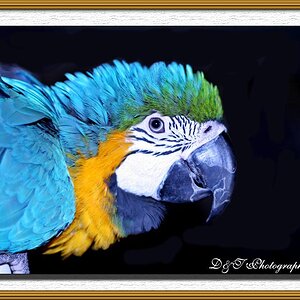
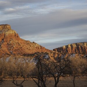
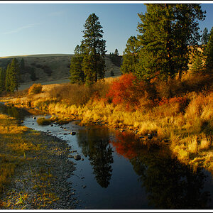
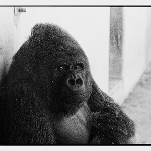
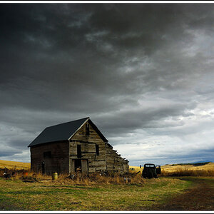
I did up a super quick idea of what I am thinking, and would love to get some feedback as well. Please note those are not the pictures I would be using, just the ones I found quickly.

ry%3D320


Thanks for any feedback.
 
The single most important thing is keep the site clean looking,
try to keep your links to one line and a short as possible.
 
I think you're on to a good start with your ideas here. I would suggest eliminating Flash from the website completely for the following reasons: (1) It's a bandwidth hog, (2) Not everyone can or will install the Flash player, (3) For the not insignificant number of people still on dial-up connections it's so slow as to be useless and (4) Because of the way Flash works all your galleries and images pages will only register as a single page, making your website that much smaller and less attractive to search-engine spiders. If you are committed to using Flash, then I strongly recommend a companion non-Flash 'site for the reaons mentioned above.

In your "About me" I would recommend including a line on your experience, eg "I have been a photographer for XX years...."

I'm not sure about "Your Investment". When I read that, rates aren't the first thing that comes to mind. I would suggest something a little more direct such as "Rates and packages".

20 images per gallery is a little much I think. I would suggest 10-15 at most, and make sure that they are the absolute best of the best, and optimized for web viewing. Again, don't forget, that while most of us are on high-speed connections because of the size of the files we throw around cyber-space, a LOT of the rest of the world ain't. If it takes too long to load, people will go elsewhere. I change mine when the mood strikes me, once, twice a year, but then I don't use my website as a business attractor; rather it's there to refer people to like an on-line portfolio.

Your e-commerce side looks good, but don't forget to have a method by which clients can pay with just a credit-card (No PayPal) and also include directions for paying off-line.

While I avoid weddings (and anything with people) like the plague, I would suggest that the time you are going to leave the galleries up will vary. Especially for weddings, as there are honeymoons and a million other things to consider. However long it is, make sure that the customers know beforehand how long they have.

With respect to the question of cropping, the simple fact is, you can't crop every image to every size. Look at each one, and crop it to the sizes which seem most appropriate. After all, is anyone likely to want an image of Aunt Martha and Uncle Bill sitting at the reception as a 16x20? Have a line which says that other sizes and crops may be available on special request for an additional charge.

I would change "Let's Chat" to "Contact me". Simple, direct, easy to understand. The index page you've posted looks fine to me; don't forget to use your images as hperlinks to the galleries.

Good luck.
 
Thanks so much for the feedback. When I meet with the developer, I want to be very clear with my ideas and this really gives me some more important things to consider.

And to tirediron inparticular, thank you very much. You always seem to take the time to comment and critique as requested. I know your opinion is valued by many people here - not just me. So thanks again.

Kristal

:blushing: Thank-you!
 
One of the pro wedding organizations recently had an article where they sent a bunch of brides-to-be to a bunch of wedding photographer websites and then interviewed them to see what they thought. Those brides said pretty much the same things I hear brides comment on when I'm interviewing them.

The website should be simple, fast loading, and easy to navigate. Flash applications and music don't impress them, and it really annoys them if it causes the pages to load slowly.

They want to find a lot of information including prices. Over half the brides said they will contact photographers who list prices before contacting photographers who don't. They want to know if the photogrpaher is within their budget before contacting them.

There's no such thing as too many photos in the galleries. Brides and Moms want to see lots and lots of photos. They are suspicious of photographers who don't have many photos in their galleries. One or two dozen wedding photos is not enough. My business site galleries have almost 2000 wedding photos. I know most brides aren't going to look at all of them, and I'm constantly trying to edit that number down, but brides often comment that they really like seeing lots and lots of photos. I'm amazed at how many say they did take the time to look through them all. Sometime I tell brides "Other photographers say I've got too many photos on my website." The response has been unanimous, in their opinion there's no such thing as too many photos, only too few photos.

I find that lots of info and lots of photos on my website make it so people have a pretty good idea that they want to hire me when they call to set up a meeting. it's just a matter of seeing that the photos look as good as prints as they do on the website, and making sure I'm not some sort of jerk they won't get along with. It keeps both them and me from wasting time.
 
No music, no flash, and put your city/country on the first page, since the Internet is global it's nice for people to know if your local or not, and it will also help search engines direct people to your site when they search for photographers in your city.
 
Thanks for all the tips. I will be making some changes based on everyones feedback.
 
I am going in opposite of the popular opinion.
Everyone here is saying no Flash and no Music, well I have both, and it works well.
Every successful photographer in my market is running flash sites.

You are using this as your first impression to customer; you need something clean elegant and informative.

Another thing to consider is who are your customers, where I live, it would be rare for someone to have a dial up connection, and the people that do have dial up understand that pages take longer to load or use the phonebook rather than the web.

There have been some big changes in flash technology in the past few years that make it load faster and is now able to be indexed by search engines.

Having the ability to add, remove and edit my gallery without creating new pages or having to edit my site in any way other than uploading to my control panel us a huge bonus.

Do not discount flash so easy, a lot of people view it as Voodoo, they do not understand it (I know I didn’t a year ago) and there have been some major changes in the last few years.
 
Thanks SpeedTrap - I appreciate hearing your opinion.

Anyone care to comment on the layout I have in mind? Does it work for you? If not, what changes could be made?
 
Last edited:
I personally think the layout looks really good. Pretty photos on the front and everything is easy to find. I also like the original titles for the links. As someone else already said though, people won't always know exactly what they mean. If you want to keep the originality, I'd use image buttons for the links instead of text so that you can have alt tags that pop up and say things like pricing, or contact info when people move the mouse cursor over the link. Also, you might want to consider putting your contact info in the header or footer. I figure getting people to contact me is the primary goal of my site, so I want them to know how to from page 1.
About the number of images, really the only way you can have too many is if the high number somehow makes the site run slower (how the site is coded will affect this), or if you try to post so many that you start including images you aren't proud of. If someone wants to see fewer images than you post, the can stop looking at anytime. If they want to see more though and they're not there, they may be disappointed....or they might email asking to see more.
As far as the flash controversy, use it if you want it, but building a non-flash companion site is a really good idea for all the reasons given above. And I say avoid music completely. Not everyone dislikes websites with music, but a lot of people find it really annoying and won't stay on your site. No one will leave because of a lack of music.
Those are the ideas I have for now, if I think of any more I'll try to contribute again.

Matthew Block
http://www.purecaptures.com
 
Thanks Pure Captures for your opinion. I really like the idea about the tags when the cursor moves over the links.
 

Most reactions

Back
Top