When exporting photos to be viewed in picture viewers...

crimbfighter

TPF Supporters
Supporting Member
Joined
Jun 4, 2010
Messages
2,176
Reaction score
1,654
Location
Wisconsin, United States
Can others edit my Photos
Photos OK to edit
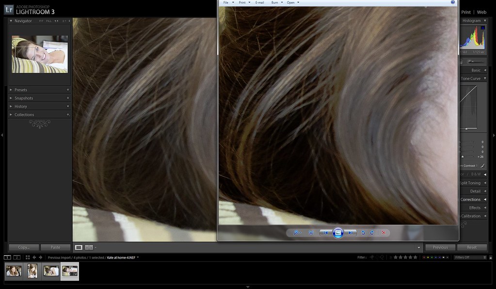
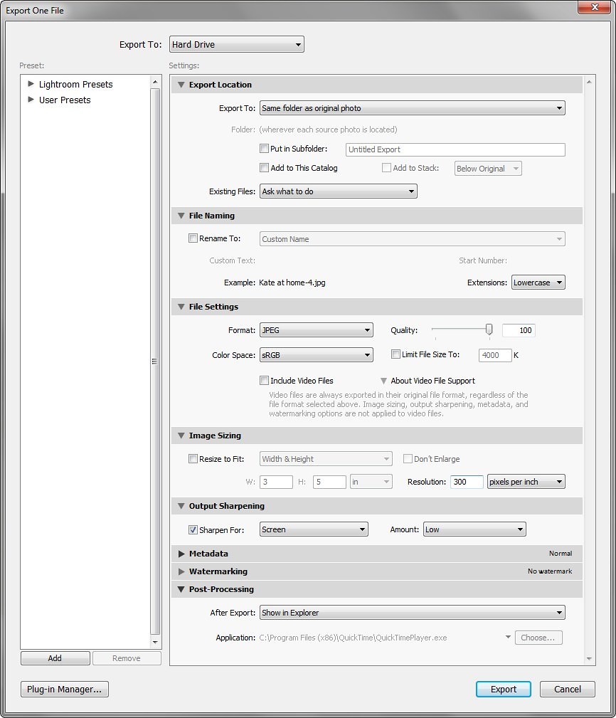
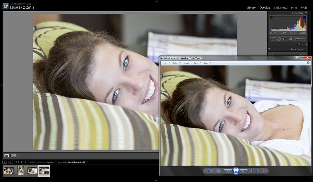
Ok, so here's my issue, and it's one that has plagued me since the first photo I exported to be viewed in a photo viewer (windows photo viewer, quicktime viewer, web browsers, ect). I finish my edit, and it looks great in the LR work space. I export, and open it up in a picture viewer such as windows photo viewer, or a web based browser, and I'm always appalled at what the picture viewer does to the image as it displays it. They almost always seem to add tons contrast and saturate the bejesus out of it. I just seem to be missing something during my edits.. What I usually end up doing, is going back and re-editing my original so that it looks like crap in the work space, but then looks good in the photo viewer. Is there something I should be changing in LR with regard to the workspace settings so there ins't such a huge difference? Do others have this same issue? Or does everyone just end up editing their photos differently depending on their intended destination or use? I have a high end monitor, and it's partially calibrated (too much to explain) but I know the monitor is not the issue. It's definitely some disconnect between my editing, and how the photo viewers present the images. What I can't figure out, is where that disconnect is occurring. A setting in LR? Or me just wishing I could edit a photo once and all the viewers in the world would view it the same way.. The other reason I know it's an issue with the photo viewers, is because some don't do it. Flickr for example, doesn't mess with the images I upload, and they always look as I edited them when viewed on the web. Or when I open the photo in a different program like PS, it looks good.

The reason it frustrates me so much, is I often will put together photos of an event, family outing, get together, ect, and give them to others on a CD. I obviously can't control what program they use to view the photos, so I can's stand the though of the photos looking like excrement when they view them in whatever default photo viewer their computer uses. I take pride in the photos I take and share, so I want them to look good to everyone else, too.

So, am I just going to have to live with making multiple edits depending on where they're going to be viewed, or am I missing something obvious that would fix this issue?
 
Is the contrast and saturation issue consistant? if it is you could do the tinkering with settings to get the image so that it works in the applications you are having trouble with then save them as a new preset, that should save you some time.

As to why it's happening...no idea I'm afraid, I'd guess it's some setting in lightroom, maybe you get get round it with the soft proofing tool?
 
I have the same issue on my laptop. Lightroom and PS look good (though I think in LR my image is quite a bit warmer than PS)... But yeah, windows photo viewer makes it look like crap. I find my photo viewer actually makes the images look dull and soft though. I trust my PS version as the closest accurate rendering to color. (though I'm pretty much only substantiating that by how it looks on my iPad vs laptop)
 
Print them and everyone will see your work the way you want them to be. This is what my pro friend always tell his students in his photography class.
 
Here's a crazy idea. Download a nice looking photo from the web or find one on a DVD that looks great. From what you say it probably won't look too good in Lightroom. Import it into Lightroom then make whatever adjustments to the Lightroom settings it takes to make the photo look OK. Those settings should then be used in the future to get your photos looking good. Don't know if that would tell you what you need to know or not but it wouldn't take much to accomplish and may provide with the information you require.
 
Not all image viewing applications are color aware, and you don't specify which LR module export dialog you are using.

It could also be a color space issue because Lightroom is basically ProPhoto RGB while the web is sRGB.

Make sure your export color space is appropriate for the export destination.

If you don't already have it, a very good LR 4 reference book to keep handy is - Adobe Photoshop Lightroom 4 Book: The Complete Guide for Photographers
 
As an Amazon Associate we earn from qualifying purchases.
Is the contrast and saturation issue consistant? if it is you could do the tinkering with settings to get the image so that it works in the applications you are having trouble with then save them as a new preset, that should save you some time.

As to why it's happening...no idea I'm afraid, I'd guess it's some setting in lightroom, maybe you get get round it with the soft proofing tool?

It's usually pretty consistent. I tried tinkering with a preset, but I found that so many of my photos take require vastly different edit settings, that it didn't really pay off. I know virtually nothing about soft proofing, so perhaps I will have to learn about it and see if it helps my process. Thanks for the suggestion.

Print them and everyone will see your work the way you want them to be. This is what my pro friend always tell his students in his photography class.

I actually thought about this. Unfortunately the cost of printing so many of the photos is the limiting factor.. People have become so accustomed to mass numbers of low quality photos, they don't understand the pride in only putting the best ones out there. But who knows, perhaps I'll end up going this route anyway.

Not all image viewing applications are color aware, and you don't specify which LR module export dialog you are using.

It could also be a color space issue because Lightroom is basically ProPhoto RGB while the web is sRGB.

Make sure your export color space is appropriate for the export destination.

If you don't already have it, a very good LR 4 reference book to keep handy is - Adobe Photoshop Lightroom 4 Book: The Complete Guide for Photographers

I'm not entirely sure what you're referring to with regard to the LR module export dialog. If you're referring to the options available in the export dialog box, then all I can say is that it depends on the photo and ultimate intended use. As for color space, unless I have a specific reason, I always export in sRGB. I've never found any set of options in the export dialog that has corrected the issue. I always end up having to desaturate my original image and remove contrast, and re-exporting.

I don't have the reference book you suggested, so perhaps I'll have to pick it up and see if it can lead me to something I'm doing wrong, perhaps several steps before the exporting process, that I'm not even aware I'm doing.

Thanks for the suggestion.

If you are not exporting the images in sRGB, it is you, not the viewer, that is screwing up.

As I stated above, I always export in sRGB unless I have a specific reason not to.
 
As an Amazon Associate we earn from qualifying purchases.
Finally got around to making a quick edit on a photo and taking a screen shot of what I'm referring to. This was just a quick casual snapshot to work with. Notice how the shadows loose detail, and the contrast is pushed through the roof. Color is also affected, as you can see. Though the colors in this one were pretty subdued, so they weren't too bad.

In the export dialog box, I'm exporting as a jpeg, from a RAW file, sRGB color, with a quality of 100, output sharpening set for screen/low, and resolution set to 300 ppi (in this one. It makes no difference if I export at 72 ppi for web). No resizing. I even brought the shadows up significantly with the tone curve (+25 I think) or it would have looked even worse. I'm stumped. It always looks good in the workspace, then absolute sheet in the photo viewer. The photo viewer being used here was Windows Photo Viewer, but they pretty much all look the same.

8693974734_af8f1f28f0_b.jpg


Screen shot of the dialog box.

8692885437_73eed74096_b.jpg


Here's one that shows more of the photo and how the issue affects the whole frame.

8692898653_a58507219c_b.jpg


Ironically, now here's another mystery. Why can the screen shot capture program capture the colors/contrast/ect. accurately, but the exported jpeg looks like crap? Even more ironically, when I bring the jpeg created by the screenshot program up in the photo viewers, they look even WORSE than the original exported jpeg :grumpy:
 
Last edited:
Finally got around to making a quick edit on a photo and taking a screen shot of what I'm referring to. Notice how the shadows loose detail, and the contrast is pushed through the roof. Color is also affected, as you can see. Though the colors in this one were pretty subdued, so they weren't too bad.

In the export dialog box, I'm exporting as a jpeg, from a RAW file, sRGB color, with a quality of 100, output sharpening set for screen/low, and resolution set to 300 ppi (in this one. It makes no difference if I export at 72 ppi for web). No resizing. I even brought the shadows up significantly with the tone curve (+25 I think) or it would have looked even worse. I'm stumped. It always looks good in the workspace, then absolute sheet in the photo viewer. The photo viewer being used here was Windows Photo Viewer.

8693974734_af8f1f28f0_b.jpg
Is it because you're going from 12-14 bit (raw) to 8 (jpeg)?
 
Is it because you're going from 12-14 bit (raw) to 8 (jpeg)?

I have absolutely no idea.. Truthfully, I'm not even sure how those specs affect an image or how I would go about changing those relationships. I'll have to learn more about bit depth before I can mess with it. Thanks for the suggestion.
 

Most reactions

New Topics

Back
Top