Which business card design?

bethany138

TPF Noob!
Joined
Sep 26, 2005
Messages
485
Reaction score
7
Location
Laurel, Mississippi USA
Website
www.bethanygilbert.com
Can others edit my Photos
Photos NOT OK to edit
Ok, this is my wedding business card. I will have a seperate one for bands/fashion. I'm pretty happy with the front, but I can't decide about the back. I know my info is on there and its ok..its on my website too. Thats what cell phones are for and thats why I don't put my address on there. Please let me know what you think - any opinion is fine (I won't get my feelings hurt!).
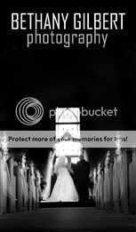
BusinessCardFinalFrontsmall.jpg


Back 1
BusinessCardFinalBacksmall.jpg


Back 2
BusinessCardFinalBackOption2small.jpg


(There is a little extra space on the side for the printing bleed, so kinda ignore it..lol.)

EDITED TO REDUCE SIZE

THANKS! :hugs:
 
it's a little hard to make a good judgement Bethany because i think they're a bit too big to view on the screen.

Also what looks good at one size may not work at a smaller size and need redesigning.

Have you got pictures which are actual size? this would help alot
 
i think the first one (front) is fine. it all balances out nicely and good choice with the photograph

I think your choice of typeface is good (Agency is it?), it's a contemporary looking font, nice and clean. Although, traditionally, all things associated with weddings seem to be in Script fonts, i think it's refreshing you stepped away from that and went with a more modern looking sans serif.

I like the way you have made the letters "h" in photography aline with the "B" and "H" in your name. nice touch, and could be used throughout letterheads etc. as a namestyle. It looks like you've went for a 10 or 15% black on the word 'photography' but its hard to tell. I would make it more grey, maybe 25-30% maybe.

I think "back 2" works better, mostly because i don't like basic gradients used like in "back 1". it's what people tend to do with a space when they don't want to leave it blank. so they put a gradient in.

try not to use to many font sizes. with the exception of the logo/namestyle, 1 or 2 sizes would prob be enough. so i would make the words 'Weddings, Advertising, Bands' the same size as the word 'photgraphy' (is it isnt already. it looks slightly bigger), but maybe in bolder. And maybe make the cell number the same size too. i dont think the contact details have to compete for space on a business card, like they would on a classified advertisement

Is the white line around the edge the bleed? if not i would be tempted to get rid.

ok, thats my two cents, feel free to ignore it though :). hope it helps abit
 
I agree about the 2nd back.. I wasn't too sure about the gradient. The line on the second one is part of the design and I like it actually. I have changed the text on the second because I didn't think it clearly defined what I do. Thanks for the comment about my name, that was my thought too. I had another "logo" but it just doesn't fit me. This one is much more "me" - clean lines, subtle. Here is my pick for now... please add any comments or changes you miight make. Thanks

BusinessCardFinalFrontsmall.jpg


BestBusinessCardcopymayyybbee2small.jpg
 
Hi,
i agree with alot of what john said.... the image on the first side works really well and i like what you've done with your name...... however, what i try and do when designing business cards is to try and make the clients branding consistant. So when a client see's your card/website/advert etc it is instantly recognisable as your business. Looking at your website, you've used a different typeface and introduced a light blue to the type..... which i also like... but is different to the logo on your cards. So you may want to consider this.... if you prefer your new version, can you alter the logo on your site?... or alternatively introduce some of the blue to your cards.

The second side is good, although i would be tempted to define your areas more clearly still..... some people may interpret 'advertising' and 'promotions' as a design service (as they are terms i use for my business), rather than purely photography...... (and you wouldn't want anyone to think you do photog as well as other things) so how about using the words 'commercial'.....'corporate'.... 'product'..... or 'portrait'.... so its more tuned to the services you offer..... (you could look through some other sites/books etc to get good words)... quite a few of people i'v done cards for actually prefer having two seperate cards.... one for weddings and another for business photog.... but thats up to you, i think you can get away with it as long as there isn't too much info on each service.
Overall tho.... i think you've done well and the image on the first sideis a very good choice :thumbup:
 
Archangel said:
Hi,
i agree with alot of what john said.... the image on the first side works really well and i like what you've done with your name...... however, what i try and do when designing business cards is to try and make the clients branding consistant. So when a client see's your card/website/advert etc it is instantly recognisable as your business. Looking at your website, you've used a different typeface and introduced a light blue to the type..... which i also like... but is different to the logo on your cards. So you may want to consider this.... if you prefer your new version, can you alter the logo on your site?... or alternatively introduce some of the blue to your cards.

The second side is good, although i would be tempted to define your areas more clearly still..... some people may interpret 'advertising' and 'promotions' as a design service (as they are terms i use for my business), rather than purely photography...... (and you wouldn't want anyone to think you do photog as well as other things) so how about using the words 'commercial'.....'corporate'.... 'product'..... or 'portrait'.... so its more tuned to the services you offer..... (you could look through some other sites/books etc to get good words)... quite a few of people i'v done cards for actually prefer having two seperate cards.... one for weddings and another for business photog.... but thats up to you, i think you can get away with it as long as there isn't too much info on each service.
Overall tho.... i think you've done well and the image on the first sideis a very good choice :thumbup:

Hey! Thanks for your comments. My site is very temporary and will be redone sometime in the next two weeks, it will be in the same style as this card. The card says advertising because I shoot models and design ads and promotions because I design for bands and singers (cd covers, t-shirts, etc) What I do is basically all the photography work for both, and the design work. Does this fit, or should I change the wording? My last card and site don't explain this, so its all word of mouth. I wanted to change that.
 
bethany138 said:
Hey! Thanks for your comments. My site is very temporary and will be redone sometime in the next two weeks, it will be in the same style as this card. The card says advertising because I shoot models and design ads and promotions because I design for bands and singers (cd covers, t-shirts, etc) What I do is basically all the photography work for both, and the design work. Does this fit, or should I change the wording? My last card and site don't explain this, so its all word of mouth. I wanted to change that.

In that case.... its ok!.... but judging by your site i would still add portraits, you seem to have done alot of them and not all wedding photogs do a portrait service. Ideally i would go for two cards tho.... giving a band member a card with weddings on it may not give the right impression.... but saying that, if your on a budget you may have to include all services.
If your gonna change your site i would use the new type logo you've done, i prefer it to the one currently on the site, i think it has a more individual feel to it.
You could still play around with words if you wish.... its sometimes hard to bullet point your services as briefly as possible so maybe look into that.
 
Archangel said:
In that case.... its ok!.... but judging by your site i would still add portraits, you seem to have done alot of them and not all wedding photogs do a portrait service. Ideally i would go for two cards tho.... giving a band member a card with weddings on it may not give the right impression.... but saying that, if your on a budget you may have to include all services.
If your gonna change your site i would use the new type logo you've done, i prefer it to the one currently on the site, i think it has a more individual feel to it.
You could still play around with words if you wish.... its sometimes hard to bullet point your services as briefly as possible so maybe look into that.

I don't really do a portrait service, I've decided to get away from that (not very fond of other peoples kids..:mrgreen: ) I will be using the new logo.. I like it better too... just made it yesterday..lol. About seperate cards.. I just don't know if I want a bunch of cards out there ya know.. I wanted people to recognize my card. Does that make sense? I chose this shot becuase its kind of dark and contrasty which will appeal to the band people, but artistic and balanced, which will appeal to the advertising people. Does anybody agree or am I nuts...lol?
 
bethany138 said:
a funeral? hmm...thats not good. I don't want to depress people. lol. Does anybody else thing it looks like a funeral?

b


Well.... close, anyway. It looks (to me) more "commercial" than "consumer." I know you're going for a "graphic" feel, but I think you should look at some others too. Maybe forget the reverse printing. You can loose some of the fine lines anyway with this sort of thing.

Pete
 
Is it just me, or is the front image tilted a tad to the left?
 

Most reactions

New Topics

Back
Top