which do u like better? *total 200k*

Dew

TPF Noob!
Joined
Jun 27, 2003
Messages
1,688
Reaction score
0
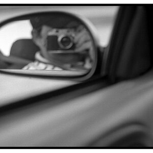
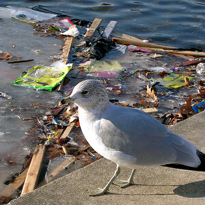
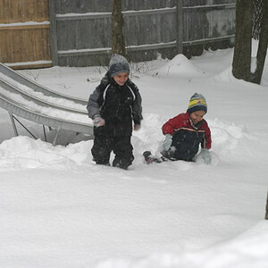
im undecisive about these two :? .. the hubby likes one, i like the other ... i need an un-biased opinion :lol: ... which one do u like better?


fred1.jpg


fred2.jpg


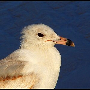
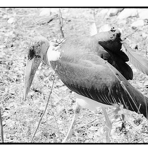
this one im totally unsure about .. i thought it was rather boring, so i did something interesting to the colors .. although i think its slightly cheesy :lol: .. what'ya think? :study:

fred_bw.jpg
 
I like the second one the best. The harsh orangey light on the top one really bothers me. But that's just me.

On 3, I kinda like what you did with the colors, but the whole thing seems like it's out of focus to me. Or maybe it's just time for bed...
 
the 3rd one i added some motion blur in the background .. he was also moving slightly :eek:
 
My fav of the first two is definitely the first one. Colors are good.

I love the last one, it's my fav of the bunch. I love the angle and the blur. Awesome pics!
 
I like the second one. Colors are too harsh for me in the first.
 
I like the first one best. Maybe a little more underexposed. But thats just kind of my style. It would give more of that artsy feel. And the right side of the picture would be a little darker with the light really standing out from the left side.

I would like the last one if the back ground was more out of focus. I like what you did with the colors though.
 
looks like the vote is split ((((SCREAMS))))

the hubby likes the first one best (color) ... i like the 2nd one best (de-saturated) :? ... i dunno .. im still confused

im doing a personal project right now photographing artist editorial/documentary style ... he will get a few images on a CD .. but i dont want to give him too many choices .. i want him to have what i want him to have (ya feel me) ... these were all shot with my digital cam .. i also shoot some b&w film .. im scanning the negs now ... at least i dont have this problem with what color to choose :lol:

im photographing my second artist today, i always get a little nervous before a shoot (even though he's not paying me).. wish me luck :D
 
how about a combination of the two? lower the saturation on everything but the painting (perhaps even boost the saturation of the painting)....
composition is awesome in this photo, btw.
 
Osmer_Toby said:
how about a combination of the two? lower the saturation on everything but the painting (perhaps even boost the saturation of the painting)....
composition is awesome in this photo, btw.

sounds like a great idea :D .. im gonna give it a shot

composition wise .. he had a good camera presence (he felt comfortable in front of the camera) .. but i also directed him a little on some (the editoral part :p) ... and some documentary .. i just let him do what he was doing undisturbed by me :D

however, its interesting .. the hubby and i was talking about these photos last night .. one of his favorites of the bunch; not posted here (so far, he nor i have seen them all yet, still scanning negs).. he said, "i really like this one, he looks so normal." in fact, the "normal" was staged ... thats a compliment coming from the hubby, cause he doesnt like anything "staged" ... hehehe, but i do .. i like to direct them towards what i find interesting and coach them on the feeling that i want them to express...

the first 2, i pulled him out of his studio onto the freight elevator, told him to bring a few paintings ... my direction, "give me a look like your having a creative block .. you're frustrated ... anxious .. you've been starring at this painting for at least an hour and nothing is happening .. you're having self-doubt about your ability as an artist ... you're getting angry.. panic is setting in.. you have to finish this for your next show in 2 days."

sometimes i like the staged to look normal .. sometimes i like it to look "staged" and dramatic (overdone.. over the top)

.... :lmao: ... im such a drama queen... but thats pretty much how it usually goes
 
The lighting and colors in the second shot really compliment the mood that I believe you were attempting. (frustration, anxiety, etc). The bright lighting in the first would be much better with a cheery picture and contradicts the current mood goal.

Just my opinion.....

Sometimes people get too caught up in the photographic qualities and forget about the story.... the real reason for the photo.
 
I love the first one! I think the colors are great! Since the colors in the second one aren't so vibrant, the paining loses my interest, and just looks too busy. That's my opinion.
 
Dew, I like the second one. For what it is worth. Would like to see the results of the combination of the two as suggested.

Thorni
 
I prefer the first photo. I like how bright the paint colours are and really love how the face in the painting stands out. I find the lighting on the painter a little harsh though
 

Most reactions

New Topics

Back
Top