vintagesnaps
Been spending a lot of time on here!
- Joined
- Jan 13, 2013
- Messages
- 9,119
- Reaction score
- 3,109
- Location
- US
- Can others edit my Photos
- Photos NOT OK to edit
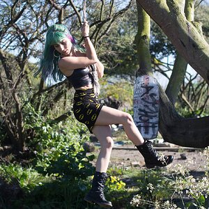
I just find the flare to be visually distracting more than anything. I thought it looked more like it was photoshopped in, and covers so much of the tree. The photos are overly bright to me, although it was obvioulsy a bright sunny day. It's one of those photos that I'm noticing the editing more than the photograph, and wondering what the original looked like.
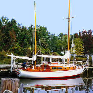
I learned doing sports and events to move around and try changing the vantage point to keep things out of the frame that I don't want in the picture, like kids and big trash cans, etc. So I try to make my eye move around to see everything in the frame so I can take a step or two or more to make the visual distraction 'disappear' (I taught myself how to make empty seats disappear by scrunching down, etc.). Those cars over there don't really add to the photo. I get aggravated with myself if some annoying thing sneaks into the edge of my photo if I didn't see it in time to reframe the shot.
I learned doing sports and events to move around and try changing the vantage point to keep things out of the frame that I don't want in the picture, like kids and big trash cans, etc. So I try to make my eye move around to see everything in the frame so I can take a step or two or more to make the visual distraction 'disappear' (I taught myself how to make empty seats disappear by scrunching down, etc.). Those cars over there don't really add to the photo. I get aggravated with myself if some annoying thing sneaks into the edge of my photo if I didn't see it in time to reframe the shot.