Which Picture Signature?

WesVFX

TPF Noob!
Joined
Jun 14, 2009
Messages
132
Reaction score
1
Location
Hemet, CA
Website
www.wesvfx.com
Can others edit my Photos
Photos OK to edit
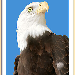
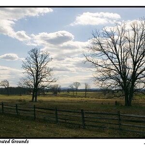
I'm torn... been having a tough time finding a signature design or font that I'm really fond of. Here's what I have so far...

1415076_orig.jpg


2529856_orig.jpg
 
What does VFX stand for?
 
visual effects
 
Forum: Beyond the Basics
Have you been at photography for awhile? This is the forum for more advanced discussion of photography, such as exposure methods, lighting, HDR, and other techniques and controls!

You might, or might not get more/better feedback in:

Forum: Graphics Programs and Photo Gallery
A place to show off your post processing skills, with explanations on how you achieved the results, including specialty images such as HDR. Share information and techniques using Adobe's Photoshop and other popular graphics software.

I think both of those are difficult to read.

What if you need white, or some other color of border, than black.
 
Take the blue dot out. It is distracting from the photo. It seems to draw the eye (at least mine) and i'm sure thats not where you want the focus to be ;-).
 
I think both of those are difficult to read.

What if you need white, or some other color of border, than black.

Hmmmm... interesting point... didn't even cross my mind.
That's why I get paid the big bucks. ;)

A basic grraphics art rule for logos/signatures type things is that they first have to work in black and white.

Second, for scalability they need to be vector graphics, not raster graphics.

PS CS5 - Creating Transparent Logos for Watermarks and Overlays in Photoshop | Adobe Evangelists - Julieanne Kost | Adobe TV
 
Last edited:
Well they are Vector, but I do need to look into the black and white thing. The blue dot one was the original, then like you mentioned I thought it took away from the photo as well which is where I started to go to a not quite so noticeable text only instead.
 
Last edited:
As someone very experienced in post-production, I have a couple small suggestions.

A serif font will definitely look very professional. It does however usually have a bit of a, "Look, I'm a fancy-pants serious photographer man" feel to it, so if your marketing strategy is less fancy-pants and more "I'm a casual awesome fellow who also takes awesome photographs," I would avoid it.

My only other complaint is that in your two examples, both signatures are a little hard to read - the first because it looks like the opacity is turned down, and the second because of the stroke. I would suggest just a simple, flat white signature. (I also highly approve of you putting it on the border instead of directly on the image.)

wesvfxsamples.png


From top to bottom those typefaces are Market Deco, Trajan Pro, Georgia, Times New Roman, and Imperator. The top two I think would go well with your images.
 
Well they are Vector,
Then on that score, you're good to go. :thumbup:

I used to go through Hemet pretty frequently in the mid-70's - early 80's, on my way from Coronado up to Idyllwild to rock climb at Tahquitz and Suicide rocks. - Tahquitz - Wikipedia, the free encyclopedia

Sorry you went through Hemet LOL

I hate it here... used to live in Temecula, then San Diego, then back to Murrieta, now in Hemet. Unfortunately it's turned pretty ghetto and just ugly in nature. Looking to move back to Temecula/Murrieta this summer LOL

As someone very experienced in post-production, I have a couple small suggestions.

A serif font will definitely look very professional. It does however usually have a bit of a, "Look, I'm a fancy-pants serious photographer man" feel to it, so if your marketing strategy is less fancy-pants and more "I'm a casual awesome fellow who also takes awesome photographs," I would avoid it.

My only other complaint is that in your two examples, both signatures are a little hard to read - the first because it looks like the opacity is turned down, and the second because of the stroke. I would suggest just a simple, flat white signature. (I also highly approve of you putting it on the border instead of directly on the image.)

wesvfxsamples.png


From top to bottom those typefaces are Market Deco, Trajan Pro, Georgia, Times New Roman, and Imperator. The top two I think would go well with your images.

Thanks much Evvie for your input! I REALLY like that first font! I've always wondered if it was beneficial to include some sort of logo/icon into the signature to set you apart from the rest of the photographers out there. Since the trend seems to be text only with everyone. But as mentioned before, it could easily take away from the photo... Hmmm, lot's to think about!
 

Most reactions

Back
Top