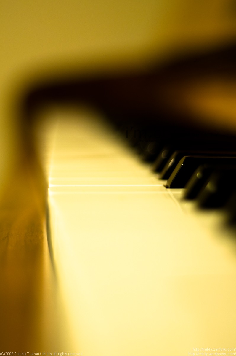
#1 is interesting... #2 is wayyy to blurry for my liking, but as you said 'it came out the way i wanted it to" so if you like it, who cares what other people think.
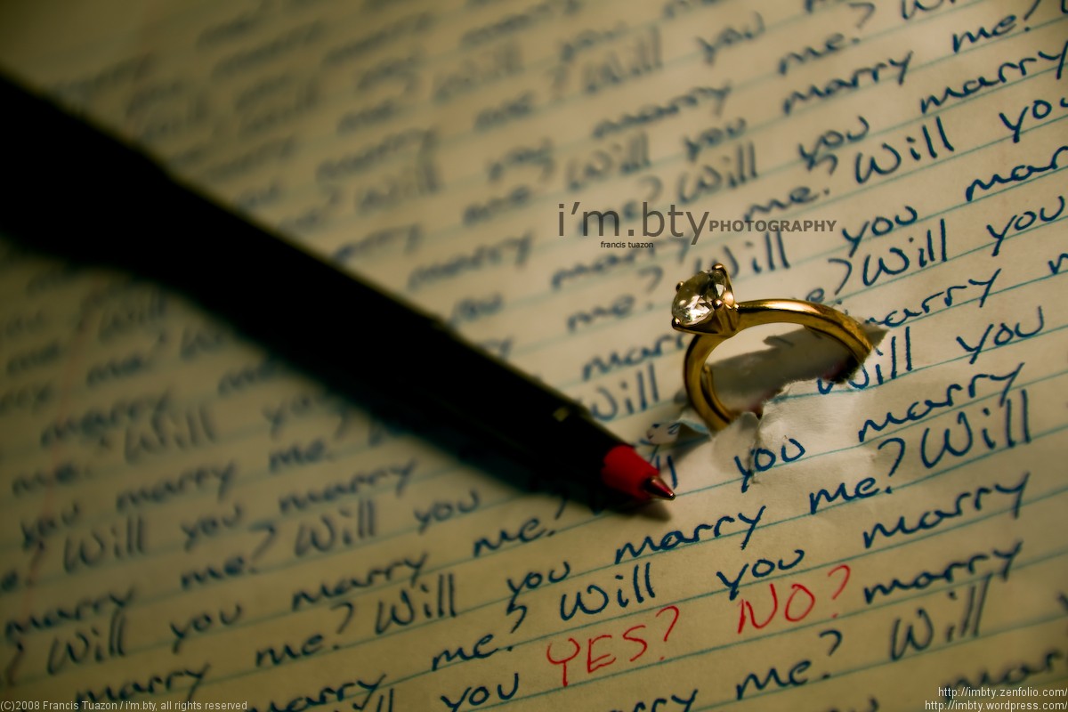
The "Will you marry me" picture is VERY creative. I really like it. I dont see the purpose of #2 though. Like Platano said maybe theres something about it that we just don't know about.
It might be me but i think the pen works fine. It looks like you are trying to achieve the look of a hand written note that's passed between two kids in high school. With the color of the ink and that kind of setting, i feel that a fancy pen would be out of place. I think #1 is very well done.
#2 is some intense DOF. I cant wait til my 50mm 1.8 comes ><
Number 1 is creative, though I must admit that it conjures up a punitive element. I had to rewrite sentences as punishment at boarding school in the 1970s. This makes me think of that. Marriage should not start as a punishment.
I should have made my comment a little more clear. I think the ring and colors captured give it an air of an older person while the note and pen add a childish innocence of high school love.
The fancy pen would help put more weight towards the maturity of the photo for sure.
My comments seem to be more about the artistic story. I am no expert but I think you did a wonderful job. I really love this photo
#2 is way better than #1. #1 is cute, sure. However #2, has this striking smooth blur going on. You know what the object is, and your eyes is most definitely pulled on a line to the singular key in focus. The "context" - who knows, but I think it works on an artsy level. The color is definitely screwy in #2, but you can easily fix that.


![[No title]](/data/xfmg/thumbnail/32/32929-22e23acc63d6ecb25e5ee941be87121f.jpg?1619735758)


![[No title]](/data/xfmg/thumbnail/38/38261-db20f6f92ee8f0d4c5cf1536e308638b.jpg?1619738546)