Williamsburgh Bridge (NYC) - C&C Please?

Bugs81

TPF Noob!
Joined
Dec 30, 2009
Messages
67
Reaction score
0
Location
NYC
Can others edit my Photos
Photos OK to edit
Hello all-

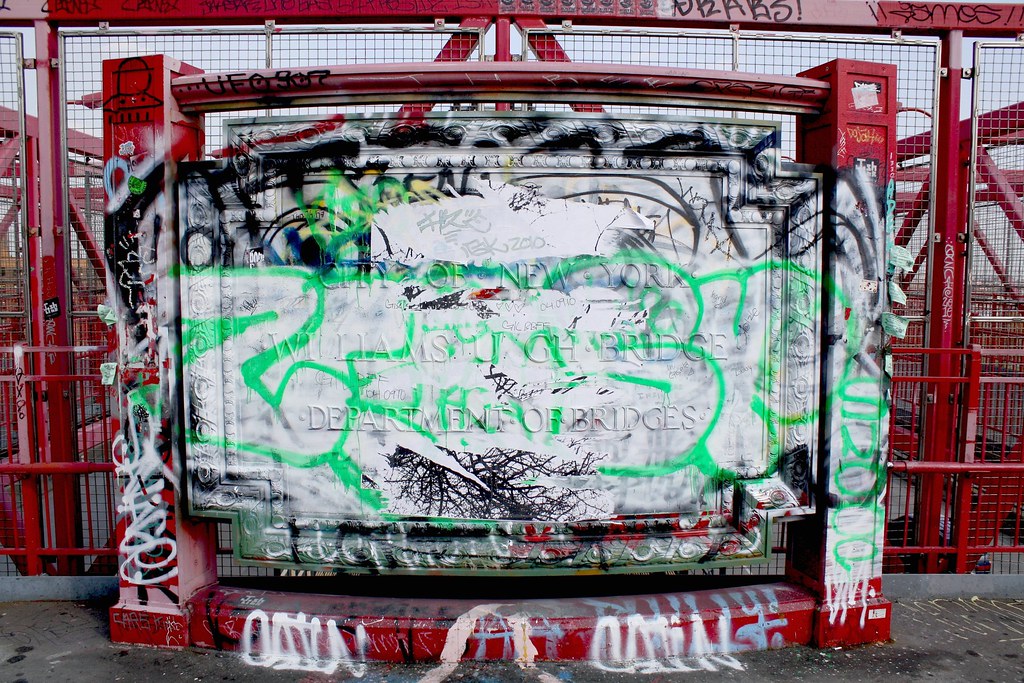
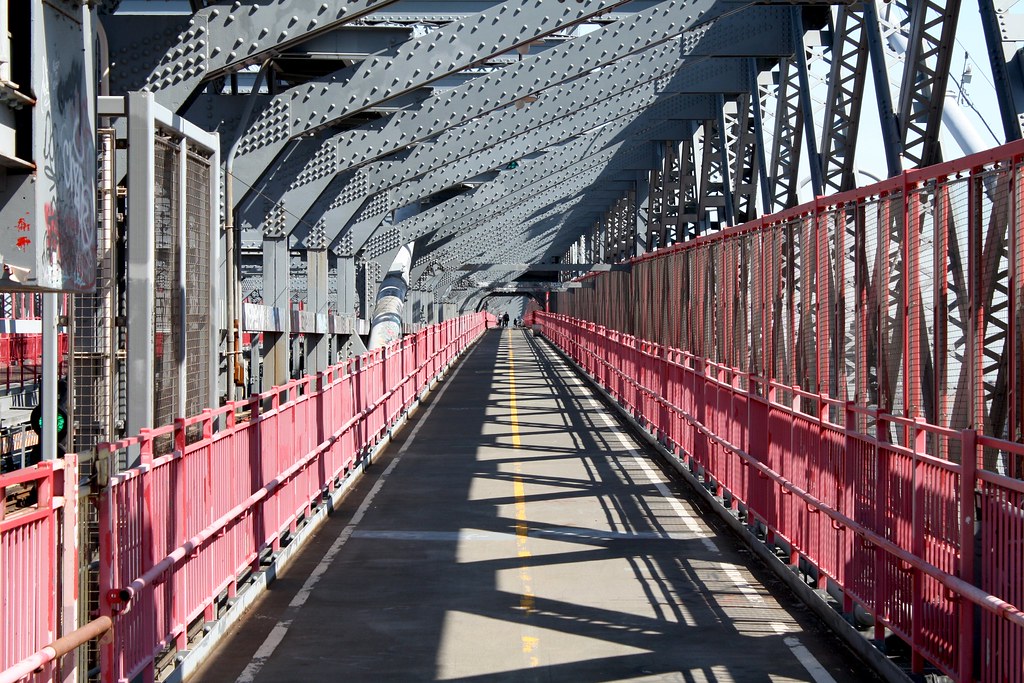
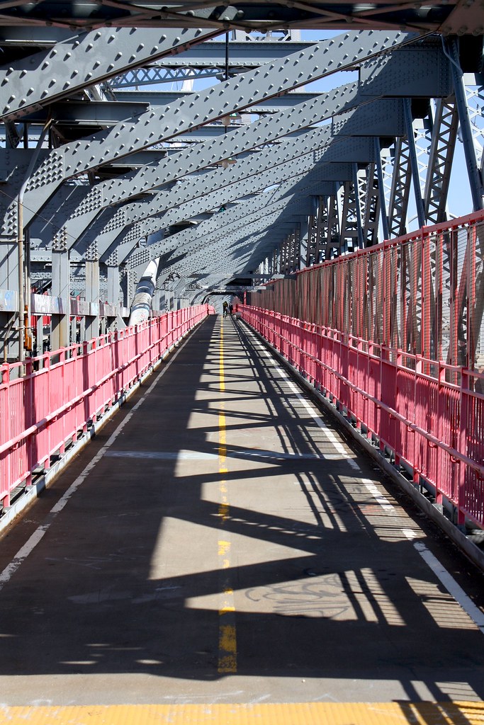
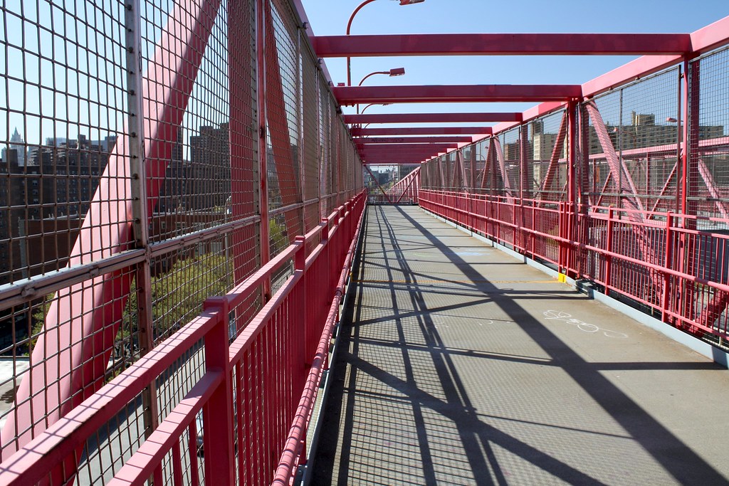
Went for a walk over the Williamsburgh Bridge the other day from Manhattan to Brooklyn and took a few shots.

It isn't the best bridge for photos as compared to the Brooklyn Bridge, but some of the structural aspects were still entertaining.

Any thoughts/tips are appreciated as always.

#1
4520427735_9df4ba8be4_b.jpg


#2
4521057826_a9d13dbdb9_b.jpg


#3
4520418271_79464f2db5_b.jpg


#4
4520415191_5af5fc3337_b.jpg
 
my favorite shots are 2 and 3, cant really decide between the two
shot 1 confuses me, there is A LOT going on in picture
i think with a different angle and focus point it would turn out better
 
Looks like with some propper editing they could be alot better. Try playing with the curves so they dont look as flat.

Still working on that but thank you.
 
my favorite shots are 2 and 3, cant really decide between the two
shot 1 confuses me, there is A LOT going on in picture
i think with a different angle and focus point it would turn out better

Thank you for the feedback.

Shot 1 is what you see at the beginning of the bridge after walking up the ramp.
 
I like #3 because it's almost like you could cut it in half diagonally and have to symmetrical parts.

I agree with some editing, they could be much much better. Maybe something moody? I'm no good with PP, but here's my edit with a handy dandy Coffeeshop Action (I'm a cheater!!) :)

206h6jl.jpg
 
Thanks for the feedback and edit aliciaqw, I will see what I can do!
 
Bugs
Between 2&3, I like the portrait shot better. I believe it works better with the vertical elements.
 
Bugs
Between 2&3, I like the portrait shot better. I believe it works better with the vertical elements.

Most definitely, thanks pbelarge.
 
The graffiti one really draws me in more than the others. I would like a bit more contrast, and perhaps you could play with the warmth/coolness of the colors to see if you could get that green to pop on the white portion of the bridge marker. I also like that there seems to be a bit of distortion on the edges, and it seems like the middle of the monument is coming out at us.

As for the others, it looks like they're washed out a little. I could see the grays being richer, the reds being richer, and the shadows being much darker. Perhaps a crop where you eliminate the top of the bridge, and only show the shadows may make for something really exciting. I typically take a second to look around and see what I'm looking at, then look for the shadows those objects are casting--sometimes, in the right circumstance and in my experience, that makes the best image.
 
/\

Great advice, I appreciate your feedback.
 
Bugs
Between 2&3, I like the portrait shot better. I believe it works better with the vertical elements.

I disagree with you, for a change. I generally prefer shots in landscape orientation because they look more natural to me (more like the way I see things with my eyes).

Also I think the end of the catwalk, where you can see someone walking, has a shape that mimics the frame of the picture.

#2 is best imo. Maybe minor contrast adjustments - don't get too crazy like the above edit.

#1 is nice also, don't mind the distortion because it looks interesting. I'd rotate it a bit though so the red beam up top is even on both sides. Maybe crop below it, maybe not. Shame people vandalize the hell out of that bridge. Here's an example of graffiti that's not art..
 
Bugs
Between 2&3, I like the portrait shot better. I believe it works better with the vertical elements.

I disagree with you, for a change. I generally prefer shots in landscape orientation because they look more natural to me (more like the way I see things with my eyes).


reznap
Thats it, I am going to have you expelled from this and all sites... ;):mrgreen:

The beauty of photos, is someone is going to like the shot. Now if I could just get someone to like mine...:mrgreen:
 

Most reactions

Back
Top