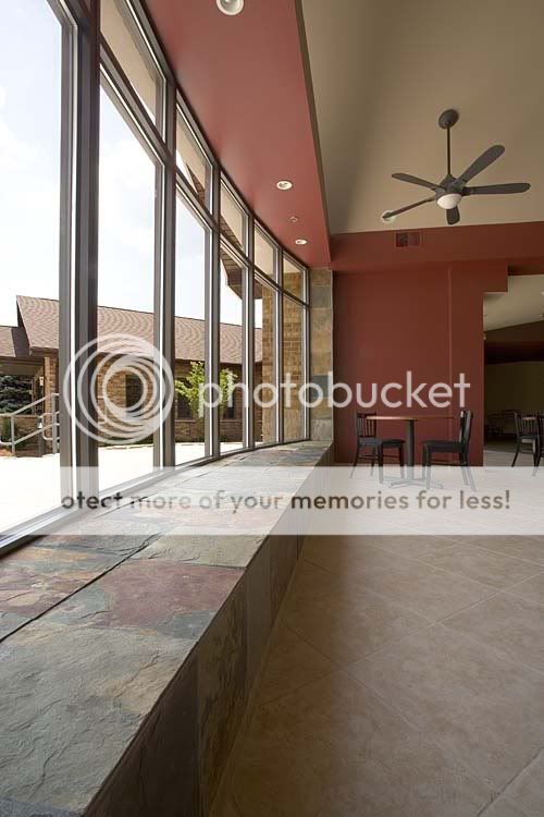
Excellent. manageable contrast, evenly lit, good detail, adequate depth of field and made with a wide angle lens which almost always appeals to me. Nice job.
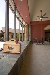
But if you crop the image, it's still the same angle. Hmmm.....
AND... more than half the sill is gone. Since the photo is of the window, which includes the sill.... (the table and chairs are there simply for scale, so I wouldn't need a breadbox).
But if you crop the image, it's still the same angle. Hmmm.....
AND... more than half the sill is gone. Since the photo is of the window, which includes the sill.... (the table and chairs are there simply for scale, so I wouldn't need a breadbox).
Very nice shot.
But there are three things that annoy me.
The distortion on the ceiling fan - particularly the mount. But as this is caused by the WA lens I'll live with it. Although if you raised the PoV about a foot it could sort it.
One of the fan blades bisects a ceiling light. Don't know why I find this annoying but I just do.
The tile join extreme bottom right corner. Very distracting.
It would be interesting to see the shot with the room lights turned on. Using daylight balance this would give the image some warmth. As it stands the 'people' side looks a little cold and unfriendly. The lights may also give the image a little more pop - doesn't take much to push 'good' to 'great'
(You do realise that I am just being extreme nit-picky here? Which should tell you how good I think it is)
Very nice shot.
But there are three things that annoy me.
The distortion on the ceiling fan - particularly the mount. But as this is caused by the WA lens I'll live with it.
I suppose I've been looking at wide angle shots for so long, I just take it as it comes. The distortion that really bothers me is the bowing of the closest upright window frame.
Oh yeah... that was one of the first things I regeted when back in the studio. I too am not sure why it troubles me. Could be that the circle formed by the light is interupted. I usually like too some separation of elements with a bit of space. Hmmmm.


")

![[No title]](/data/xfmg/thumbnail/42/42275-2ca41f93a172e2e510afb46912a2bb61.jpg?1619740084)


![[No title]](/data/xfmg/thumbnail/42/42277-63576745f84be96df79b94ca0f49e00b.jpg?1619740085)