morydd
TPF Noob!
- Joined
- Apr 19, 2006
- Messages
- 499
- Reaction score
- 0
- Location
- Chicago
- Website
- www.morydd.net
- Can others edit my Photos
- Photos OK to edit
From a trip to the Missouri wineries.
Some Gimping, saturation, etc.
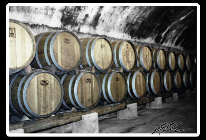
Some Gimping, saturation, etc.

") This method gives the image a strange superimposed look, like the casks don't really belong there. To me, anyway. I do love the composition in this shot, just wish it jelled better. Just my two cents.
This method gives the image a strange superimposed look, like the casks don't really belong there. To me, anyway. I do love the composition in this shot, just wish it jelled better. Just my two cents.
![[No title]](/data/xfmg/thumbnail/38/38736-5bc266b035e23faf5ad942bdd97466a8.jpg?1619738703)
![[No title]](/data/xfmg/thumbnail/42/42059-61b97bbebb00e6276672551f4e3b3e43.jpg?1619739995)
![[No title]](/data/xfmg/thumbnail/42/42058-8597ac0f687fb4007aa3ca0210936f04.jpg?1619739994)

![[No title]](/data/xfmg/thumbnail/42/42060-f597479f8fd78d4bb4d17e7686fb0812.jpg?1619739996)
![[No title]](/data/xfmg/thumbnail/42/42057-1509913128bb1db2bc11235c05832fd4.jpg?1619739993)