Working with curves

Aquarium Dreams

TPF Noob!
Joined
Jan 14, 2007
Messages
731
Reaction score
0
Can others edit my Photos
Photos OK to edit
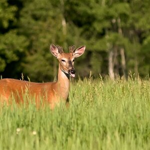
This is my first try at playing with the RGB channels in curves. The first is the original, no pp work. The second has levels, sharpening, and five curves layers. I was trying to bring out the color. I've been shooting a lot of ermmm.. walls.. lately, so I've been working on ways to punch up color and texture. What I'm looking for here is if I'm doing the curves right, or if it looks overdone or the color looks off. If anyone has any tips for working with RGB curves, let me know!


475818340_2693f4fd6e_o.jpg


475818354_776487e6bc_o.jpg
 
Hi Aquarium

My initial reaction is that 5 curve layers seems like a lot. One usually does the job

I personally find that curves comes in most handy for giving the contrast a little boost or for creating unusual colour effects, but that's all

I find the Levels option a much better choice for controling colour. I see in your description you state you have used levels, do you have a good understanding of using Levels?.

Your processed picture definately is more contrasty and saturated, possibly a bit much for my taste but i'm not sure
 
The point of color curves is to increase or decrease saturation in a particular part of the tonal range, i.e. you can make, say, the reddest parts more or less red, while leaving the rest relatively untouched.

Another option would be something like the channel mixer.
 
Thanks for the responses! I could have used two curves layers and done the same thing, but I used a different one for every channel, so I could turn their visibility on and off one at a time while I adjusted them. I like the saturation, but I think there's too much red and too much contrast.

JohnMF, I only used levels to increase the tonal range, I didn't mess with colors on it at all. I don't know much about levels, but I've heard rave recommendations about curves, which is why I was giving it a go. I'll have to research more about levels.

MaxBloom, I've used the channel mixer before, so using curves like this was a way to compare and see which I like better. I think it's easier for me to go overboard with curves, whereas with the channel mixer, it's more measured and precise. (Probably due the fact that I don't really know what I'm doing with curves!)
 
#1 looks better than #2. I love the tone/colors of the second one. You did good in my book.
 
Do you want to keep the color cast and punch it up a bit, or do you want to change the colors? I use use curves and levels for a bit of a contrast boost (usually, just a dab will do ya). For a slight contrast boost I tend to peg the center of the curve, and then drag "up" a point about 3/4 along the line, making a subtle "S". Again, just a dab should do it.

With shots that don't work well with this method, "cup" and "upside down cup" shapes tend to work.
 
Gmarquez, what do the cup and inverted cup look like on the curve? I tried making them, but I just couldn't visualize it.

With the second one, I was trying to increase contrast and saturation, but not change the colors. My first curves layer was an S curve, the second was a smaller tilde type curve along the values of the flowers. The others were all S curves for the separate RGB channels.

I went back and kept the first two curves, but instead of S curves on the RGB, I just pegged the center on R and B and adjusted them slightly. I think I like the results of this one more, because it's not as contrasty. What do you all think?

476497165_404bf5ff41_o.jpg
 

Most reactions

New Topics

Back
Top