OLaA
No longer a newbie, moving up!
- Joined
- Aug 5, 2012
- Messages
- 259
- Reaction score
- 48
- Location
- Sacramento, CA
- Can others edit my Photos
- Photos NOT OK to edit
This is the 2nd thread ruined by this ridiculous topic. Why are members going to want to keep logging on and sharing their ideas if every thread turns into getting the third degree about copyright. Assume the poster has done his/her due diligence unless proven otherwise. I'm new to this forum and have already started looking for a new one because of the communities general attitude.
To keep it on topic. OP I can't wait to see your results! Please repost when you do. I like the direction as it stands.
To keep it on topic. OP I can't wait to see your results! Please repost when you do. I like the direction as it stands.
") . As for the color, I'm not sure I'm a fan of that. I wanted to keep the red band the main element of color, and I feel like the red pole takes away from it. Personal preference I guess. Thank you for the edit though!
. As for the color, I'm not sure I'm a fan of that. I wanted to keep the red band the main element of color, and I feel like the red pole takes away from it. Personal preference I guess. Thank you for the edit though!![[No title]](/data/xfmg/thumbnail/37/37534-e0f67d1d14bd79cca15937359f0e4c94.jpg?1619738132)


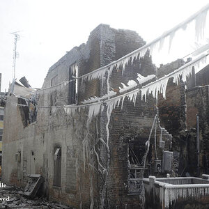
![[No title]](/data/xfmg/thumbnail/37/37536-3578b4f283f738d862be62d896fa52d5.jpg?1619738132)
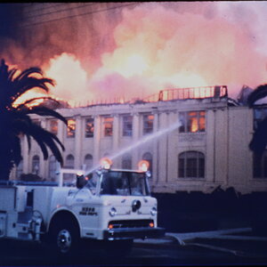
![[No title]](/data/xfmg/thumbnail/37/37537-25afab1a7980214af6067df3c997c353.jpg?1619738132)