Would it grab you?

2Stupid2Duck

No longer a newbie, moving up!
Joined
Aug 24, 2004
Messages
1,184
Reaction score
5
Location
Brisbane
Website
www.photoslamour.com
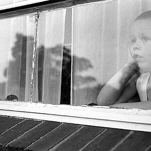
A good friend of mine designed a website for me. I was actually pretty happy with it but I would be pleased to know what people think.

(Oh, I know there is an issue with the thumbs in the gallery - they all show landscape which mean some get stretched. )

Really appreciate the feedback folks.

www.photoslamour.com
 
I really didn't look around a whole lot but I really like the design ideas used there. Kinda making me rethink some of the ideas I had for mine actually. I dig it :thumbup:
 
I like the easy navigation. I think so much red is over the top. Maybe white, with red trim, accents, etc...?
 
It really is nice to be able to navigate around a site so quickly. Nicely done!

I agree it's a pretty "red" site, but it didn't particularly bother me. You could tone it down on a page or two and still get your "la'mour" effect, I think. :D I like it.
 
Thanks fine folks. I guess there is a lot of red - hadn't even noticed til you said something. LOL. I guess I thought the red was a good contrast to the main pic.
 
MHOs:

1. Overall site is pretty good with no scrolling on home page one of the best things
2. Red color distracts the viewer from the pictures and directs his/her eyes on things written on red background.
3. With reference to Galleries, I would avoid using any scroll bar inside home page.
4. When I click on the image thumbnail it opens another window. I would avoid poping window, if I "had" to do that way, I would ensure that popped window resizes itself to Image size with an option "back to site" which will close the window.
5. Again it might be just my taste, golder borders of images reduces the impact of your beautiful photos.

Hope you wont mind this critique. I am purely thinking of a normal user who would land accross your site by reference or thro search engines.
 
Mate... I don't mind the crit. in the slightest. In fact, I am very grateful. Thanks for taking the time to look around. It's still a work in progress, especially the way the galleries work and the contact page etc.

I also wasn't sure about the gold frames. The reason I am currently using them is because I'd eventually like to sell pics that I mat and frame myself (using pre-purchased frames). The other thing I was thinking about the frames is that it kinda standardises all the pictures.

Again, thanks for the crit (sincerely).
 
Overall I like it I can move around quickly. Some of the thumbs however look kind of distorted. Could just be the settings on my computer.
 
No the problem is with me. I don't know how to get the portrait ones to appear portrait. They are all showing landscape for some reason.
 

Most reactions

Back
Top