theraven
No longer a newbie, moving up!
- Joined
- Oct 16, 2012
- Messages
- 677
- Reaction score
- 102
- Location
- Stoke on Trent, Staffordshire, UK
- Website
- www.ravenphotography.co.uk
- Can others edit my Photos
- Photos OK to edit
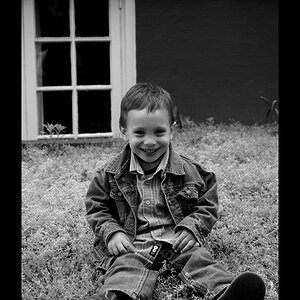
Ok, so I have been putting together my website, and have done as much as I feel I can at the moment. Will be sorting the domain out soon and finalising it, but before I do, I would love your opinions!
This is my first website so be gentle!
Raven Photography by Jenna Goodwin
Any tips?
Thanks in advance...
Jenna
This is my first website so be gentle!
Raven Photography by Jenna Goodwin
Any tips?
Thanks in advance...
Jenna


![[No title]](/data/xfmg/thumbnail/42/42472-9229a7111196e5db141ab82c04a4ba48.jpg?1619740193)
![[No title]](/data/xfmg/thumbnail/42/42474-aa3cf1f7163a823d6f10558b262a4bc3.jpg?1619740194)

![[No title]](/data/xfmg/thumbnail/36/36682-50d0684eabff70509e27d7061c265146.jpg?1619737677)


![[No title]](/data/xfmg/thumbnail/37/37602-1ef8dbb1c2d0e4ff347ee65d328c3603.jpg?1619738147)
