Yappo | NSFW Implied

Austin Greene

Been spending a lot of time on here!
Joined
Jan 6, 2012
Messages
1,472
Reaction score
855
Location
Mountain View, California
Website
www.austingreenephotography.com
Can others edit my Photos
Photos NOT OK to edit
Thought I'd post a couple from a recent shoot, a cross between a standard portrait shoot and an outdoor boudoir/implied shoot. The second image made it into my 52 Weeks Project :) All in all, the shoot went well. It took awhile for the client to get comfortable as she hadn't done this type of work before, but once she did things really took off and she was quite happy.

1.
i5lwms1.jpg


2.

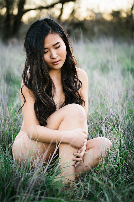
52 Weeks: Unbound (Week 49/52)
by TogaLive, on Flickr
 
nice set.
I think i might have liked #1 better in portrait orientation.
it looks good horizontal, but...there's a lot of very bright background pulling my eyes from the subject.

#2 is a really nice shot too, and my only nitpick on it would be that her left hand is in focus, but her right had seems to be really soft.
 
i have to like it anyway. I am a sucker for the style of #2. I can't turn down naked women sitting in long grass.
 
oh geesh. Did i just really type that? Yeah, guess i did.
 
#2 is exceptional. Sensuous and creamy without any tartness. #1 has too much distracting background ... I love the bokeh, but it is too bright and competes against the subject.
 
Nice bokeh. Is it possible to take a photo like this by using 60D + 70-200 f4L non-IS? Just a noob here.
 
Nice bokeh. Is it possible to take a photo like this by using 60D + 70-200 f4L non-IS? Just a noob here.
Whether the blur is "bokeh" or not could be debated, but IMO, yes, you could get a shot very much like these.

If it is blur that you want, read up on how that is generated.

Meanwhile, welcome to the forums.
 
#2 is really nice :icon_thumbsup:

I see you posting more of "these types of shots" in the future :)
 
I don't like the pose in #1, her facial expression just doesn't work for me.
#2 is wonderful though, I love everything about it!!!:)
 
Good work. Completely agree about Portrait orientation for the first shot. Second shot, agree about the softness of the right hand. Also, it would look better with her hair all to one side (say...her right side)--her right knee is going to keep things modest.
 
What bothers me in shot #1 is the way the vanishing point just goes BOOM! big, black rectangle...my eye goes to that doggone black rectangle in the middle of all that light backdrop. I think part of the reason the black patch is so distracting is its relationship to the very light, luminous green/yellow of the background grass area. maybe adjust the luminance and saturation of the background greens a bit, and sublimate them? I don't mind the horizontal camera positioning in #1, since it shows her as she is seen within the context of the larger landscape...seems okay to me to frame horizontally in this case.

#2 is a very solid composition. I LOVE the way the hardwood tree is shown in the background. It's tasteful, classical, lovely. My processing idea might be to maybe lift the black point up just a tiny bit (the darkest parts of her hair appear just a bit dark to me) and reduce the foreground vignetting or lens fall-off 10 or 12 points. She looks just wonderful in this shot, and it has good background control. It's a photo that could be processed any number of different ways and still look good because it's simple and strong and timeless; this could have been shot in 1915 just as easily as in 2015. Nice going!

Both these shots have the new G-series Nikkor-type of realllly high saturation...I'm older...I'm not used to such high, high color saturation.
 

Most reactions

Back
Top