cherrymoose
TPF Noob!
- Joined
- Jan 21, 2007
- Messages
- 1,063
- Reaction score
- 0
- Location
- Berkeley, California
- Can others edit my Photos
- Photos OK to edit
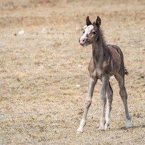
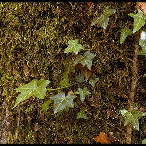
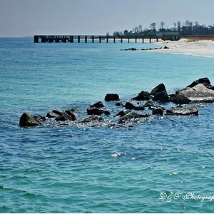
C&C? There's some here that I'm particularly proud of, and some that I'm not quite sure I like.
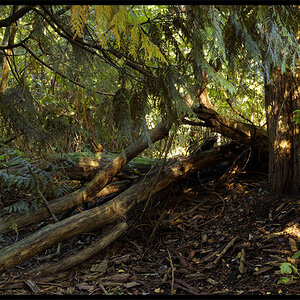
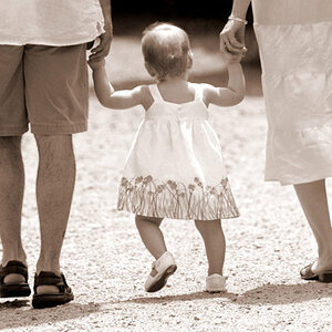
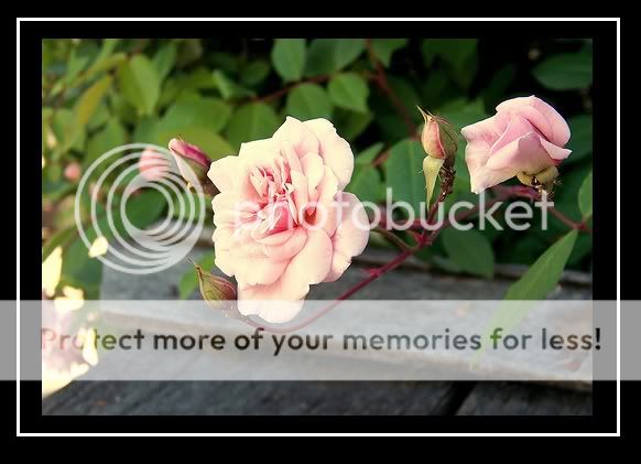
1)
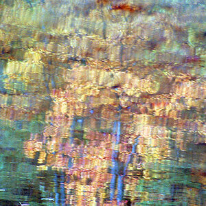
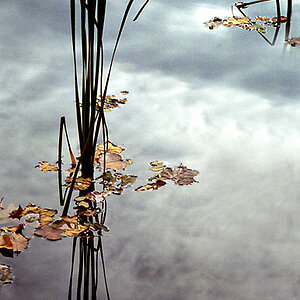
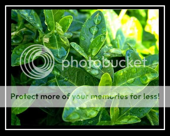
2)

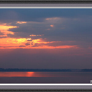
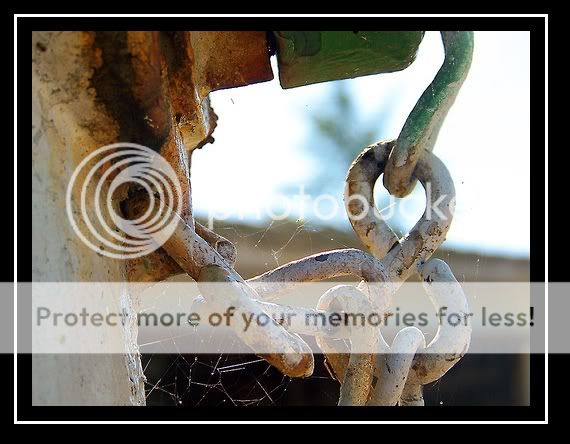
3)
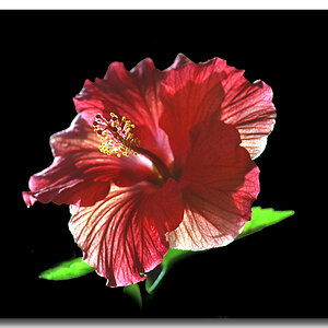
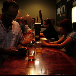
4)
5)
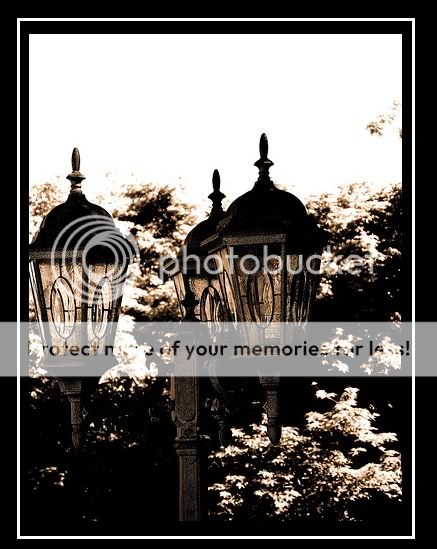
6) This one I'm not sure about. It's really different from my usual style, but I kind of like it anyways.
1)
2)
3)
4)
5)
6) This one I'm not sure about. It's really different from my usual style, but I kind of like it anyways.
") My favorite is #4, though the extreme yellowness in the top right corner is a tad distracting. I also like the first and the last though i wish on the last we could see the edge of the very left light, and I think, for me, I'd possibly crop off part of the top to take away some of the white.
My favorite is #4, though the extreme yellowness in the top right corner is a tad distracting. I also like the first and the last though i wish on the last we could see the edge of the very left light, and I think, for me, I'd possibly crop off part of the top to take away some of the white. .
.