YOUNG BEGINNING PHOTOGRAPHER

McWeasley

TPF Noob!
Joined
Jul 6, 2011
Messages
6
Reaction score
0
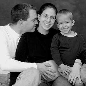
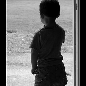
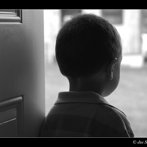
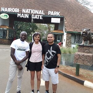
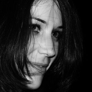
I've been an avid photographer since i was 13, i'm now 17. i know i'm barely an amateur, but i would really really like any sort of feedback or critiquing. even if it's just to tell me maybe i should pursue another hobby, i don't care. i've only recently starting posting my photos online, and i want all the help i can get. any sort of beginning tips or critiques would be awesome. my flickr is : http://www.flickr.com/photos/mcweasley/
:
)
 
Looks like you have quite a few photos on your flickr...why don't you pick 3 or 4 of your favorites and post them here? A lot of people don't like to click on links, and most people probably won't look through 100+ photos.
 
if you tell him 3 or 4, he'll post 5.

Pick 1 or 2, tell us why you think they are good and where you think they fall down.
That way you exercise your brain and everything you hear is new to you.
 
3 things:
1.thank you! i'lll do that!
2. *she
3. i would've put 3, if you had said 3-4. you're supposed to always go with the bottom number on those things.
 
In your first link, anytime you shoot into the sun, you will get some spill over into the rest of your subject usually resulting in low mid-tone contrast. The framing seems a bit akward for me...parts of the branches are cut off and parts of the sun are cut off. The branch at the bottom left is particularly bothersome and the branches at the top left form leading lines leading the eyes away from the photo. All in all, it's a picture of a tree without an interesting background. Sometimes a lone tree can make a very interesting subject...sometimes not.

For your second link, I have many of the same comments. The sky is much more interesting in this photo and it looks to be exposed well. Kudos for taking photos at a different angle and perspective. My main hang up on this one is the focus point seems akward and not really thought out. Looks like you used the center focus point and didn't use focus to emphasize any particular part of the subject...the middle of the post is probably not what I would have chosen, and probably not what you would have chosen if you had it to do over again. I would have either adjusted the focus so that either the very bottom of the post was in focus or the very top...I think the very top would have probably worked better, but either would be preferable to the middle of the post.

For the third link, it looks like the focus is a bit soft, but it could be a result of the very shallow depth of field...a smaller aperture would have probably been helpful for this shot. The other part is that people's eyes are naturally drawn to the brightest area of the photograph, which, in this case is an overexposed, busy, and out of focus background. It creates disunity and, again, just seems a bit akward.

On the plus side, it looks like you either, naturally or intentionally, used the rule of thirds for all of your images to help put your subject in a strong position in the frame. Now we just have to work on making sure the focus is on the area you really want to emphasize and work on getting interesting backgrounds that add to the photo instead of backgrounds that just happen to be there.
 
I see no pictars.
 
thank you thank you thank you thank you!!!!!!!!!!! you completely rock!!! i see what you're saying with my focus points! this was exactly what i was looking for!
 
Your welcome...for what it's worth, you will get more responses if you actually post the images to this site.

The Image poster is kinda broken at the moment, but an easy way is to goto flickr, click share, and grab the link that actually ends in .jpg
Then post it in here and put
after it.
 
question. can you tell me what i did well? i'm not fishing for compliments, i want to know for future photos
 

Most reactions

New Topics

Back
Top