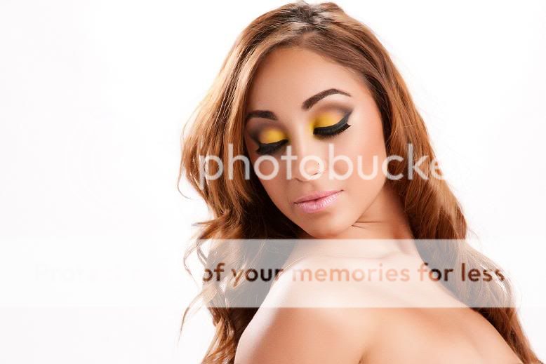
The skin looks good in this pic. The hair on the left shoulder just ends... there is no overlapping like the right shoulder. Either she has grey hair, or the highlights were over-sharpened to cause them to look grey. Either way, it is a bit of a distraction for me. The shadow on the left side of the neck is mottled and does not flow into neighbouring tones.
I like this shot. Nice balance good lighting and good control of DOF. Just on the verge of really nice bokeh coming out. It's flat lighting, but I like the distinct foreground, middle and background.
That's really, very kind of you... but I'm pretty sure there's a long line of people on this forum and another I frequent that would VEHEMENTLY disagree with you.
Able to speak my mind? Check.
In a way that doesn't put anyone off... ... ... That's about a 50/50 split. :lmao:
Whatever photonumber that is....anyways, you should probablly make a new thread instead of adding to a thread constantly. Easier to keep track of what photo's you want C&C on.
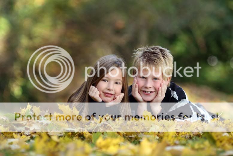
My favorite one is the kids. it may not be the perfect shot but it is a rather nice portrait of two kids. I would have cropped most of the OOF foreground myself.
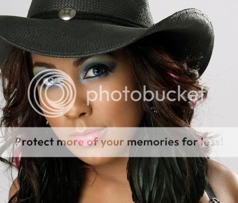
As for the girls... The PP is way too much. And you need to do the entire skin showing. In the first 2, the necks look different, ie they are not smooth. Also, the hair needs some extra detail. The photo in post 15 shows that the worst. The lack of detail inthat one makes the hair look like a helmet or some weird coif of the middle ages. It also looks like she was cut out and pasted on a piece of white background. In that one her eyes could benefit from a bit of dodging.
I also agree with The_Traveler as far as the brushes are concerned. Were the models holding the brush? If yes, attach it to something so it is straight and independent of the model. The white girl head is tilted up which allows us to see right up her nostrils. Not the worst case here but not super nice. The black girl, it looks to me like you shot down on her which I find better. But if it is to be a series I would like them to all be positioned the same way...
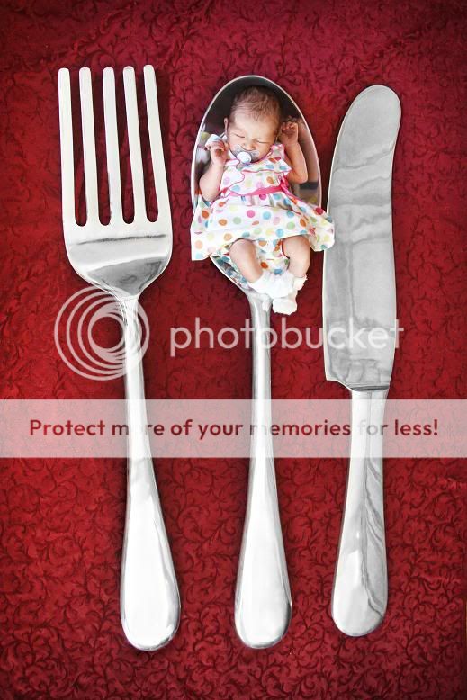
About the silverware shot, I agree that a baby and eating utensils is a bit weird. What's for dinner? But that is your artistic choice and really is up to you only. However, the reflections on the knife kill it for me. They make it look like a marble knife and i've never seen a marble knife...
#25 doesn't do anything for me. But this is a good example of how the background should have the slightest bit of tone. Can't tell where the edge of the image is... If this was to be printed in a magazine on a white page, a border would have to be added. I realize those are probably personal work not meant to be printed but my background colors are chosen with the designer of the end piece. No white background if the end piece is white paper, for example.
#26 is much better but again a bit more detail in the hair (on our left side, along the cheek and chin) would be nice.
Overall, you show some creativity and your light control is pretty good but your PP needs some work as well as your attention to details. Although details rarely consciously make a photo, they often can kill one.


![[No title]](/data/xfmg/thumbnail/36/36302-6ee4929dfdf80290ffd73704693e860f.jpg?1619737496)
![[No title]](/data/xfmg/thumbnail/42/42465-64dd69400e2bfaf59e558c3d8c934271.jpg?1619740192)
![[No title]](/data/xfmg/thumbnail/42/42466-109a1021e2f0f132abfd74e1a6e39444.jpg?1619740192)


![[No title]](/data/xfmg/thumbnail/32/32711-b57dd72845f94aa34b3bd7207b07f98c.jpg?1619735616)
![[No title]](/data/xfmg/thumbnail/42/42469-20c0ef5882a1e31d6172f182d8e90cf2.jpg?1619740193)