Your HELP required: which to send in for a competition?

Which one to enter in a competition?

  • Photo 1

    Votes: 5 11.6%
  • Photo 2

    Votes: 2 4.7%
  • Photo 3

    Votes: 2 4.7%
  • Photo 4

    Votes: 3 7.0%
  • Photo 5

    Votes: 16 37.2%
  • Photo 6

    Votes: 15 34.9%

  • Total voters
    43

LaFoto

Just Corinna in real life
Staff member
Supporting Member
Joined
Feb 1, 2004
Messages
34,813
Reaction score
822
Location
Lower Saxony, Germany
Can others edit my Photos
Photos NOT OK to edit
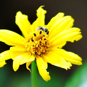
Yesterday we had a nice little hail storm and after that the sun came out.
Our quinche tree was glistening with droplets and I could not restrain myself.

Now I would like to enter ONE into a photo competition but since there are so many similar ones, I am not sure which is best. Can you help?

1.
schauerwetter01.jpg


2.
schauerwetter02.jpg


3.
schauerwetter04.jpg


4.
schauerwetter05.jpg


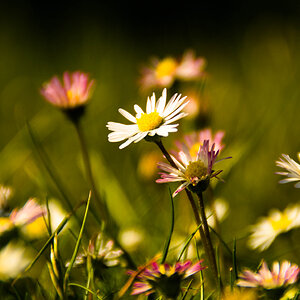
Now there are these, which are different, would you post one of these to the competition and if so, which one?

5.
schauerwetter09.jpg

f11 at 1/1600 ISO 1600 (+ NeatImage)

6.
schauerwetter10.jpg

f29 at 1/400 ISO 1600 (+ NeatImage)

These are definitely not going into the competition, I have already decided on that:

7.
schauerwetter06.jpg


8.
schauerwetter12.jpg

...but I still found the rainbow colours in the blurred drop in the background interesting ... but this being a reversed lens macro, DOF is razor thin and I could only get the droplet in focus, but not the leaf sticking towards me and I don't like that fact well enough.

So... which one out of 1 - 4 should it be - or none of those but one out of 5 + 6?
 
I would have said no. 1 or no. 8 but seeing as you have decided that no. 8 is definiatly not going in then I'd choose no.1!

BTW, why not no.8? What is the comp theme?
 
"In the countryside" ... very wide theme. Others have already posted sunsets, fields, wood themes, things like that.
These were actually NOT taken far out in the country, only just in our garden, but given that we live in the country and given the fact that no one can tell where this tree is, I felt it would make a change to send in one of these glittering droplets after a heavy shower.

You really think the last has potential?
I felt it was rather weak, given the minute DOF I get by using the lens reversed ... despite this being the lens put to 55mm which gives me the least magnification. But any bigger magnification (lens set to 35 or 24mm) always meant I hit the drops with the lens and that was the end of that drop... plus my lens wasn't too happy...
 
i voted for 5 ... the branch is better in 6, but otherwise 5 is so much better in terms of the background, and the reflection...

with 1,2,3, and 4 the bokeh is too hectic and uneven for me.
 
oh, i'd maybe try a 2:1 landscape crop on 5 ...
 
So you don't like all the glistening of the farther-away droplets on all the other branches to form the background for those in focus?

And yes, a question about a possible crop for 5 or 6 would have followed soon, since those two are not cropped at all, this is their original compo and size... You like the coloured starburst of 5 then, Alex, and the very evenly green background (with is our moss-lawn ... more moss than grass, I'm afraid)?
 
The reason I like no. 8 is because it's an original take on a subject seen many times. The other reason I like no. 1 over 5 is that it looks in context. No. 5 could have been done in a studio and I agree with with your comment "glistening of the farther-away droplets on all the other branches to form the background for those in focus".
 
The reason why I am not considering 8 is because they will be shown as tiny pictures on the website of that newspaper only ... ok, the "jury" (some people of the paper) will see my to-be-e-mailed-to-them version (which will be larger than what will be shown), but I doubt many will even RECOGNISE this without any lengthy explanations. That is why I thought maybe not 8...!?!?!
 
I am not saying that no.1 is bad ... just i personally like 5 more ;)

although 1 maybe has more "countryside" feeling to it.

5 is simple, that makes it beautiful.
 
I have meanwhile made the crop and find that 5 now looks better.
Why do only you and Mohain talk with me about these photos?
Are they only good on a very low (bad) level?
 
I'm obviously the odd one out... I voted for #4, though for me it was very close with #5. Personally I liked the fourth out of the first similar photos since my eyes were very clearly drawn to the droplet in vocus and like #5 it has a simpistic feel to it.
I don't think you'd go wrong with submitting any of the photos in this series, the color and detail of each are superb.
 
#5 or #6....I like the background in #6.

I also appreciate the rainbow srounding the bud in #8, maybe a little cropping would help.

Good Luck!

Paul
 
Corinna - I happen to like #7! :blushing: Which you have already decided is NOT a contender....but I really love to see reflections in natural-looking droplets like this, and I like the deliberate center placement, and the fact that it is a large enough droplet to show us the tree and blue sky.

But this probably doesn't help you to narrow your choices from the ones you prefer. So a second choice would be #1. :)
 
I have meanwhile made the crop and find that 5 now looks better.
Why do only you and Mohain talk with me about these photos?
Are they only good on a very low (bad) level?

if they were on a very low level, more people would have talked in this thread, saying so or giving hints how to improve ;)

I guess, people are

a) lazy
b) don't see a reason to post much if others have already said what they think
c) US-posting time has not really started yet ... and most Europeans just come home from work .. so it is only Mohain and me who are evil enough to post while at work :p
 

Most reactions

Back
Top