twocolor
No longer a newbie, moving up!
- Joined
- Feb 26, 2008
- Messages
- 1,044
- Reaction score
- 227
- Location
- Utah
- Website
- www.twocolorphotography.com
- Can others edit my Photos
- Photos NOT OK to edit
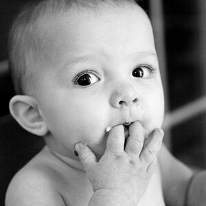
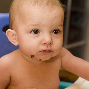
I am the sponsor for a local art center and their annual "Art-Tell". It's an art contest that tells a story. Each year the contest sports a theme that all artwork must be centered around. This year the theme is "See the Magic". As sponsor, I create the artwork for the posters, flyers and other marketing materials. I am also responsible for all graphic design of same materials.
I had ideas floating around in my head for weeks, and thanks to local businesses donating a live bunny (for an hour only), a child-size tux, and a top hat, and for a local neighbor willing to donate her child (for an hour only ;D) I was able to bring my ideas to fruition!
I used my snoot to create a spotlight look (as though this little guy were creating magic on a stage) and used a grid and barndoors to direct another light into my subjects face to fill any shadow the snoot created.
I am quite pleased with the result, but would like the honest and helpful critique from my buddies on the forum. Let me know if I'm on the right track.
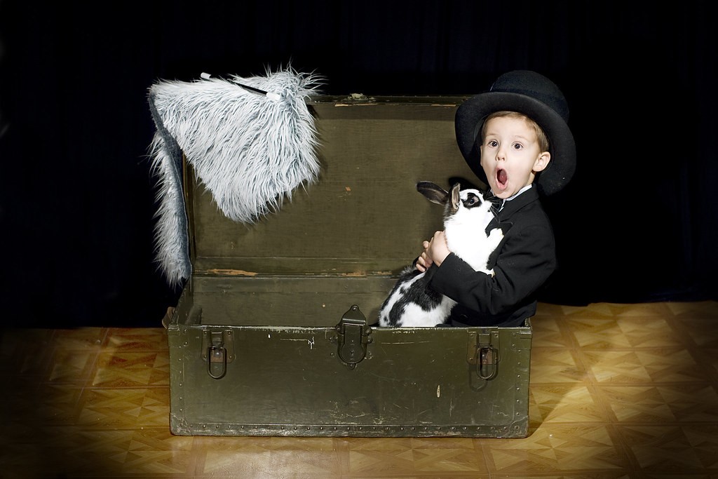
The coloring and sharpness are lost in upload to flickr, but I assure you it is crisp and the skin tones on the little guy are spot on. I'm mostly curious on your thoughts on my lighting. It will be cropped differently when the poster is designed. Less centered
I had ideas floating around in my head for weeks, and thanks to local businesses donating a live bunny (for an hour only), a child-size tux, and a top hat, and for a local neighbor willing to donate her child (for an hour only ;D) I was able to bring my ideas to fruition!
I used my snoot to create a spotlight look (as though this little guy were creating magic on a stage) and used a grid and barndoors to direct another light into my subjects face to fill any shadow the snoot created.
I am quite pleased with the result, but would like the honest and helpful critique from my buddies on the forum. Let me know if I'm on the right track.
The coloring and sharpness are lost in upload to flickr, but I assure you it is crisp and the skin tones on the little guy are spot on. I'm mostly curious on your thoughts on my lighting. It will be cropped differently when the poster is designed. Less centered