Zion C&C

Blackjack

TPF Noob!
Joined
Feb 11, 2010
Messages
43
Reaction score
9
Location
Edmond, OK
Can others edit my Photos
Photos OK to edit
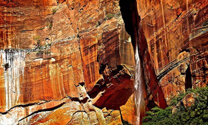
Here's a landscape shot from Zion National Park of Upper Falls. I know there have been millions of photos taken of this landmark. Many of them are way better than mine. However, I'm wondering what you think of mine? Thank you.


IMG_3923 by Blackjack1943, on Flickr
 
This doesn't strike me as much of anything, I regret.

ETA: ^^^^ is just wrong, now that I look at it. I think this is a near miss, as should be obvious from the below vvvvv!

Part of the problem is the time of day, the light is quite harsh and strong which makes things look sort of unappealing generally. Composition also strikes me as weak. You put the falls off-center, which is good.But they're just kind of there with a bunch of stuff around them.

The shadow on the right edge of the frame doesn't seem to be doing much, so I would have framed it OUT. I would have placed that echo of the water, the guano (?) running down the cliff on the left side more in the center. Trim out some of the trees below, which are adding very little (although they do ground the frame, they don't need to take up much of it to do that). You can get part of the way there by cropping this one, but I'd prefer it with more stuff on the left and above.

This also has a curves adjustment to push a little tonal separation into the high tones (i.e. the waterfall) and pull the midtones down a bit, to make the waterfall pop out a little more, and a very very light vignette to close up the frame a bit:


$foo.jpg
 
1) Seems a bit oversaturated
2) The composition could use some work. Since you can't see any sky and can barely see any leaves, there is no sense of scale or anchoring. And there aren't many clear shapes to look at.

I use as a rule of thumb "imagine what the image would look like if you were squinting your eyes a bit and it was the size of your thumbnail. At that size and blurriness, would the shapes still be compelling enough to make you want to look closer?"

This image at thumbnail size would just be an almost uniform red brick of color, and would not make me want to click closer.

As an example of one that would, this is my favorite composition of this landmark that I see from google images:
$emerald-falls-m.jpg

The colors in this are weird, but I'm just talking about the composition. The shapes are compelling and interesting, even at 50x50 pixels. It makes me want to zoom in, and then when I do, I can also appreciate the small shadow detail and the waterfall, etc. You have interesting small detail and texture, but you have to get the viewer close enough first to see it.
 
Amolitor and Gavjenks: Thank you for the C&C. I expect your critique will be very useful to me in the future. I've looked and looked at this photo over and over again. Even though I kind of like it, there was always something about it that kept it from being completely satisfying to me. You've helped clear things up.

One question about the saturation: I noticed while I was in southern Utah that almost all depictions of the rocks, arches, etc. in the area were over-saturated, even the paintings. I concluded that perhaps over-saturation is the norm. Now, not so much. Thanks again.
 
To me the problem with this shot is texture vs structure dilemma. I think you need to answer the question - what are you concentrating on? Do you want to show the striking texture and colors of the rock? Then you have to compose accordingly. Do you want to show the waterfall in the rock? Then it is completely different shot. Your shot is somwhere in between to me. What is the focal point? What is this shot about? We know it is about the striking beauty of the place. But what EXACTLY makes it so beautful? Answer this question and the rest is easy.
 

Most reactions

Back
Top