2 senior pics + my new fav location

Breanna

TPF Noob!
Joined
Jan 25, 2009
Messages
210
Reaction score
0
Can others edit my Photos
Photos OK to edit
We just moved and this amazing field is steps outside of my front door.

Here are 2 from a recent shoot. The versions that I gave her matched in their editing style, but I wanted to see if you guys thought that it could work. I usually don't play this much in PS.

ShelbyJuly09015_ActionSm.jpg


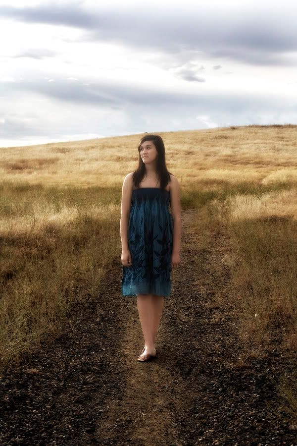
I know this pose is kind of boring, but I liked it none the less.
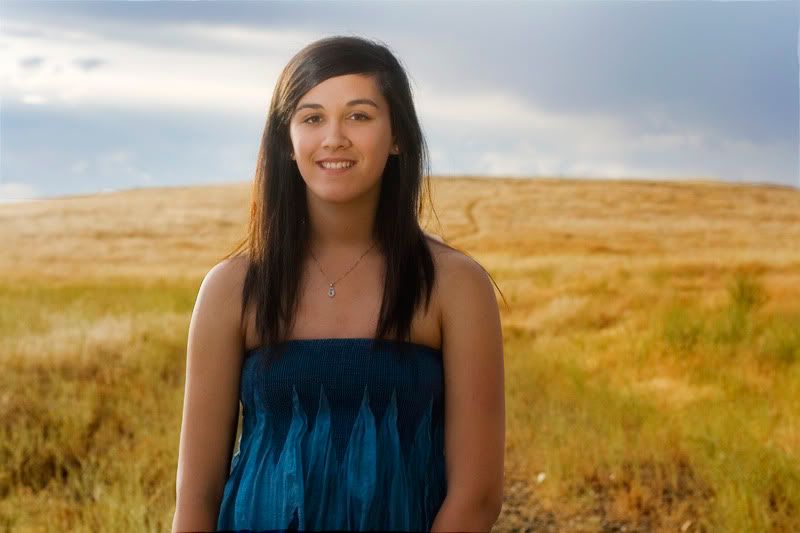
ShelbyJuly09003Lovely.jpg
 
Soft and glowy. I don't care too much for that style of PP, BUT if she likes it, and you get paid, that's what counts. Even though I don't care for it, I think it can work; definitely.
 
I like the location too. I think the back ground looks great soft but she needed to be a bit sharper. None the less very pretty!!!
 
I'm liking number 2. The more saturated colors and sharper subject are prefered over the first image. In the first, the softness in her arms and legs makes them look almost plastic to me. Her fingers and legs just kinda all blend together.

Awesome location - I bet you can't wait for another shoot there!
 
Funny, I'm opposite from rub, I like #1 the best because I love that soft, muted, faded summer look that is so popular w/seniors now (at least out here!)! Though I do agree the arms and legs are a bit too soft for my tastes. While I love the colors and background in #2, it reminds me too much of just a snapshot, maybe a different crop, tighter or at an angle? Just what I would try.
 
Okay- how odd is this. I did another shoot on Friday....both of the girls are wearing almost identical dresses! TOTAL coincidence. So, not only is the location the same, but so is the outfit. UGH! I think I'm done with my field for a while ;)

1-
IMG_1568.jpg


2-
IMG_1575.jpg


3-
IMG_1614.jpg


4-
IMG_1644FunSm.jpg
 
I like the last 2 best. Not sure if it's my screen, but the full bodies shots seem a little dark and flat in the faces, maybe increase the tonal curve a bit?
 
Number 4 of he second set is GREAT! I said OHHHHHHHHH out loud! And wow - same dress! That makes for a big challange!
 
They looks pretty good. You need to watch out for how you place your horizon lines in relation to people bodies. In most of these pictures, the horizon line is cutting through the neck or the head, which is generally to be avoided. The way the first one has her whole body under the horizon is good. The way the last one of the second set has the horizon lined right up with her shoulder, gives a floating head appearance. With any strong lines in the background, you should apply the same rules as you would with cropping, mostly being that they shouldn't go through the joints.
 

Most reactions

New Topics

Back
Top