4 photos for you to Critique.

Sundae

TPF Noob!
Joined
Mar 7, 2007
Messages
7
Reaction score
0
Can others edit my Photos
Photos NOT OK to edit
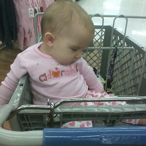
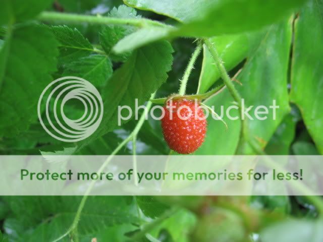
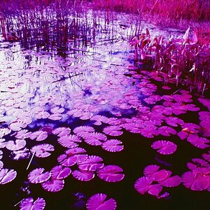
Here are 2 photo's for you to critique. I am 14 years old currently, and I hope to become a great photographer one day. :D

Do you have any critique for me on these photos? I would love to get better.

Model: Canon Powershot A520.
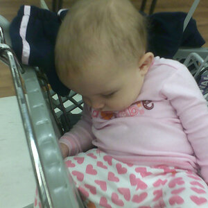
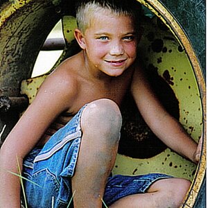
thezoopics036.jpg


Beautiful_Berry.jpg


And 2 of my doll:

oooohstars031.jpg


oooohstars032.jpg


Go ahead, critique it to your hearts content.
 
Yeah I don't know what that is in the first image but it's an awesome photo. The fact that you don't see the rest of the animal but just its hand (assuming that IS an animal) is awesome. Good composition, colors, etc.

The other 3 aren't bad either but for me the first one really stands out. Nice job.
 
haha! No, it is a little monkeys hand.. It was so cute, about 1 foot tall. I took it through the cage at the zoo.:wink: !
 
the last 2 are blown out.
 
the last 2 are blown out.

That means that there is no detail in the highlights.. In simplest terms, the shutter was open too long, and let in too much light, which makes the lightest parts of the image white. You don't want to do that, because instead of seeing detail in the image, all you see is the color of the paper.

I really like the concept of the last two, though. It looks a bit like a faux Suicide Girl.

Same as everyone else, number one is a standout! I thought it looked like a sasquatch or troll hand. But be careful not to get too close to simians in cages, as they have been known to mutilate people.
 
That means that there is no detail in the highlights.. In simplest terms, the shutter was open too long, and let in too much light, which makes the lightest parts of the image white. You don't want to do that, because instead of seeing detail in the image, all you see is the color of the paper.

More likely the flash was direct and too powerful.
 
I like No1. The composition of 2 is too central. Read about "The Rule Of Thirds". No 1 exhibits this.
 
#1 is awesome! i love that the fingers are off centered and that i can't see the rest of the animal. the rest don't jump out at me.
 
14 years old and you already take pictures better than I do! You have a rare talent. The pictures of your doll are blown out as has already been mentioned. However I like the affect. If they were not blown they would look somewhat dull.
 
Hiya Sundae and welcome to ThePhotoForum.

I have moved this post to the General Gallery. The Photo Critique section is reserved for more serious critique and therefore we like to keep it to one image at a time...(see FAQS), otherwise it just gets too confusing.

Feel free to post multiple images in other parts of the forum...or to re-post your images individually into the Photo Critique section, with a bit of an explanation of the shot and what you were trying to show.

Thank you.
 
the first one is a superb shot....really creepy!!! #2 as stated earlier, is too central, but you had the right idea with the pop of colour, #3 is the best of the doll shots, good composition, a little weird too..ha....yes, the highlights are 'blown' as they say, but it works!!!!
You have a talent at 14...keep posting!
 
Hiya Sundae and welcome to ThePhotoForum.

I have moved this post to the General Gallery. The Photo Critique section is reserved for more serious critique and therefore we like to keep it to one image at a time...(see FAQS), otherwise it just gets too confusing.

Feel free to post multiple images in other parts of the forum...or to re-post your images individually into the Photo Critique section, with a bit of an explanation of the shot and what you were trying to show.

Thank you.
Woops! I had a feeling I was posting this in the wrong place.

More likely the flash was direct and too powerful.

Actually that was taken in natural lighting outside and I think I put the Exp up a little too high.

I like No1. The composition of 2 is too central. Read about "The Rule Of Thirds". No 1 exhibits this.
Will do! Thanks!

I will take all of your tips into mind to try to improve. :thumbup:
 

Most reactions

Back
Top