TiCoyote
TPF Noob!
- Joined
- Apr 28, 2009
- Messages
- 626
- Reaction score
- 4
- Location
- New England
- Can others edit my Photos
- Photos OK to edit
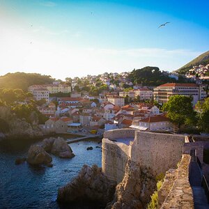
btw isn't it "Seine" river?
Yes it is the Seine River Sorry for the Typo haha and I agree the more I look at it, it does look over saturated, Ill try to post an edit of it in a bit.
Im trying to figure out what exactly you meant by the (temperature, not awesomeness) part; Do you mean that you don't like the cool feel of the photo or just that temperature in the photo is not good? The first and 4th are my 2 favorite. Ill try to post another of the 4th image as well with a little less saturation.I actually like #1 the best. I like the contrasting textures between the water, the sky, and the concrete. The blues and greens give it a cool feel (temperature, not awesomeness). #3 and #4 look a bit too saturated. They look overly processed.
It has to do with color theory. Blues and greens are generally cool colors, and reds and oranges are warm colors. Although there are warm blues, like cerulean, and cool reds, like alizarin. Color temperature is a matter of preference, and it can differ by portrait. In general, I like cool colors, but I prefer something warmer for portraiture. As I said, I like #1 the best.
")
![[No title]](/data/xfmg/thumbnail/37/37604-7ad625e983f92f880eb65a264eeef5e4.jpg?1619738148)