A couple of abstract shots

invisible

Been spending a lot of time on here!
Joined
Mar 10, 2007
Messages
5,213
Reaction score
983
Location
Canada
Website
www.federicobuchbinder.com
Can others edit my Photos
Photos NOT OK to edit
I know this type of photography is not everyone's cup o' tea, but it's what rocks my boat the most :)

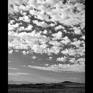
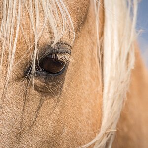
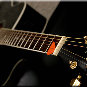
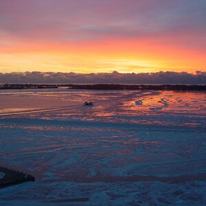
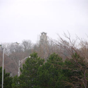
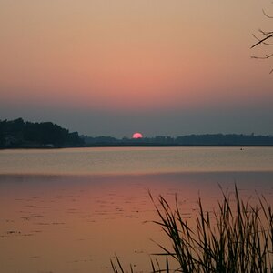
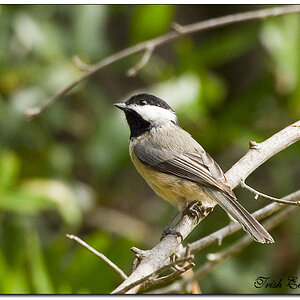
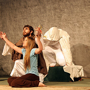
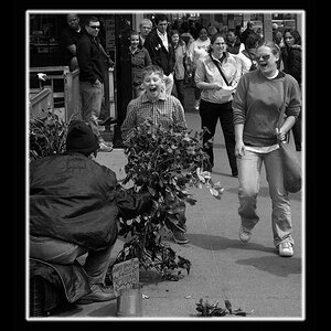
The four images below were shot in Mexico City. Obviously the last two are of the same subject, but I'm not sure which of the two I prefer, so both are shown here.

Any C&C will be welcome, including "is this your subject of choice when you travel to Mexico, you nitwit?" and "this garbage does nothing for me".

1.


2.


3a.


3b.


Thanks for looking.
 
Last edited:
Well, I like them. The color of the first one is very weird. is it natural? It makes for an interesting abstract because its hard for me to imagine an entire body of water that color. The second one is okay, I don't like the dark thing in the lower right, but if you cropped it out, you'd also crop out the corner in the lower left corner (heh, a corner in a corner, but i think you see what I mean)

and of the last two, I like b better (no i didn't stutter), small sharp curve, as opposed to longer softer curve...
 
Well, I like the long soft curve. :D In other words I like a better (and better is not a noun here :biggrin: ).

My favourite is 2.
OK, it does not precisely scream "Mexico" at me - as do none of these four, so I might as well say "is this your subject of choice when you travel to Mexico, you nitwit?", but would I ever say such a thing???

But I wonder why the deck (3a mostly) is so haloed???
 
Well, I like them. The color of the first one is very weird. is it natural? It makes for an interesting abstract because its hard for me to imagine an entire body of water that color.
I did saturate the colour a bit. Below is the image right out of the camera. Like I said in another forum, this is not exactly what you'd call "spring water" :)


The second one is okay, I don't like the dark thing in the lower right, but if you cropped it out, you'd also crop out the corner in the lower left corner (heh, a corner in a corner, but i think you see what I mean)
Good catch, thanks! I hadn't even noticed that dark triangle. No need to crop, it can be easily cloned out.

and of the last two, I like b better (no i didn't stutter), small sharp curve, as opposed to longer softer curve...
Thanks, good to see I'm not alone liking that one a bit. All of the other feedback I've received so far puts 3a well ahead of 3b.

Well, I like the long soft curve. :D In other words I like a better (and better is not a noun here :biggrin: ).
You are now part of the vast majority :)

My favourite is 2.
OK, it does not precisely scream "Mexico" at me - as do none of these four, so I might as well say "is this your subject of choice when you travel to Mexico, you nitwit?", but would I ever say such a thing???
I'm surprised someone likes #2 over the other images here, but to each its own. I like it too, but we are in the vast minority :) You could say "is this your subject of choice when you travel to Mexico, you nitwit?" just because you love the word "nitwit", like I do :)

But I wonder why the deck (3a mostly) is so haloed???
I don't see the halo... Are you referring to the whiter part of the bowl? That's where the light was hitting it... I have the hunch you are perceiving the perspective in a way different than the real one here –which is a "side effect" of abstract that I love. (Of course I might be wrong.)

Thanks Eldrich and LaFoto for your comments.
 
Last edited:
I like 3a the best. I originally thought it was a dock or patio over the water, taken with long exposure. 3b gives it away though.
That's a very good point. Being the person who took the pictures, it's difficult for me to realize that by myself.
 
I like 1 & 2 a lot.

I kinda-sorta like 3a, just personal preference I guess - I like straight lines more than curves.

2 is my favorite.
 

Most reactions

New Topics

Back
Top