another panoramic - horizontal log bridge

thebeginning

TPF Noob!
Joined
Jan 10, 2005
Messages
3,795
Reaction score
30
Location
Texas
Website
www.danielcolvinphotography.com
Can others edit my Photos
Photos NOT OK to edit
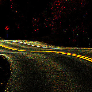
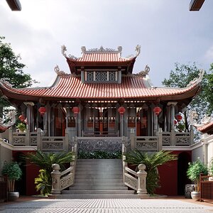
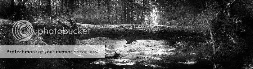
this one i must say was much harder to 'stitch'. But as long as you dont look too closely at full size, you shouldnt see to many mess ups :). I think this one was 7 images.

color:

logtiny.jpg


black and white:

logtinybw.jpg


thanks for looking and commenting!
 
Great work. 7 picks??? holy moly. You do an amazing job at this stitchin stuff. Very well done!!
 
pah-leese... i cant sew on a button, i hot glue...

great job... and i agree with raymond, i love the green AND the black and white...
very cool idea....good job, i think...

(but remember, i cant sew...i use a stapler..!!)
 
thanks everyone!

lanrod, i can see what you mean about the greens. it does seem to have a few too many greens and not quite enough reds, although it might just be overly-warm altogether. If you have more to critique, i'd love to hear it, give me the word and i'll post it in the critique section.
 
I prefer the colour version :) but there the colours fallout if visible. Almost in the centre (and about 1 cm on right). black and white is a bit boring here but colour is neat. I love panos!
 
thebeginning said:
thanks everyone!

lanrod, i can see what you mean about the greens. it does seem to have a few too many greens and not quite enough reds, although it might just be overly-warm altogether. If you have more to critique, i'd love to hear it, give me the word and i'll post it in the critique section.
Well, I like the bright, over-the-top green. It's warm, friendly, inviting. I think the B&W loses that.
 
I love the b/w.. it's awesome.. love the tones and the light... great job :thumbsup:
 
wow, those are awesome man. I think I like the B/W version better becuase of how the border of the image is darker, and the middle is brighter... gives it a cool feel. Nice stuff :)
 

Most reactions

New Topics

Back
Top