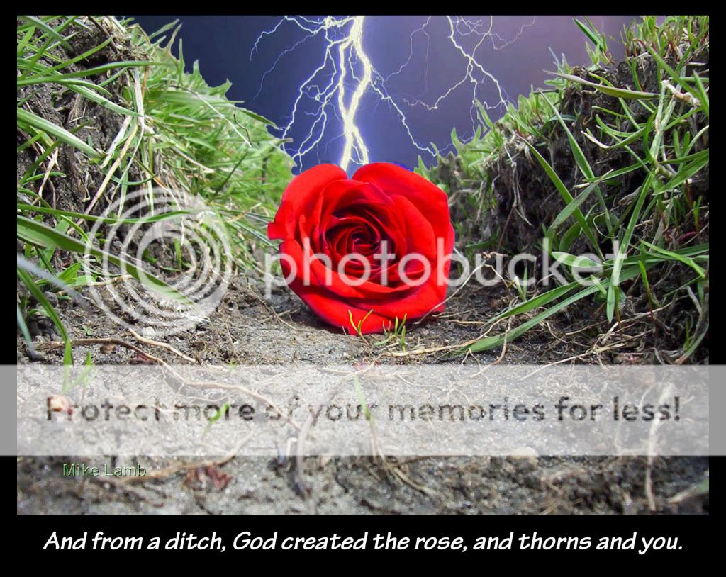
As said...great photoshop, but I find the foreground to be way too bright for the lightening. The brightness in the foreground just doesn't go with the darkness of the lightening area....in my opinion.
the foreground has little importance before the beautiful rose and lightining...i wud have cropped by one and half inch....great photo though ..thanks for sharing.
Reminds me of album covers from a few decades ago. Oddly juxtaposed images, vaguely suggesting underlying meaning. Can you get an image of a bug, maybe a roach, and composite it in? I always liked images like this. You've been thinking about things.

![[No title]](/data/xfmg/thumbnail/40/40287-4f839095000f74d779b90ed75df9dc62.jpg?1619739408)
![[No title]](/data/xfmg/thumbnail/32/32806-e16129723fd659a65a21d27ec96c2637.jpg?1619735667)
![[No title]](/data/xfmg/thumbnail/32/32805-61ca9a4fb87d37c0ef4f991ac1705e1f.jpg?1619735667)
![[No title]](/data/xfmg/thumbnail/40/40289-d47f888aadd01e2147ff6cfe4b94f2be.jpg?1619739409)
![[No title]](/data/xfmg/thumbnail/31/31708-69f4ec98ec000d4fc9a9a1cc282e8e16.jpg?1619734965)