back in the day

Dang Ansel Adams??? I shouldn't even be able to breathe the same air as him when it comes to photography lol.. That's a huge compliment.. Thank you..
 
Dang Ansel Adams??? I shouldn't even be able to breathe the same air as him when it comes to photography lol.. That's a huge compliment.. Thank you..


I am a looooong time appreciator of Adams, so the compliment was not given lightly. ;)
 
And was not taken lightly... Thanks again..
 
And was not taken lightly... Thanks again..
Nice compliment you've got from Didereaux. :icon_thumbsup: However, don't imitate anybody, shoot with your own heart.
 
I agree, was not intending to imitate. A few said it was to dark so i lightened a tad. I am very happy with both photos, and appreciate all comments and feed back.
 
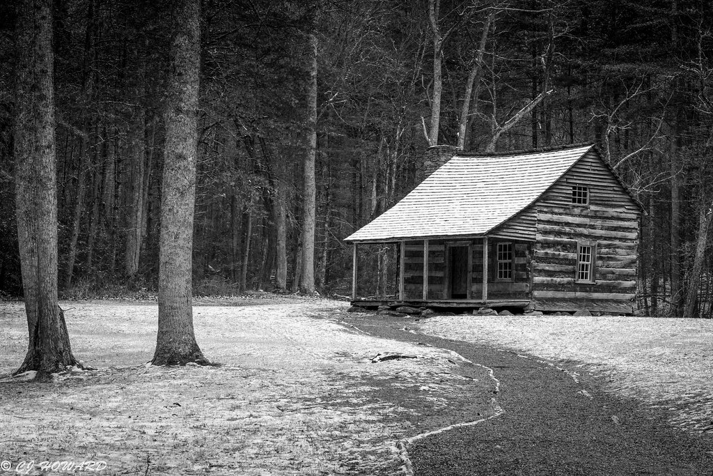
I (unfortunately, because it ruins a lot of my pictures-processing) LOVE dark tones and dark pictures. Especially when darkness creates atmosphere. Number ONE wins for me. I love the dark wood outside the house. And something don't make me feel safe at all. It has a norwegian black metal taste. It seems the cover of an album of Burzum. I really enjoy number one. Very good shot.
 
I (unfortunately, because it ruins a lot of my pictures-processing) LOVE dark tones and dark pictures. Especially when darkness creates atmosphere. Number ONE wins for me. I love the dark wood outside the house. And something don't make me feel safe at all. It has a norwegian black metal taste. It seems the cover of an album of Burzum. I really enjoy number one. Very good shot.

When i first processed it, i wished i had a little girl dressed in drab holding an old teddy bear. I could probably still do it with my daughter but Momma wouldn't be happy Lol... thanks for the compliment.
 
Last edited:
When i first processed it, i wished i had a little girl dressed in drab holding an old teddy bear. I could probably still do it with my daughter but Momma wouldn't be happy Lol...
Very good idea. I would go for it. Many things, which turned out well, went at first against the grain.
 
Better?
IMG_6497 2 by choward_01, on Flickr

No, this has become just a house in the woods in B&W.
If you want to make this a dark foreboding scene, then look at the original.
All of the attention is on the right side and having that much space on the left just takes away the closed in feeling.
The path is light and that leads to an almost black porch.
The roof is really bright.
This is an incoherent impression.
I would brighten the porch a bit so one can see the door, darken the roof so it doesn't pull the eye as much, darken the path so it matches more with the porch - a kind of pathway to evil thing.
Then darken the corners to give it that claustrophobic look.

house.jpg
 
I like this one, not like the brighter pic!
good shot!
 
The latest one is really...wow. Gives me shivers. Jumped out of a Raimi's movie or an old horror movie. Supershot!
 
I prefer the original picture. To me it is not about the detail but feelings. Don't get me wrong, each of presented versions is enjoyable, but each by gaining something is loosing something else. I think, eventually it is up to the author, what he wants to convey to viewer.
I agree the first picture provided a somewhat somber mood which may have set nicely with the author at the time of posting. I too, like the original.
 

Most reactions

New Topics

Back
Top