Blackpool Street Portrait - Mono

Black_Square

TPF Supporters
Supporting Member
Joined
Mar 18, 2017
Messages
253
Reaction score
267
Can others edit my Photos
Photos NOT OK to edit
Hi guys - happy new year!

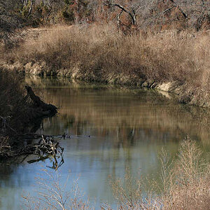
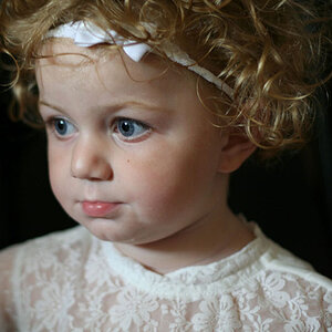
This is a mono version of the last image I posted. I think it works well, and benefits from the tighter crop.

Thanks for looking!

53422780009_e7e89d5257_h.jpg
 
As always your photography and processing are excellent. However as I've mentioned before the image I'm seeing is dark and very limited in tonal range, especially on smaller screens. That could be a preference (if so then please disregard my comment), a monitor adjustment, or adjusting the White and Black Point. A quick histogram confirms my comment as there is no data showing from midtones up, and a portion of the deep shadows are blocking out.
Screenshot 2024-01-03 111325.png
 
As always your photography and processing are excellent. However as I've mentioned before the image I'm seeing is dark and very limited in tonal range, especially on smaller screens. That could be a preference (if so then please disregard my comment), a monitor adjustment, or adjusting the White and Black Point. A quick histogram confirms my comment as there is no data showing from midtones up, and a portion of the deep shadows are blocking out.
View attachment 270845

hmm, you've got me wondering now smoke! Appreciate what you're saying regarding the histogram (I was aware of this when editing), but to my eye, and on my monitor, the image looks right. I could always clip the histogram slightly, but there isn't much dynamic range in the image to do that without blowing highlights. As an aside, my monitor is 32 inch, so perhaps it just needs to be viewed a little larger :)
 
As an aside, my monitor is 32 inch, so perhaps it just needs to be viewed a little larger :)

I actually waited to view it on my 32" monitor. It is better but still dark (for my tastes). Typically I'll do a virtual copy of an image and tailor it for the viewing audience because there is a difference between how a phone, monitor or large print displays.

My eyes are better now than they were a few years ago thanks to cataract surgery. It was astonishing how much difference it made. Room light can also affect how bright we perceive an image, which is why I rely on my histogram to guide me.

I know your editing process is very detailed, with lots of layers. That in itself can choke the tonal range especially dodge and burn layers, requiring multiple levels layer to readjust the white/black point. There's a difference in setting your white/black point and an exposure adjustment.
Hi Smoke, thanks for your patience with this! Out of interest, what aspect of the image looks too dark to your eye? On my monitors the shoulder areas are dark, although this was intentional. The face though appears well lit. This approach was intentional. Cheers
 
Not sure how this will work but this is a screen shot from my phone screen. I keep an eye on my histogram while editing, if it touches the left its reached pure black, once it reaches the right its pure white. You cant get any blacker than 0,0,0 or any whiter than 255,255,255. Any time you go up the left you delete shadow detail, if you go up the right you delete highlight detail. If you top out anywhere in between the same thing happens you lose detail. Choking your tonal range decreases micro transitions and results in blochy areas. I like to double check my work on multiple devices.
Screenshot_20240103_154251_Chrome.jpg
 
Last edited:
Not sure how this will work but this is a screen shot from my phone screen. I keep an eye on my histogram while editing, if it touches the left its reached pure black, once it reaches the right its pure white. You cant get any blacker than 0,0,0 or any whiter than 255,255,255. Any time you go up the left you delete shadow detail, if you go up the right you delete highlight detail. If you top out anywhere in between the same thing happens you lose detail. Choking your tonal range decreases micro transitions and results in blochy areas. I like to double check my work on multiple devices.
View attachment 270847
I am not really sure there is a problem here as you perceive it. The subject is beautifully exposed and an excellent black and white. The method of conversion used did a great job of accentuating the age of the subject. I don't know if the subject would be in favor of that accentuation, but it is well done IMO.
 
I am not really sure there is a problem here as you perceive it. The subject is beautifully exposed and an excellent black and white.
Just to be clear the OP is someone I follow, and have great respect for his abilities. That said I'd refer you back up to my post #2. I tend to be a "full data file" photographer, because it allows more latitude in post, in the world of RGB 0.0.0 is black and 255.255.255 is white, exceeding either results in a loss of detail in the shadow or blown whites at the other extreme. On my big monitor the image looks acceptable, but in the world wide web, you don't have control over the device that's displaying your image, on smaller screens you lose detail and the micro transitions.
 
Just to be clear the OP is someone I follow, and have great respect for his abilities. That said I'd refer you back up to my post #2. I tend to be a "full data file" photographer, because it allows more latitude in post, in the world of RGB 0.0.0 is black and 255.255.255 is white, exceeding either results in a loss of detail in the shadow or blown whites at the other extreme. On my big monitor the image looks acceptable, but in the world wide web, you don't have control over the device that's displaying your image, on smaller screens you lose detail and the micro transitions.
My primary point to this is there is a big difference between shades of gray and color. A lot is lost in B&W that isn't in color. I saw both the color and the B&W version and my preferred version by far is the B&W because of the loss in the conversion. You are free to analyze as you see fit. My personal thought is that the B&W version of this image is an excellent rendition of it and my personal preference. I was simply left thinking that you may be over-analyzing it.
 
A lot is lost in B&W that isn't in color
The only thing lost in B&W is the color. There are 256 shades of gray in a fully exposed B&W image, but rather than hijack this thread, I'll comment in another thread.
 
I would be more than happy with this as a low key image. It's very striking. Almost in the tradition of Yousuf Karsh. My only thought is that the BG highlights at the top could be toned down a bit more.
 

Most reactions

New Topics

Back
Top