Lamasu
TPF Noob!
- Joined
- Aug 17, 2009
- Messages
- 14
- Reaction score
- 0
- Location
- Illinois
- Can others edit my Photos
- Photos NOT OK to edit
Hello friends,
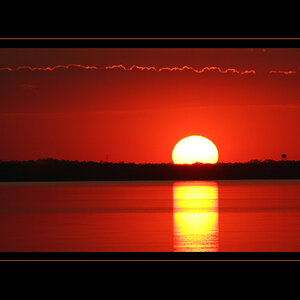
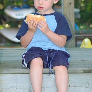
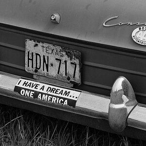
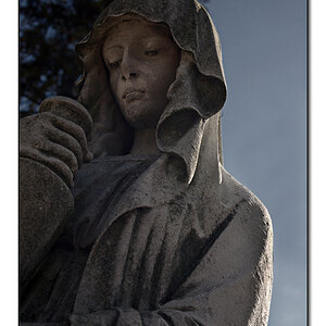
I would appreciate it if you could share with me your honest (you won't hurt my feelings) opinions about the photos below. Those were taken on a very foggy Saturday morning 9/11/2009 in Skokie, Illinois (USA)
http://lh4.ggpht.com/_LuCZVmtlnok/SqwhALWriEI/AAAAAAAADi4/dP9-lo7wuDA/s720/Picture 027.jpg
http://lh3.ggpht.com/_LuCZVmtlnok/SqwhfHaWOyI/AAAAAAAADjA/QidjoSCsAWE/s720/Picture 009.jpg
http://lh6.ggpht.com/_LuCZVmtlnok/Squzzo1QbLI/AAAAAAAADiI/Mt2MyfGQKrc/s720/Picture 005.jpg
http://lh5.ggpht.com/_LuCZVmtlnok/Sqwh_bqTNTI/AAAAAAAADjI/PD9UdjcObjg/s720/Picture 017.jpg
Thanks,
Paul
![[No title]](/data/xfmg/thumbnail/37/37245-5f15b292311b21913f10cc41f40682ba.jpg?1619737952)

![[No title]](/data/xfmg/thumbnail/38/38743-ad854d502dddc7f41a927f1731a504cd.jpg?1619738704)