Does this look over saturated? Beach pic C&C

Alter_Ego

TPF Noob!
Joined
Feb 5, 2010
Messages
330
Reaction score
4
Location
Hawaii.
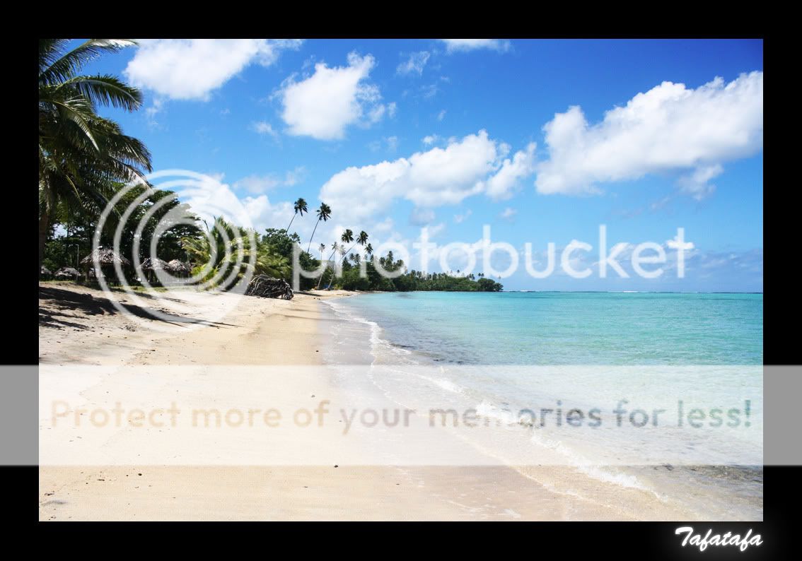
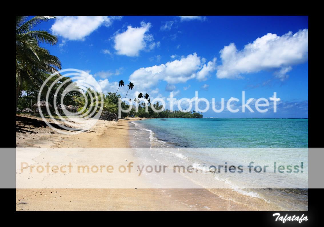
Hey the shot itself is pretty common and not very interesting but ive just been practicing with photoshop to bring out the sky and water for that typical holiday, beach, vacation look. Let me know what you think? some of the trees are a bit too dark imo.

IMG_0905.jpg
 
I'd say it's too saturated, yes. And there is too much contrast which is why the trees are too dark, IMO. Of course, it all depends on the effect you are after. But if you are looking to produce a natural looking picture, I'd say it's too much. It is easy to get carried away in PS - it happens to me all the time.
 
Cant say im going for that natural look more of advertising look.
Ive changed the settings up to make it look a litte less saturated.

IMG_09052.jpg
 
It is definitly better, but maybe a little too bright. If you lower the brightness just a little, it will bring out more detail in the sand, and the sky becomes darker blue, which suits the scene just well, I think.
 
It is definitly better, but maybe a little too bright. If you lower the brightness just a little, it will bring out more detail in the sand, and the sky becomes darker blue, which suits the scene just well, I think.

Thats exactly what ive been trying to do. Is too bring out the sand, sea and sky out a little more. Here is what ive done now after taking your advice.

IMG_09053.jpg


What do you think? I like this one out of the lot.
 
I would have to say that I like the second one better.
 
I like the third one, looks like a good inbetween. The only thing I can see, and maybe it's because I've seen the other two, is that the sand looks dirty because it's a little darker than the 2nd. Maybe try to remove some of thos black rocks to clean the sand up a little and bring less attention to it.
 
What am i doing wrong?


My wife and I spend a lot of time in the Carribean. Your last shot is very close to how I see it with my sunglasses on. I like it.

"Maybe try to remove some of thos black rocks to clean the sand up a little and bring less attention to it."

I also agree with this statement.
 
Using contrast and saturation sliders, thats what your doing wrong
 
The third of these would definitely be the best if, as has been said, the sand was more like it is in no.2. I've made so many mistakes in Photoshop and I think it's definitely something where you have to learn by trial and error :thumbup: / :thumbdown:.

Probably obvious, but wherever possible make 'local' rather than 'global' changes to an image. In picture no.1, what you wanted for the sky and beach was not the same as you wanted for the huts and trees.

I tend to use the 'polygonal lassoo tool' to highlight an exact area and then feather the edge of the selection before adding a new adjustment layer to that section.

A lot of people, myself included, come almost full circle in realising that less is more and that what's in the camera to begin with counts ( I'd also recommend shooting in RAW).

By the way, for an 'advertising look' I think the first pic almost actually works because the Caribbean is so vibrant and colourful that upping saturation is kind of a natural extension of the place.

I also think you would see a massive improvement in shots like this, where there are dark and light areas that both need exposing correctly, if you learnt to produce multiple exposures in Photoshop - there is a full tutorial on this here:
Digital Photography Tutorial - Creating Multiple Exposures

It's simple when you know how!;)
 
I prefer the last example out of all 3 of the shots posted.

When you edit this, how are you doing so? I mean do you edit the picture as a whole, or do you break it up and edit different parts of it. For example the sky, sand, water, & trees.
The lasso tool and a good feather can help in situations like this.
 
I agree with all those who say the third version looks the best, it IS colourful enough to be "advertising", but not so blatently oversaturated and over-contrasted (with the tree line becoming too dark and the clouds clearly too bright) as the first. (Though I must admit to have seen catalogue pics that WERE this oversaturated and over-contrasted! But it is not NICE).

And like Dominantly is saying: when the light dynamics are so large, and HDR is NOT the way for you to go (which it wouldn't be in this case, unless the photo was meant for something quite special), then working on different areas of the photo separately with the help of the lasso tool and a good feather often IS the way to go.
 
Both the first and third have too much contrast, way too deep of a blue and tons of artifacting in the sky. The second one is the best, IMO, but the clouds are too white. You need to have more control over the exposure by using something like levels or curves. Is it a jpeg? Were you using a circular polarizer? It looks like yes and yes. A lot of time if you in a place where the sky is already vibrant and saturated, using a cpol will just oversaturate it so bad that you camera pukes a little bit in it's mouth. I don't use one if the sky is anywhere close to deep and saturated, because I've found that it's easier to add blue saturation in post than it is to try and recover a clipped and chunky blue channel.

If I were you, I would be bringing the white point down on the clouds and sand, and adjusting the blue channel to brighten it and pull a little saturation out. If it were RAW it would be an easy fix.
 
I would take some darkness away from the trees as to compliment the ocean, it's my own point of view as the water and trees are dark and the sand and sky tends to be lighter. Wonderful pictures!
 

Most reactions

New Topics

Back
Top