[Fashion] Model Paige Carson

EvoG

TPF Noob!
Joined
Dec 23, 2009
Messages
39
Reaction score
0
Location
New York
Website
www.evogphotography.com
Can others edit my Photos
Photos NOT OK to edit
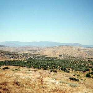
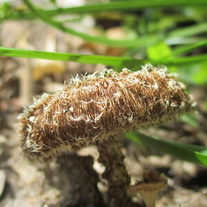
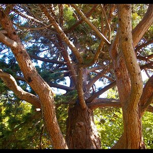
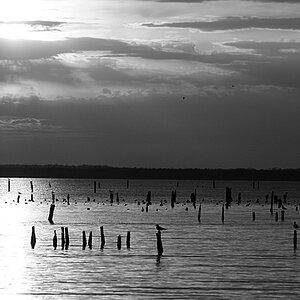
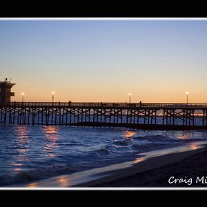
Hey all hows it going. Last Sunday went out for a shoot with Paige and had a wonderful day. Shot for about 2 hours and got some really great images... Here are 6 shots that i have done so far and i figured i would share!

4619574951_817392a825.jpg


4619322885_bf5e625f2b.jpg


4619533754_5e8dc0711f.jpg


4618917633_a1659854dc.jpg


4614287553_327d27cb21.jpg


thanks for looking!

EvoG Photography
Tumblr
Flickr
 
=| It took me a minute to decide how I felt about most of these but here it goes!

1. First impression is "Her skin tone looks, odd." My monitor has not been corrected in a few months (and mine is already pushed blue a tad) so I really don't know but she just looks like she has a slight case of jaundice. It isn't that tan color you expect to see in someone that as been naturally tanning, nor is it that fake tan orange, appears to be a bit more yellow than it should be. The composition is not too bad, it is interesting enough, I would have liked to see a bit more green in the photo I think to help balance out the weight of the image. I do like the lighting here though, and it feels nicely controlled.

2. I really don't want to comment much on this one, as it seems to be the weakest of the lot. I see what you were going for but I think you stopped to early and didn't work it enough. For all I know you were out there for 10 hours with this shot, but it doesn't look polished.

3. Now we introduce some drama and some action. This is a great pose and great use of props. Also the way you used the nature vs. humanity element (the couch and buildings both being over taken by nature, which has been done many times) is not the newest thing around. However, you did an excellent job executing it. Classic Rembrandt lighting, nicely harsh but not too much, overall probably the best of the series. My biggest problem is that the scene around her seems to be a bit darker than it should be, that is just my taste though since I like to make the plain my subject is on to be just slightly darker and not as drastic as you have chosen.

I am not the biggest fan of how her leg is bent though, just not my taste and to me at least makes it look foreshortened and a bit stubby.

4. This is another one that just isn't polished :| The building behind her completely ruins this one for me since it appears you are trying to make her look like she is in a forest this time.

5. This is a nice shot, and I think in B&W could have been a bit more powerful. In color I feel like the hot spots on her are a tid bit distracting, but with some working in B&W could actually be used as decent contrast spots. I'd lower her right arm a bit since many editors hate even the slightest glimpse of an arm pit, though here it may be forgivable since it really isn't that extreme just a slight pit.

Again the lighting is nice, just those hot spots are really frustrating all over her. It would have really worked out better if you could have avoided the naturally created ones and added in some that would have been more pleasing via gobo / cookie.

Good work overall, I enjoyed them a lot!
 
Hmmm I am sorry about the tones they are not suppose to look like that... If you check out my flickr the tones are way better and not green idk why it's doing this...

Flickr seems to be the only one to have uploaded th correctly I'm confused.
 
Hmmm I am sorry about the tones they are not suppose to look like that... If you check out my flickr the tones are way better and not green idk why it's doing this...

Flickr seems to be the only one to have uploaded th correctly I'm confused.


Hmm somethings weird now.. Cause the tones were all messed up on my iphone.. now i checked the tones on a mac in class and they are spot on... weird...
 
Well, Macs are calibrated.
iPhones, idk.

#1: I would have included more leg, less tree. The skin tone is fine on my monitor, I like the tan color on her cheekbones, but her arm is very awkward! It looks weird and not very graceful/beautiful like the rest of the photo.

#2: I enjoy the reflection but being a fashion shot, it doesn't radiate much 'fashion'. I assume it's about the dress, so again, I would have brought the camera down and included more of the dress and maybe played with the angles more, because this is a pretty boring shot.

#3: Okay, so this is one of the better shots, I love the light and shadow going on here. Amazing composition, great placement of the subject, and a good pose. I agree w/ shmne, this could have been also very strong in B&W, but I think as a fashion shot it's stronger in color. It is a little too dark around the shadows of the dress, if you could dodge them a bit, I think it'll be an even more exceptional image. :)

#4: Another weak one, it just feels so off. The background has so much black to the left, that no detail was salvaged. It's super super posed and she looks very stiff, and although sometimes not making eye contact works, I don't think it works here. I actually think even with eye contact, it would not have worked either. This whole photo just bothers me a lot. It just doesn't match up to the level of #3 & #5.

#5: Really wonderful lighting again! The biggest hot spots that bother me is the one right on the chest of her dress (see the blown out red?), and the slit on her elbow. I like the purplish tones in the lighting on the window, but I don't like it on the whole of her left arm, but it's something I can get past. Overall, I really like this photo!

We'll i had a huge list of C/C to type out on this thread.. but after reading your post, Sbuxo, I dont think i need to waste my time typing out something so close to what you just covered greatly.

I really have to agree with everything you said here... your right, imo.

Defenitly more legs, more * model * than other things... the first shot seems to have somewhat of a haze-like halo around her body... could be my monitor--who knows
#3, #5 my favorites out of the bunch, aside from #4, where shes holding the tree.. nothing fits or seems natural to me in that shot.. Id say they all look pretty great! Love the series.
 
The last one is great, although none of them are fashion related in the least.

Great shot on that one, the others are boring.
 
well i figured out what the deal was... it was lightroom was in prophoto color space and photoshop was in adobe 98:meh: oops haha
 

Most reactions

New Topics

Back
Top