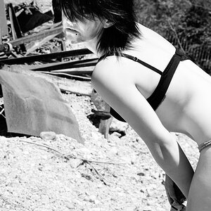
I like the saturation for some reason... but processing is all personal preference. I do agree with everyone that said there was too much dead space on the top. Overall, great subject(s)
The picture was taken in Trinidad, Cuba.
I looked at the picture several time and hummed and hawed about the dead space on the top. I was quite fond of the HUGE doors in Trinidad and had personal sentiment with the big blue door. I took most of it out and in the end agreed with everyone else about the dead space and like it better....for some reason I still prefer the high saturation more.
The blue siding and fencing at the top needs to be burned in and darkened a bit. A small amount cropped off the left, and a more-substantial amount cropped off the top would help. I do not like the crop above, in post #8, with the straw bag touching the right hand side of the frame---that causes tension at the edge of the frame, and kinda' ruins the shot. The lowered saturation in the crop in #8 is too low...if you like the vivid, clownish Fuji Velvia-like saturated look, then it's hard to be satisfied with an Astia-like color rendition....
Honestly, some people might laugh at this shot, but I find it pretty interesting from a photographic standpoint for a variety of reasons. For one, there's an interesting juxtaposition between the man and the birds - he almost seems to be unaware of them. It also makes me wonder, what story is behind this shot, because it's obviously it's not someone the subject knows. I could easily see this in a book (with some post-processing first, that is). From a compositional standpoint, this is probably one of the rare times when a static, centered composition seems fitting.
I'd approach with a more straight on angle. Right now, you are shooting at and angle to the door. It's not deliberate and looks like you took a careless shot. The result is almost like as if you shot a landscape photo with unintended slanted horizon line. Otherwise, I think this has great potential.
I like the angle you used. Straight on shots can look amateurish at time if it's straight on and the subjext centered. The composition is very good. With the colors and subject the area at the top of the image is fine. sometimes everything doesn't need to be cropped to the subject, the extra space sets the tone for the image with the textures. I like heavy saturations in most cases... I like the toned down version you posted but would probably take a bit more blue out and add some contrast, but that is just me. The image you have created is very nice.


") Especially since you said it holds a special memory of the large doors.
Especially since you said it holds a special memory of the large doors.
![[No title]](/data/xfmg/thumbnail/42/42026-4f14b406e4eb9c886f454721fb021fba.jpg?1619739982)
![[No title]](/data/xfmg/thumbnail/34/34139-e52deba745f42ba091907fcc460cd6db.jpg?1619736311)
![[No title]](/data/xfmg/thumbnail/38/38747-bbe463248feefb7affb6b5e00efb70c6.jpg?1619738704)