First Senior Port, hoping it belongs under "semi professional"...

Crimsonandwhite

TPF Noob!
Joined
Jun 22, 2008
Messages
268
Reaction score
0
Location
Tuscaloosa, AL
Can others edit my Photos
Photos NOT OK to edit
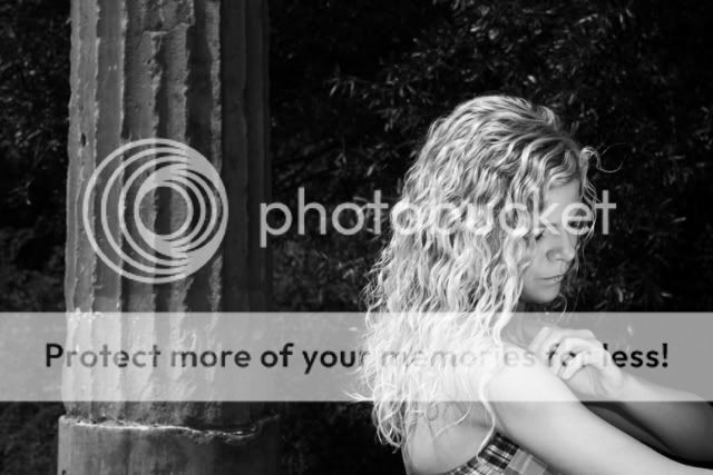
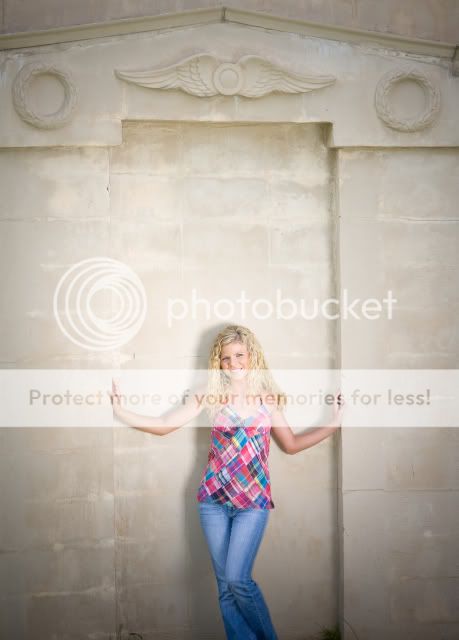
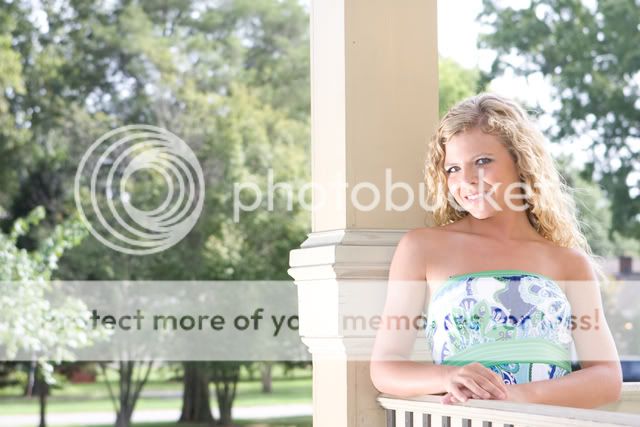
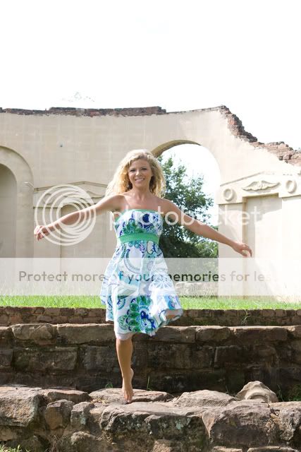
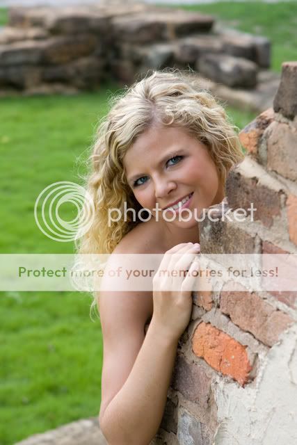
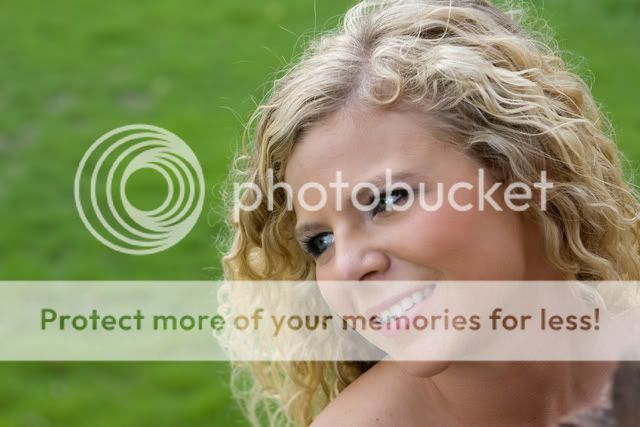
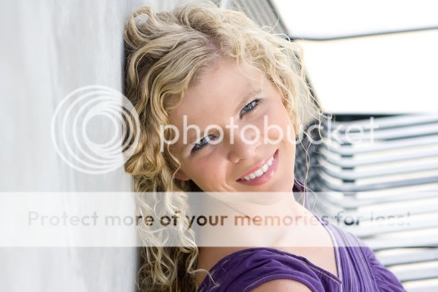
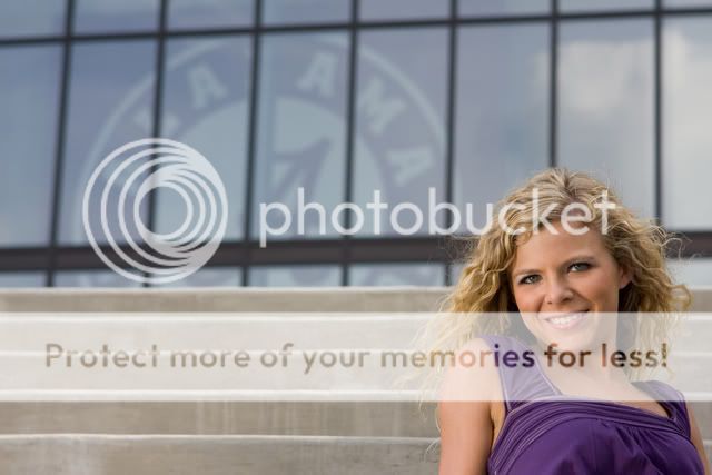
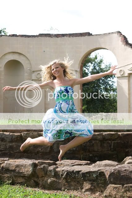
C&C is always welcomed, in fact I insist! This was our first try with reflectors and fill flash combos. I had a great time and this made me want to be a full time photographer!

1.
CloseUp.jpg


2.
3101Blackandwhite.jpg


3.
IMG_3129.jpg


4.
IMG_3169.jpg


5.
IMG_3186.jpg


6.
IMG_3189.jpg


7.
IMG_3208.jpg


8.
IMG_3219.jpg


9.
IMG_3254.jpg


10.
IMG_3297.jpg


11.
IMG_3313.jpg


12.
IMG_3322.jpg


13.
IMG_3403.jpg


14.
IMG_3412.jpg


15. Hat was requested.....
PACap.jpg
 
Something weird happened with 1 and 15. I did a good bit of PP in CS3 on those and when uploaded them to photobucket them seem to have taken on a tint...... they dont look like that in the original file....hmmmm

Edit: Ok here is a link to the original, take a look for yourself, can you tell me why its putting that shading/tint when I upload? http://echoesmarketing.smugmug.com/gallery/5846112_CypgA#362836538_85aMo-A-LB Should I be using something else to upload with? I have always used Photobucket, but this is becoming a problem....

#15's original http://echoesmarketing.smugmug.com/gallery/5846112_CypgA#362846966_vMhGB-A-LB
 
Last edited:
I agree with you on 1 and 15. I did follow the link to the original, and it looks great! In #2 I would like to see just a bit more of her face, and I think I would prefer her in the other third of the frame. Number 13 if my fave!

Nice job!
 
Critique per req:

I'm afraid there's just a few too many for individual critique, but I'll do some generalization. 2, 5-9: I'm guessing these were done with the reflector & fill combo; close, but just a little too much. Looking at her skin and/or dress, it's easy to see that there's just too much light.

#10 is nice BUT it seriously looks like she's an amputee. I'm assuming she was jumping/spinning here, so in a case like this, put your camera into "As fast as it friggin' can' mode and take 15-20 exposures; even just a bit of leg would have saved this.

#3, 10 are a little too centered for my taste.

#14 would have been great (wonderful exposure) but she's jammed in a corner; I assume the sign in the background has significance, but you need more of her in the image.
All that aside, some nice work, and I think a little more work with the fill light and reflector, and you'll have it nailed.

Just my $00.02 worth - your milage may vary.

~John
 
I agree with you on 1 and 15. I did follow the link to the original, and it looks great! In #2 I would like to see just a bit more of her face, and I think I would prefer her in the other third of the frame. Number 13 if my fave!

Nice job!

Thanks! Yea I agree, a bit more face. I needed to recompose the whole thing to get the column on the other side, which is the way I normally perfer it too, trying something different there, but now I know why I like the empty space in front of the subject in the first place :)

Thanks for the kind words...
 
Critique per req:

I'm afraid there's just a few too many for individual critique, but I'll do some generalization. 2, 5-9: I'm guessing these were done with the reflector & fill combo; close, but just a little too much. Looking at her skin and/or dress, it's easy to see that there's just too much light.

#10 is nice BUT it seriously looks like she's an amputee. I'm assuming she was jumping/spinning here, so in a case like this, put your camera into "As fast as it friggin' can' mode and take 15-20 exposures; even just a bit of leg would have saved this.

#3, 10 are a little too centered for my taste.

#14 would have been great (wonderful exposure) but she's jammed in a corner; I assume the sign in the background has significance, but you need more of her in the image.
All that aside, some nice work, and I think a little more work with the fill light and reflector, and you'll have it nailed.

Just my $00.02 worth - your milage may vary.

~John

John you crack me up, amputee, lol....

I agree that some were a bit overexposed and a bit "hot". Her mother operated the reflector for me :) she took direction well, but sometimes we were not on the same page :) all in all it was a positive experince, I would rather have a bit too much light than non at all, right? The reflector makes a world of difference.

I did have about 10-15 hits on the jumping scenes, although she looks like an amputee, I liked it b/c she looks like she is floating/levitating....I will post one in a bit that shows she has 2 fully operational legs :)

#14, the sign in the background is where she is going to college, this was outside the football stadium and it has meaning in that manner. What I like to hear more than anything is that is the perfect exposure, so now I have an idea of what ideal is, this was near the end of the shoot and I was starting to get a feel for what I wanted with the reflector.

Thanks for taking the time as always to provide wonderful feedback! Many thanks!
 
I'll tell you what, I definitely think these are worthy of being placed under semi-professional (or professional if that means they're worthy of being paid for). In general they are very nice shots.

#2,4 are both nice, but I don't think they really work for senior shots, or at the least, they probably wouldn't be picked... (2 might be)

1. is probably very nice without that odd tint. A small nit on it is the slight view of her left hands fingers... kinda odd how they're chopped on it.

on the ones with sky, it's a bit of a bummer how washed out the sky is. I think a polarizer or something might be really nice there.

some of them, #9 in particular look really bright. My personal taste is a little darker, maybe that would look better... I dunno.

on 5 and 10, with the blown sky, I think it may be helped by cropping a bit of it out, just because the sky in it is so boring.

on 13 and 14, you'll want to be really careful with your necks. I think they both work, but on thirteen I think if you'd done the shoulders a bit more towards the camera you probably wouldn't have that line which may have helped (easily cloned out if you wanted to do it that way as well). On 14, you came really close to having a double chin, on that if you were able to have her maybe extend her neck more, maybe tilt her head up or something a bit more would have made the neck look much smoother which may have helped the photo. (I really liked the photos... just looking for critiques, in hopes you'll do the same for me).
 
1) Alright but she is super super super green in the face. I hope you shot in RAW. The brick is a little distracting as well

2) Definately not a favorite of mine. Looks a little bit underexposed in the background and that pillar is very distracting for me. It was the FIRST thing I noticed, not the beautiful senior!

3) Wide shots like this with so much other stuff in the back (the wall basically) are hard to get right. I think the reflector did a little bit of overkill on it. She's not evenly lit - almost like there is a spotlight on her

4) Interesting shot maybe for those fun shots but did she get a print of this?

5) Alright but the DOF should be more. What apereture was this shot at? It would have been nice to not have that bright (and distracting) brick wall in the background. I like the pose though. For me, her left arm should have either been shown or the right one cut off like the left one is and you come in a little closer. That bug..........is um........well it's definately there.

6) Decent shot. She is still really bright in the face. Those reflectors really work well :) I'm not a big fan of this pose (the model looking off into the distance)

7) Nice pose but once again, that Depth of Field need to be much much more shallow. Would have been nice with your 70-200 f/4 or even your 50 prime.

8) Nice. Probably my favorite. Just remember next time to look for things being cut off. In this case, her chin. I personally like and think it's alright that the top of her head was cut off a little bit, but not the chin. I want to see her face.....her WHOLE face. Make sure to remember stay hairs. Those on the left shouldn't be that big of a problem to photoshot or edit out.

9) Nice pose again I think. Could use a little more contrast to make that dress pop a little more.

10) Way too centered and I'm REALLY not liking the foot up. It looks like it has been amputated?

11) Nice composition wise but she is too centered. Could have come to the left (move your camera that is) and have less of the wall. Good shot though.

12) You still haven't changed my mind about the looking in the distance with this shot. I would also crop out the brick in the bottom right corner if she orders prints.

13) For such an unlucky number, I like this. Actually, this one is my favorite. What's that in the background though.

14) Nice pose again, but that background is.......well I don't like it. If it has significance (sp?) then alright but I would create a guassian (sp?) blur and make that less noticable. She has a beautiful smile and even more gorgeous face. Also, after looking at it again, for future shots for a girl, just be sure to include a little more bust. I mean not for viewing pleasure, just there is not enough body there.

15) What can I say, I love a girl in a hat but I don't like an Olger or the Incredible Hulk either. She's green man. Once again, hope you shot in RAW so this can be corrected.


Overall you have the idea and I like them all for the most part except for what I have just said.

~Michael~
 
I covered the green issues in post #2 in this thread, you can look at the version that didnt turn green on the links there.

I love the feedback and I love that all the pics are being nik-picked and torn apart. I take in all advice and things mentioned and put them in my bank of knowledge for next time, this is why this forum makes people better photographers....

Thanks everyone
 
well, now that I went back and looked... the two greenish ones (1, and 15) actually look rather red to me. I don't know if that's the way they actually are, but one the links she looks a little red in both of those (my eyes may be deceiving me as I haven't slept recently...)
 

Most reactions

Back
Top