boost the contrast, brightness, clarity and you might get it all sexy.
or in PS, add a layer of BW then change it from NORMAL to Soft or Hard Light, you might get decent results as well.
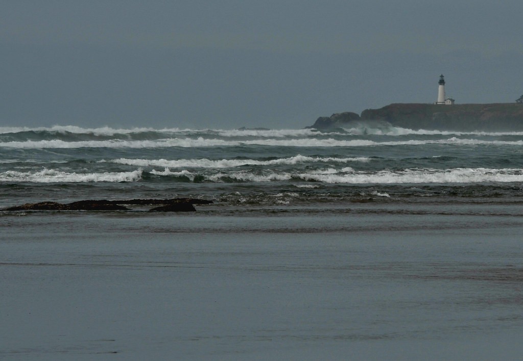
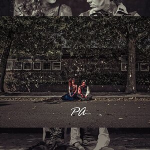
For as long as it is so dark and little contrasty, it still hovers fairly much over "indifferent", though I do see the potential that is in this photo. It could be worked on in pp so it might become "good" or go in that direction.
Thanks to everyone for taking the time to leave an opinion.
I see a few things I did wrong, such as shooting when the light and conditions were wrong, not positioning myself right, and trying it without a tripod. Not to mention PP.
This started to be a test shot, as I wanted a portrait with the lighthouse as the background. When I did that one, I didn't even notice until later that one of the subjects blocked the lighthouse(!)
Your 2nd version is lighter, but it still has a hazy flat quality. Still a lot of mid-tones. It needs more punch. It's far from ideal, but what about the following processing technique... I bumped up the exposure, adjusted the colors, added contrast, added some sharpness, and finally cropped a bit. Some of the whites do get washed out, but it's a different look...
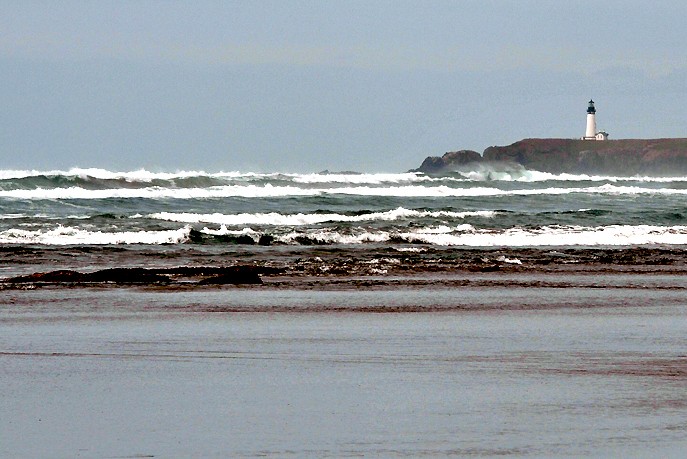
but the first was also good. At first sight it even seemed as if the waves moved)))
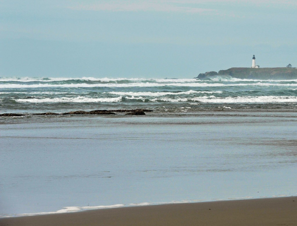
Only one thing in terms of the original photo- make the sky and sand of different grey colors....as soon as one is darker the other is lighter- this is a great picture!!!!


![[No title]](/data/xfmg/thumbnail/39/39497-93752210dd49247220721e5ac8c61245.jpg?1619739055)

![[No title]](/data/xfmg/thumbnail/34/34746-f8e4b50f9d9b0de43c95af3d2caf956b.jpg?1619736628)

![[No title]](/data/xfmg/thumbnail/1/1592-cfae4a7ea791f96c6e2d03484be2e454.jpg?1619729144)