Harry Potter as art? ;-)

Meysha

still being picky Vicky
Joined
Feb 21, 2005
Messages
4,152
Reaction score
60
Website
vickywall.deviantart.com
Can others edit my Photos
Photos NOT OK to edit
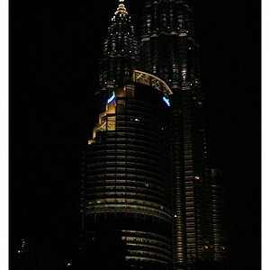
I've also put the first one in for the Weekly Challenge #3 theme for shallow DOF but I wanted to know what you guys think of it coz we don't really get comments on the pics there.
It's a small extract of Harry Potter and the Order of the Phoenix that I wrote out.

ShallowDoFsideon.jpg


ShallowDoF.jpg


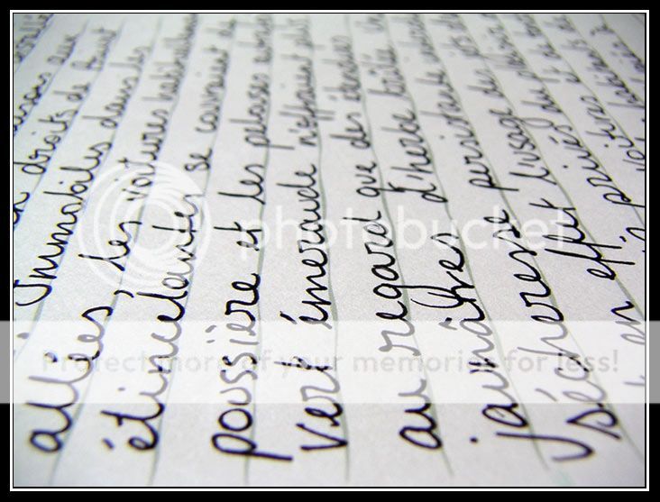
I think I prefer the first one because it's a bit more arty farty rather than just a photo of text.
 
I am glad to see text in these photos. I think the Harry Potter art is in it is ability to get the kids jazzed about reading, which leads to a beautiful world beyond the Xbox and MTV.

I think the second frame is stronger. I love the hand written script, but the lighting is a little "lack luster". Maybe more directional light would give it a mysterious feel.

Personally; Ms Rowling should give up on the painful film process. The first film was a nightmare. I mean they left out the magic and craft of filmmaking. Not to mention the magic of the the book and or script. I am sure you or I could have done a better job on that one.

Can you explain what "art farty" means?
 
I like the second one as well, but since I have no idea what the words say (i don't know french), I don't get much out of the photo. If it were in English, or any language I could understand, I would be looking for meaning in the words in the shot...
 
craig said:
Personally; Ms Rowling should give up on the painful film process. The first film was a nightmare. I mean they left out the magic and craft of filmmaking. Not to mention the magic of the the book and or script. I am sure you or I could have done a better job on that one.

Agreed.
 
I love pictures of text, regardless of what the text actually is. I think the DOF is better in the first one, but I love the angle of the second. Great work on both though!
 
I agree on the lighting on the second one! the first is a much better exposure, love the DOF on both, nice job! :thumbup:
 
Thanks everyone,
Yeah it was an absolutely crappy day yesterday - raining. Yuk!
So that's why I did these coz I couldn't go outside.

By arty farty - I meant that the words didn't have any meaning anymore because they were on such a harsh angle and it's difficult to read them. I guess I wanted it to stop being text and become something else.

Re: the movies, definately agree on the first one. It was absolute crap, acting wise and just for the general feel of the movie. #2 was a little bit better - but that was probably just because they didn't have to waste time introducing characters and the original story line was a lot better. #3 was by far the best but still not perfect. That director Alfonso something is great! I'm looking forward to the next one although it's with a different director (4 weddings and a funeral guy) I reckon it'll be really good.
 
The definition of "Arty farty" may be a whole thread in it's self. At any rate the text has become "something else" I love the curves. Not being able to make sense of the words is somehow interesting as well.

In our current state of technology; I wonder if hand written text is dead?
 

Most reactions

New Topics

Back
Top