echoyjeff222
No longer a newbie, moving up!
- Joined
- Jun 27, 2010
- Messages
- 643
- Reaction score
- 140
- Location
- WA
- Can others edit my Photos
- Photos OK to edit
Hi all,
I just processed the first of my photos from yesterday's trip. I am pretty confused about which processing I like. I posted three below: one is the original, unedited, pne is the b&w conversion, and one is the "blue" tinge that I tried for a futuristic look. I like color because of the two different light trail colors, but I really like the blue for some reason as well .. I was hoping for some feedback, since this is one of the few times I've ever done a b&w conversion in photoshop/lightroom. I was hoping to bring out the s curves really nicely and darken the other parts. I wasn't sure how much to darken the other parts, though.
Thanks a bunch!
Also, if anyone wants to play around with this file, I would be happy to send it over. I am not a pro at all in PP, so I would love to learn! Just let me know what you did, so I can learn!
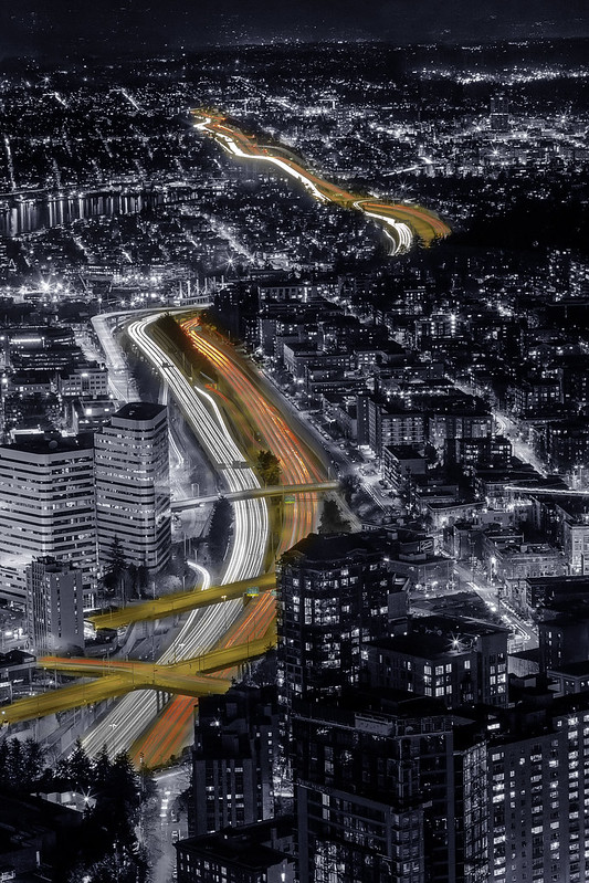
 Original by .Jeffrey L., on Flickr
 B&w Conversion by .Jeffrey L., on Flickr
 Blue Edit by .Jeffrey L., on Flickr
I just processed the first of my photos from yesterday's trip. I am pretty confused about which processing I like. I posted three below: one is the original, unedited, pne is the b&w conversion, and one is the "blue" tinge that I tried for a futuristic look. I like color because of the two different light trail colors, but I really like the blue for some reason as well .. I was hoping for some feedback, since this is one of the few times I've ever done a b&w conversion in photoshop/lightroom. I was hoping to bring out the s curves really nicely and darken the other parts. I wasn't sure how much to darken the other parts, though.
Thanks a bunch!
Also, if anyone wants to play around with this file, I would be happy to send it over. I am not a pro at all in PP, so I would love to learn! Just let me know what you did, so I can learn!
Original by .Jeffrey L., on FlickrB&w Conversion by .Jeffrey L., on FlickrBlue Edit by .Jeffrey L., on Flickr
 Final Color
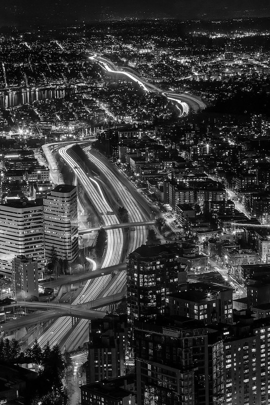 Final BW