
jcdeboever
Been spending a lot of time on here!
- Joined
- Sep 5, 2015
- Messages
- 19,868
- Reaction score
- 16,081
- Location
- Michigan
- Can others edit my Photos
- Photos OK to edit
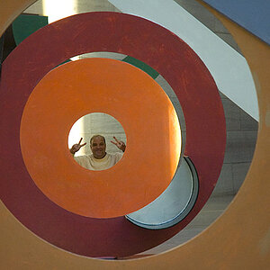
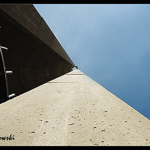
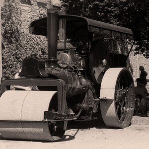
Experimenting with B & W conversions on foliage again. Hosta's seem to like the treatment. Want to thank @Tim Tucker and @Gary A. for their encouraging words that motivates me to explore for better or worse.
1.

2.
.jpg")
3.
.jpg")
1.
2.
3.


![[No title]](/data/xfmg/thumbnail/32/32631-60d0db057ee085953a0921e337396654.jpg?1619735552)

![[No title]](/data/xfmg/thumbnail/40/40286-86401b94de8b01bea8bb4ea154aaea0a.jpg?1619739408)
![[No title]](/data/xfmg/thumbnail/31/31706-3e429b21053f11072ed2e5b37c019073.jpg?1619734964)