libeco
TPF Noob!
Hi all, it's me again! :blushing:
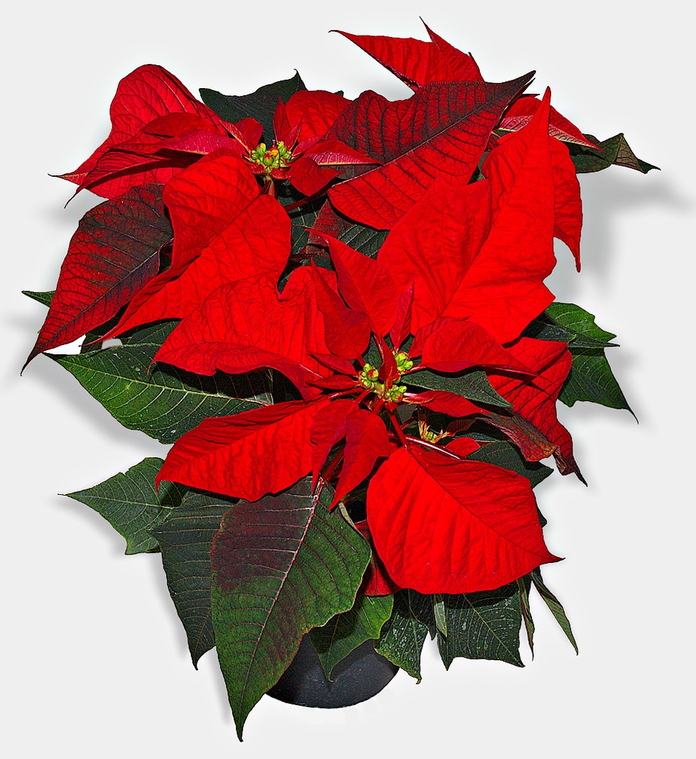
Today I was trying my new polarizer filter with this plant Euphorbia pulcherrima (don't know the english name). Although the difference between photographing with and without polarizer was not that big, it did seem to get me less noise (or perhaps it's just the amount of light).
Well, here's the problem; I've opened the image in Adobe Camera RAW, with which I've been playing the past two weeks after reading tutorial and buying a book about RAW, but for the first time I'm stuck in there. No matter what I try to change, I can't seem to get the original bight red color to appear, which you can see in this image shown on wikipedia;
I've uploaded the original RAW-file (zipped) to rapidshare, could someone try to get something out of this image?
Thanks in advance!
http://rapidshare.com/files/9552464/pic_2006_1230_152024.zip.html
*edit*
And more important for me, can somebody tell me how it should be done if they get it done?


![[No title]](/data/xfmg/thumbnail/37/37539-ae46a74e6510aad73c9101a029847880.jpg?1619738133)
![[No title]](/data/xfmg/thumbnail/37/37522-f67b10bc5ee534f9bc21ee94917445b9.jpg?1619738129)
![[No title]](/data/xfmg/thumbnail/42/42478-4b86cc30ef794e056633611c9644b04e.jpg?1619740195)
![[No title]](/data/xfmg/thumbnail/36/36661-18a8e3651b710864d15fa75baedaac77.jpg?1619737675)
![[No title]](/data/xfmg/thumbnail/42/42480-70a0d1b3ccdeb380098dd12f512b4a17.jpg?1619740195)
![[No title]](/data/xfmg/thumbnail/42/42481-e35ff0c514a554d7bd4381fb2ae79c5a.jpg?1619740195)