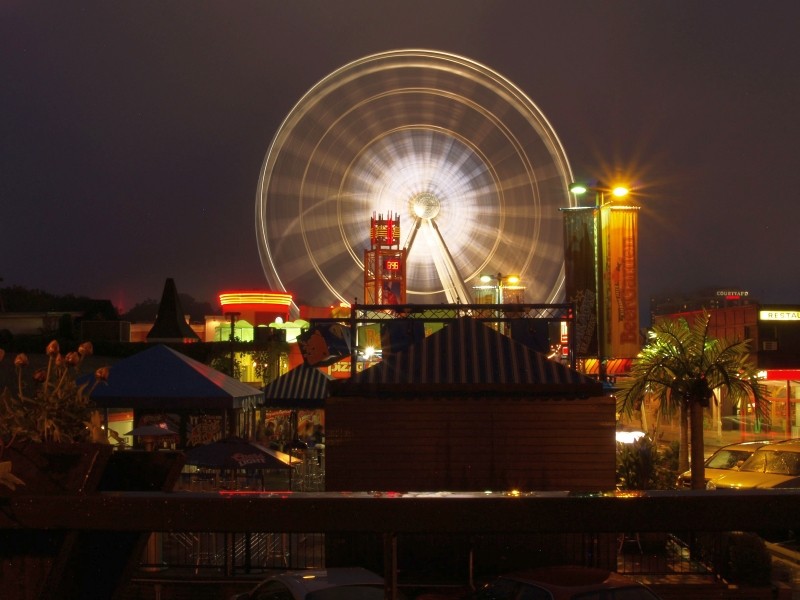
I really like the how you captured the movement of the ferris wheel in the last one. To me (yes I'm a noob as well) the right part of the sky in the middle three look to be overexposed.
I like number 5, although I'd like to see it cropped differently. The wheel is to centered for my taste.
The others unfortunately (to me) appear to be your basic vacation "snap shots). No exciting angles, exposures, just pretty basic shots.
Just my 2 little pennies worth.
Great job! With that said (I'm still a noob), I agree with CubsFanMike. The last one is the best, could the ferris wheel could have been moved to the left more. The skies in the others do look over exposed. AS for pic number 3, if you had a different angle on the photo and got some more of the pier in it I think it would have been better. Just my thoughts.
In pictures 1 and 4 the horizon is uneven.
In #3 the sky to right is blown.
In #5 the buildings in front a taking away from the wheel.
#4 is boring and the foreground is once more distracting.
Ok those were my C&C now for my opinion.
I love the first one. The colors are amazing.
All of these picture came out great. Keep up the good work and continue shooting.
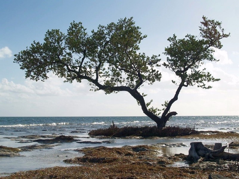
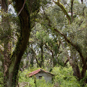
The tree seemed kind of neat, but the crop didn't work for me as much... maybe leave more on the left hand side to throw off the balance a little... not a ton... 10-20% more maybe. (you may not be able to do this if you dont have any more source material on that side on the original)


![[No title]](/data/xfmg/thumbnail/41/41929-26c4134c150c4c6befd5f544a5223aaf.jpg?1619739946)


![[No title]](/data/xfmg/thumbnail/40/40284-f59f6230f0d5b9eacf977f8b0392f087.jpg?1619739407)