My First Entry

cary

TPF Noob!
Joined
Jul 28, 2008
Messages
50
Reaction score
0
Location
AZ
Can others edit my Photos
Photos NOT OK to edit
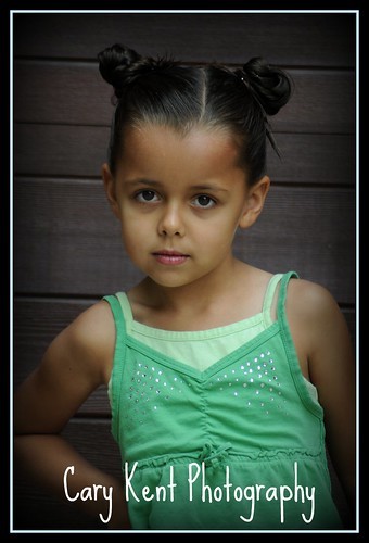
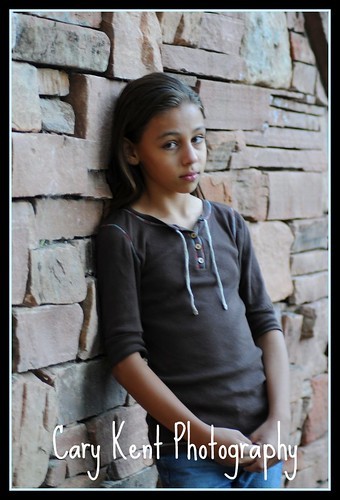
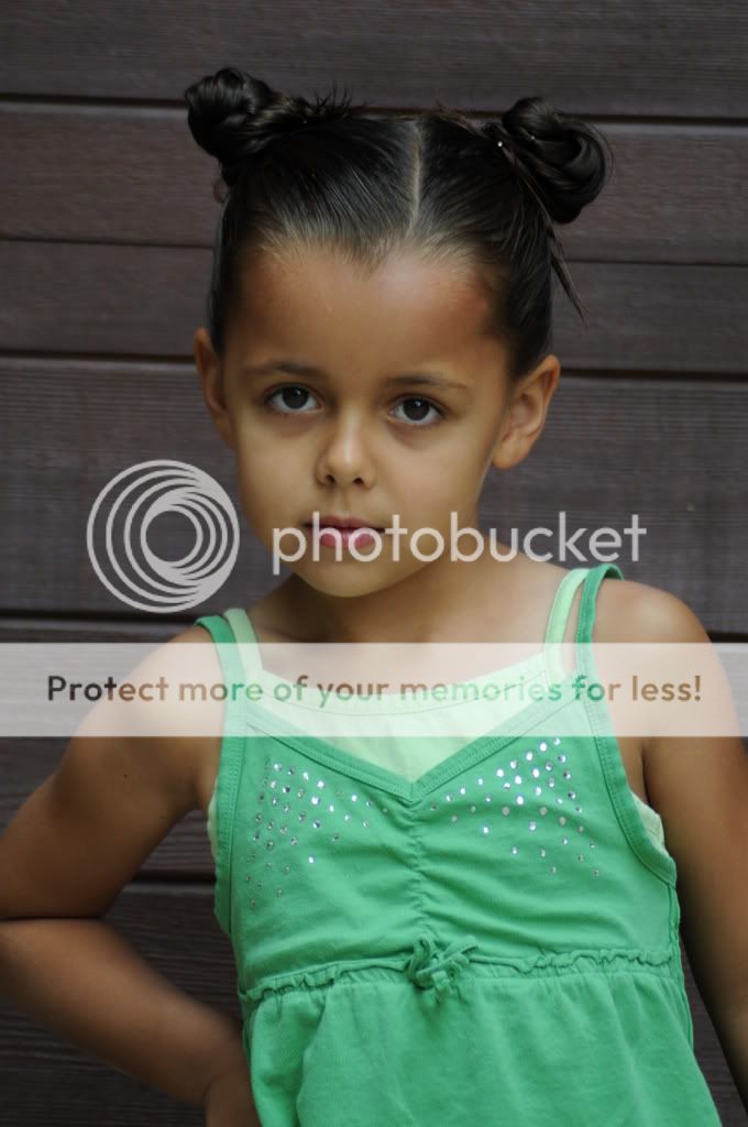
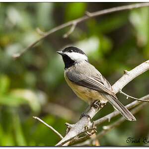
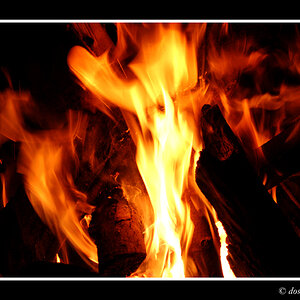
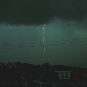
These are the first shots I took with my new Nikon. I know my favorites, let me know yours. Also, does anything stand out to you: good, bad? I'd like to hear the positive and negative. I added vignettes and borders and that is it.

Thanks!!!!

1.
2688694224_7baafcbb72.jpg

2.
2687873367_a9fe4e47da.jpg

3.
2687865433_5be3e00034.jpg
 
#1 is great! #2 is also nice, but out of focus (or has a motion blur). #3 is also nice, but the cropping has somthing, I can not tell what.

Overall very nice soft lightning, lovely photos!
 
I like them, but number two probably should have been thrown out (no offence), as there isn't really any way to salvage such a soft shot.

Number One could have done with a bit more lighting, as the girl appears underexposed to me, solidified by how she looks in the third shot.

Looking good though, and the little girl in shots one and three seems to be quite the model.
 
Wow!!! You guys are great....really. I agree with your assessments.
When I took #1 it was almost the very first shot I took outside so I still had my settings set to indoor (I think my ISO was up).

As for the 2nd, I also agree that it's a little blurry or something. For some reason with the 2nd picture (my oldest daughter), I could NOT keep my camera still for the life of me. It was like I was so excited about the whole thing I was shaking. What a geek I am!

It's funny what you say about the 3rd because that was her own pose and she really doesn't enjoy her picture being taken. I bribed her and told her that if she lets me do her hair and take her pictures I'll reward her with my camera---that is, I let her take ONE picture with my camera. For some reason that did it for her. She hated her hair and took it out as soon as we got home. She's my classic middle child! Just love her.

Thanks for the input, would love to hear more if you have it.
 
#2 like was pointed out is OOF, but I love #3! great pose and she's showin some sas it seems. I think the font size of your sig is a little distracting from the photo IMO.
 
I'm going to work on that signature of mine. I'd like to somehow scan in my actual handwriting and use that as a signature---and then emboss it so you can see the whole image.

Thanks, wlsmoku!
 
Little heavy on the vignetting IMO.
 
Here's the original with no vignette or border---no photoshop either.

JuneD300180.jpg
 
I think the first is the most successful-- however, I think it could use a levels move, as the skin tones look a bit flat. I don't mind the slight motion blur in the second, but the image overall is very blue, which also makes her skin look flat. If you add some yellow to the image, I think it would fix that.
 

Most reactions

New Topics

Back
Top