My First Newspaper Assignment!!!!!

DeepSpring

TPF Noob!
Joined
Jul 12, 2006
Messages
1,451
Reaction score
0
Location
Los Angeles
Website
www.joshualights.com
Can others edit my Photos
Photos OK to edit
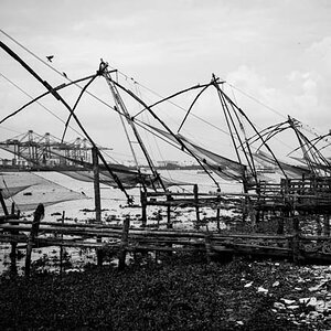
So these are pictures from the first assignment I was given. I don't know exactly what the articles are about so I just took as many as I could and they can choose the pictures that fit best. Since the paper is in B&W so are these.
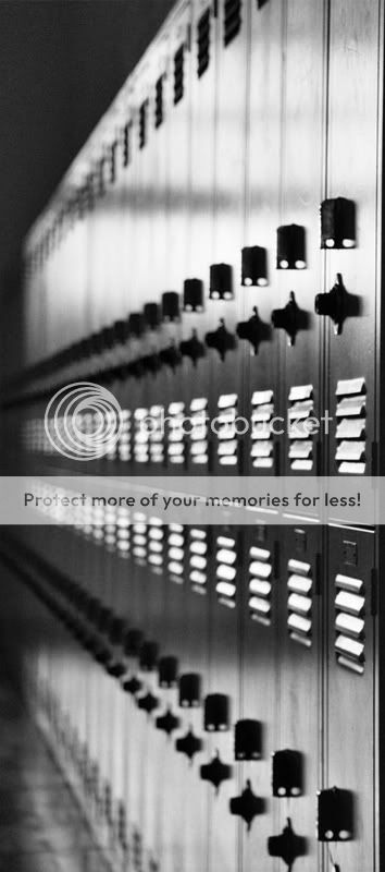
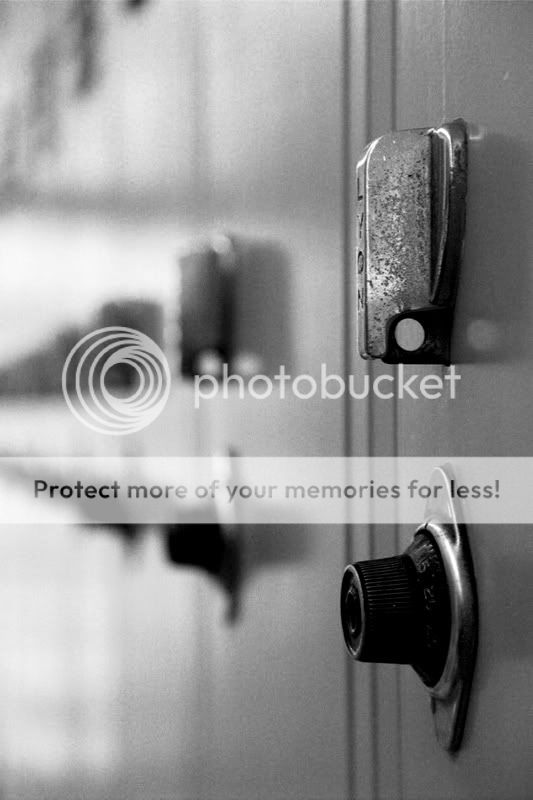
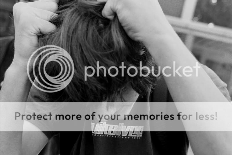
my assignments were

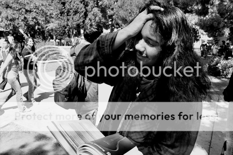
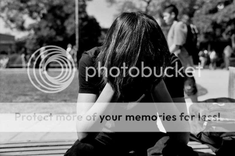
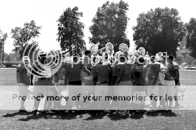
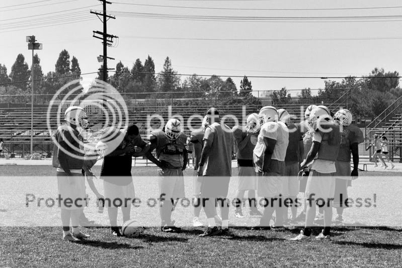
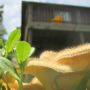
1. Cheesepuffs (these cheeto like snacks the school sells)
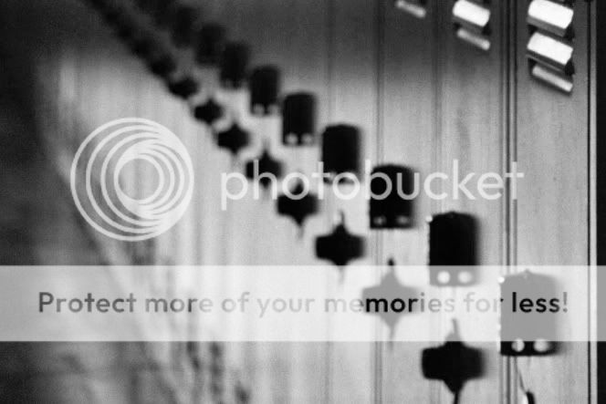
2. Lockers
3. Stressed student pulling hair
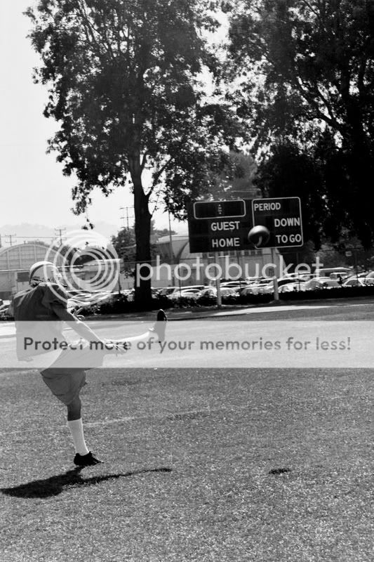
4. Football players


1
002_23AE.jpg


2
003_22AE.jpg


3
005_20AE.jpg


4
007_18AE.jpg


5
012_13AE.jpg


6
011_14AE.jpg


7
010_15AE.jpg


8
013_12AE.jpg


9
sorry put this one twice

10
014_11AE.jpg


11
018_7AE.jpg


12
020_5AE.jpg


13
022_3AE.jpg


14
024_1AE.jpg


So how did I do?
 
they gave me a note saying kid pulling hair (stressed) and no more information, so i tried to get as many veriations of the shot as possible hoping I get something that matches the article lol

thanks
 
i think #4 is a very nice picture. as for the student, it just depends, in my opinon, whether or not the student is stressed in general, or from schoolwork. if schoolwork, make sure and use one with a book involved or something. otherwise, if general stress, i think #10 is nice.
 
#3 and #10 do it for me...keep it up, tyke
 
Thanks guys. The weird thing is, I shot on color film and the only thing I did to #3 was adjust the contrast and brightness a hair. My print came out like. Even tho you cant see it right at the end of the lockers was an open door to the outside so I'm thinking that so much light was hitting the lens my cameras meter told me to expose it to the ligh of the door and not the lockers, but anyways this "mistake" tho I wouldn't really call it that turened out to be one of my favorite pictures
 
I really liked number 10, DeepSpring. I liked it so much, I just nominated it for POTM. You captured a good moment there. That photo conveys a lot of emotion, even without a face.
 
Efergoh said:
I really liked number 10, DeepSpring. I liked it so much, I just nominated it for POTM. You captured a good moment there. That photo conveys a lot of emotion, even without a face.
Thank you :D:D. and everyone else for their replies too I appreciate all you feedback
 
I am not a fan of selective coloring, but for the Cheesy Poofs it might be fun to try.
 
#1 IMO the DOF is a little to shallow, think the bag should be if focus too

IMO #10 works the best for stress, also #8 would be good, but #S 5, 6 & 7 seem a little too animate IMO, what I like about #10 is that it is faceless and could be most any guy.
 
Alright, I'll give you my advice based on the fact that I'm the photo editor for my schools newspaper (doesn't mean my opinion is worth that much, I got the job by default, but still :) )

I'd run photo 1, photo 3, photo 5, and photo 14.

I can see why a lot of people say 10 is the best, but to me that doesnt convey stress, it conveys sadness. I like the over the top look of that 5th one.

Oh and the football kicking one is good, timing is hella difficult on kicks to get the ball after it leaves the ground and before it leaves the frame.

I'll fill you in on a secret though, and give one peice of advice. Secret: we generally don't care how good a photo is, most students won't appreciate awesome talent, and all we want is to fill a hole in the paper. Doesn't mean you shouldn't try for awesome (and you did get some awesome shots here), but don't be too worred if you don't get it. Oh and my advice is to try and get a shot in both horizontal and vertical format for anything you take (unless it really demands one), becuase normally the words are layed out before the photos (in my epxerience) and you have to fit the photo in whatever box they give you. If there is a vertical box and a horizontal photo you have a problem.

Keep it up man. I wrote a lot there, sorry about that.
 
omeletteman said:
Oh and my advice is to try and get a shot in both horizontal and vertical format for anything you take (unless it really demands one), becuase normally the words are layed out before the photos (in my epxerience) and you have to fit the photo in whatever box they give you. If there is a vertical box and a horizontal photo you have a problem.

Yes we ran into that problem with the lockers. She told me last night they had a horizontal space to put them in, luckily I was able to get a decent crop out of both

005_20AE2.jpg


and

007_18AE2.jpg


And after talking to her the photos you mentioned are probally the ones that are going to be run in the paper along with 11 because the sports writer was lazy and there is a lot of space to fill. I agree with you about 10, alone it's a good shot but dosn't fit the stress look as much as some of the others. And no don't worry about writing too much, I'd like to hear everything:wink:
 

Most reactions

New Topics

Back
Top