New Flash - My sons 8mos old mini shoot C&C please and thank you

CorrieMichael

No longer a newbie, moving up!
Joined
Sep 28, 2012
Messages
447
Reaction score
166
Location
Canada
Can others edit my Photos
Photos OK to edit
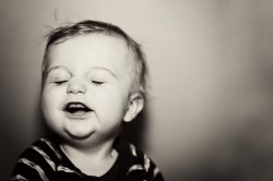
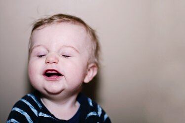
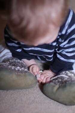
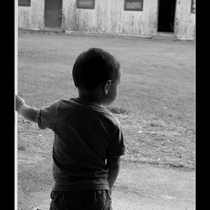
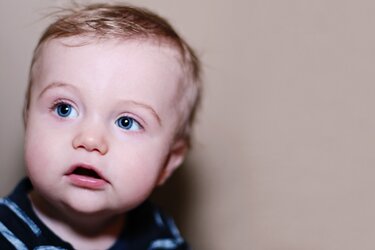
So I just received my new flash with diffuser the other day. I took these pictures in my hallway as he just turned 8mos old and try and have a photo assignment to get his pictures once a month. This is the first time that I have used this type of flash and diffuser, just wondering if I am executing it properly? Also curious to know what you think about colour vs black and white.....and why. Compositionally how do these look....what could I have done to improve? Thanks, Corrie
1. $IMG_4559edit1clasfilmweb.jpg2.$IMG_4575edit1bwfilmweb.jpg3.$IMG_4575edit1clasfilmweb.jpg
 
You asked, "what could I have done to improve? Thanks, Corrie"

Well, you could have rotated your camera to vertical orientation...all of that empty wall space is space that has been stolen from showing off his royal tiny-ness!!!

His pudgy,short little infant arms! His tiny little baby hands! All not shown...in favor of empty wall...
 
Really cute. :)

You've missed focus. It looks like your shutter speed was too low and you were using too wide of an aperture. Since he was up against a wall, DOF isn't something you need to worry about and you could have closed down. Bump your ISO to compensate for that and use a faster shutter speed as well. Those things will help with the focus on a moving baby.

As for color vs. black and white, again I think the color versions need to be warmed up. Maybe they look normal to you on your monitor... are you calibrated? On mine, they look cool, and your others did as well.

I LOVE black and white, but I think your conversion could stand to have less contrast. Looks like you have, or are close to clipping the blacks and the whites.
 
You asked, "what could I have done to improve? Thanks, Corrie"

Well, you could have rotated your camera to vertical orientation...all of that empty wall space is space that has been stolen from showing off his royal tiny-ness!!!

His pudgy,short little infant arms! His tiny little baby hands! All not shown...in favor of empty wall...


I disagree with this wholeheartedly. I love a horizontal portrait with negative space on one side... it's a great look. Matter of taste, I guess. Compositionally it works for me. I also like the focus on his face rather than his whole body, and she didn't chop his joints so it's appropriate.
 
$IMG_4590web.jpg
You asked, "what could I have done to improve? Thanks, Corrie"

Well, you could have rotated your camera to vertical orientation...all of that empty wall space is space that has been stolen from showing off his royal tiny-ness!!!

His pudgy,short little infant arms! His tiny little baby hands! All not shown...in favor of empty wall...


By the time I decided to rotate my camera this was all the love I was getting. I guess I should have thought of it earlier!
 
Really cute. :)

You've missed focus. It looks like your shutter speed was too low and you were using too wide of an aperture. Since he was up against a wall, DOF isn't something you need to worry about and you could have closed down. Bump your ISO to compensate for that and use a faster shutter speed as well. Those things will help with the focus on a moving baby.

As for color vs. black and white, again I think the color versions need to be warmed up. Maybe they look normal to you on your monitor... are you calibrated? On mine, they look cool, and your others did as well.

I LOVE black and white, but I think your conversion could stand to have less contrast. Looks like you have, or are close to clipping the blacks and the whites.

No I totally agree these are a bit on the cooler side.....sometimes I am afraid to warm them up too much. Thanks so much for your input....it will go to good use :)
 
"Negative space" advances a composition. "Dead space" on the other hand, weakens the shot. These are filled with dead space.

NOBODY will give a rat's patootie about seeing the empty wall when he's a grown man...

These are portraits of a BABY...show his body..show HIM...not an empty wall. That's how to make the compositions better. Study the art of composition.

See, there's actually a HUGE difference between negative space, and dead space. You will not learn anything about composition by taking advice from people who have never studied composition, and who have no idea what dead space is.
 
Corrie,

read up on flash diffusion! These look like direct flash... and they need some work. In flash diffusion, the larger the light source... the softer the light. Also the closer to the subject, the softer the light. So there are several things you can do.. bounce the flash off the wall behind you (if it is white.. you don't want to do a colored wall, trust me). Sometimes you can bounce it off the ceiling... sometimes off a reflector.

Or you can get an umbrella, brolly, softbox, etc.. and really do a nice job.

You can also close down that aperture a little bit... shooting flash at 1.4 can be difficult when you are learning...

Where you missed focus... was actually just too shallow a DOF....
 
You asked, "what could I have done to improve? Thanks, Corrie"

Well, you could have rotated your camera to vertical orientation...all of that empty wall space is space that has been stolen from showing off his royal tiny-ness!!!

His pudgy,short little infant arms! His tiny little baby hands! All not shown...in favor of empty wall...


I disagree with this wholeheartedly. I love a horizontal portrait with negative space on one side... it's a great look. Matter of taste, I guess. Compositionally it works for me. I also like the focus on his face rather than his whole body, and she didn't chop his joints so it's appropriate.

And I disagree with you, and agree with Derrel wholeheartedly! lol! All that dead space is a distraction, and just pulls the focus off of the subject...
 
Corrie,

read up on flash diffusion! These look like direct flash... and they need some work. In flash diffusion, the larger the light source... the softer the light. Also the closer to the subject, the softer the light. So there are several things you can do.. bounce the flash off the wall behind you (if it is white.. you don't want to do a colored wall, trust me). Sometimes you can bounce it off the ceiling... sometimes off a reflector.


Or you can get an umbrella, brolly, softbox, etc.. and really do a nice job.

You can also close down that aperture a little bit... shooting flash at 1.4 can be difficult when you are learning...

Where you missed focus... was actually just too shallow a DOF....

Thank you I will do that.....I was trying to bounce the flash off of the ceiling here......but maybe I need to play with some of the other factors some more.... I personally love shooting at a 1.4 but maybe I should step outside of the box a bit and see what I come up with! Thanks again. :)
 
You asked, "what could I have done to improve? Thanks, Corrie"

Well, you could have rotated your camera to vertical orientation...all of that empty wall space is space that has been stolen from showing off his royal tiny-ness!!!

His pudgy,short little infant arms! His tiny little baby hands! All not shown...in favor of empty wall...


I disagree with this wholeheartedly. I love a horizontal portrait with negative space on one side... it's a great look. Matter of taste, I guess. Compositionally it works for me. I also like the focus on his face rather than his whole body, and she didn't chop his joints so it's appropriate.
I think you'll find yourself amongst rather sparse company with that thought! ;)
 
[.... I personally love shooting at a 1.4 but maybe I should step outside of the box a bit and see what I come up with! Thanks again. :)

Shooting wide open is fine if you account for your DoF, but on a crop body, with a 50mm 1.4 at a camera to subject distance of 6', your DoF is only about 3". NOT really sufficient for most portraiture. Try this calculator and plug in some different apertures and distances to get a better idea of what your working DoF is.

Thank you very much!
 
"Negative space" advances a composition. "Dead space" on the other hand, weakens the shot. These are filled with dead space.

NOBODY will give a rat's patootie about seeing the empty wall when he's a grown man...

These are portraits of a BABY...show his body..show HIM...not an empty wall. That's how to make the compositions better. Study the art of composition.

See, there's actually a HUGE difference between negative space, and dead space. You will not learn anything about composition by taking advice from people who have never studied composition, and who have no idea what dead space is.

You're thinking very technically and not artistically. We have completely different ideas about negative vs. dead space.

I'm certain I've got composition down, but thanks for the tips. You're ignorant to even assume you know about me or my compositional knowledge.
 
You asked, "what could I have done to improve? Thanks, Corrie"

Well, you could have rotated your camera to vertical orientation...all of that empty wall space is space that has been stolen from showing off his royal tiny-ness!!!

His pudgy,short little infant arms! His tiny little baby hands! All not shown...in favor of empty wall...


I disagree with this wholeheartedly. I love a horizontal portrait with negative space on one side... it's a great look. Matter of taste, I guess. Compositionally it works for me. I also like the focus on his face rather than his whole body, and she didn't chop his joints so it's appropriate.
I think you'll find yourself amongst rather sparse company with that thought! ;)

I'm not surprised... but then, I haven't found too many of the photographs here to be of my taste.
 

Most reactions

New Topics

Back
Top