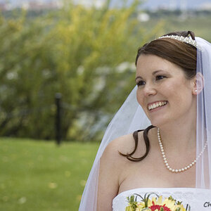
1 and 3 and 4 i like. 2, to me, seems a bit underexposed... the phoenix necklace catches my attention right away.. don't know if you were going for that.
These are all excellent photos with very solid composition, I only have a couple of quirps with these and they are nit picky to the extreme!
The first one I actually enjoy a lot, you could have run into trouble with the lines but you were smart and captured her at a moment where they were not running through her.
The second one is a bit troublesome with flow, since there is so much red the black stands out. Sadly her eyes are not dark enough to stand out over the necklace. Therefore the eyeflow starts at the necklace and kind of sits there. If you were to darken her eyes it would create a nice flowing vertical eyeflow (potentially, this is pure speculation as I have not tried) It is a great composition and set up, this is being extremely nit picky but it is a very good photo and I like it (especially the black and red theme, one of my favorite color combinations)
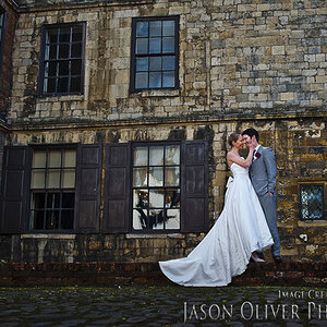
The third one is very fun and nicely set up, but again being nit picky I would love to see this cropped a bit tighter actually. It has excellent flow because of the light gradation but there is a good amount of empty space that doesn't really help the flow. I really like this shot though, and honestly doesn't need to be changed as this is just my opinion of the photo. It still works very well as is
The fourth image is very well set up and lit! The composition is solid and the background bokah is subtle and accents the photo nicely. I really don't have any suggestions to improve this photo, very well done
These are all excellent photos with very solid composition, I only have a couple of quirps with these and they are nit picky to the extreme!
The first one I actually enjoy a lot, you could have run into trouble with the lines but you were smart and captured her at a moment where they were not running through her.
The second one is a bit troublesome with flow, since there is so much red the black stands out. Sadly her eyes are not dark enough to stand out over the necklace. Therefore the eyeflow starts at the necklace and kind of sits there. If you were to darken her eyes it would create a nice flowing vertical eyeflow (potentially, this is pure speculation as I have not tried) It is a great composition and set up, this is being extremely nit picky but it is a very good photo and I like it (especially the black and red theme, one of my favorite color combinations)
The third one is very fun and nicely set up, but again being nit picky I would love to see this cropped a bit tighter actually. It has excellent flow because of the light gradation but there is a good amount of empty space that doesn't really help the flow. I really like this shot though, and honestly doesn't need to be changed as this is just my opinion of the photo. It still works very well as is
The fourth image is very well set up and lit! The composition is solid and the background bokah is subtle and accents the photo nicely. I really don't have any suggestions to improve this photo, very well done
The second one is a bit trouble, I bordered it in red to try and pull the eye away from the giant necklace, but it wasn't set up... this was a candid at an art show where the model was exhibiting - so perhaps I feel like I got a better shot than I did because of HOW I got it; surronding by hundreds of people being pushed around and having drinks spilled on me all evening! LOL
Wow that was a candid shot? I had no clue, now that you mentioned it that makes a lot of sense lol. I think strengthening the color in the eyes would help a lot!
For eyes I usually use a separate set of curves to brighten and highlight the iris and white of the eye, then I go in with a white brush on overlay and about 10% opacity and directly paint on the Iris to make it have a little bit more depth


")

![[No title]](/data/xfmg/thumbnail/30/30874-7f3345ba7c76a7c5fa2570559598531b.jpg?1619734491)
![[No title]](/data/xfmg/thumbnail/32/32926-ec27ecead8c80d803404500d8f888dbf.jpg?1619735754)