greybeard
Been spending a lot of time on here!
- Joined
- Dec 30, 2011
- Messages
- 4,507
- Reaction score
- 1,835
- Location
- WV
- Can others edit my Photos
- Photos OK to edit
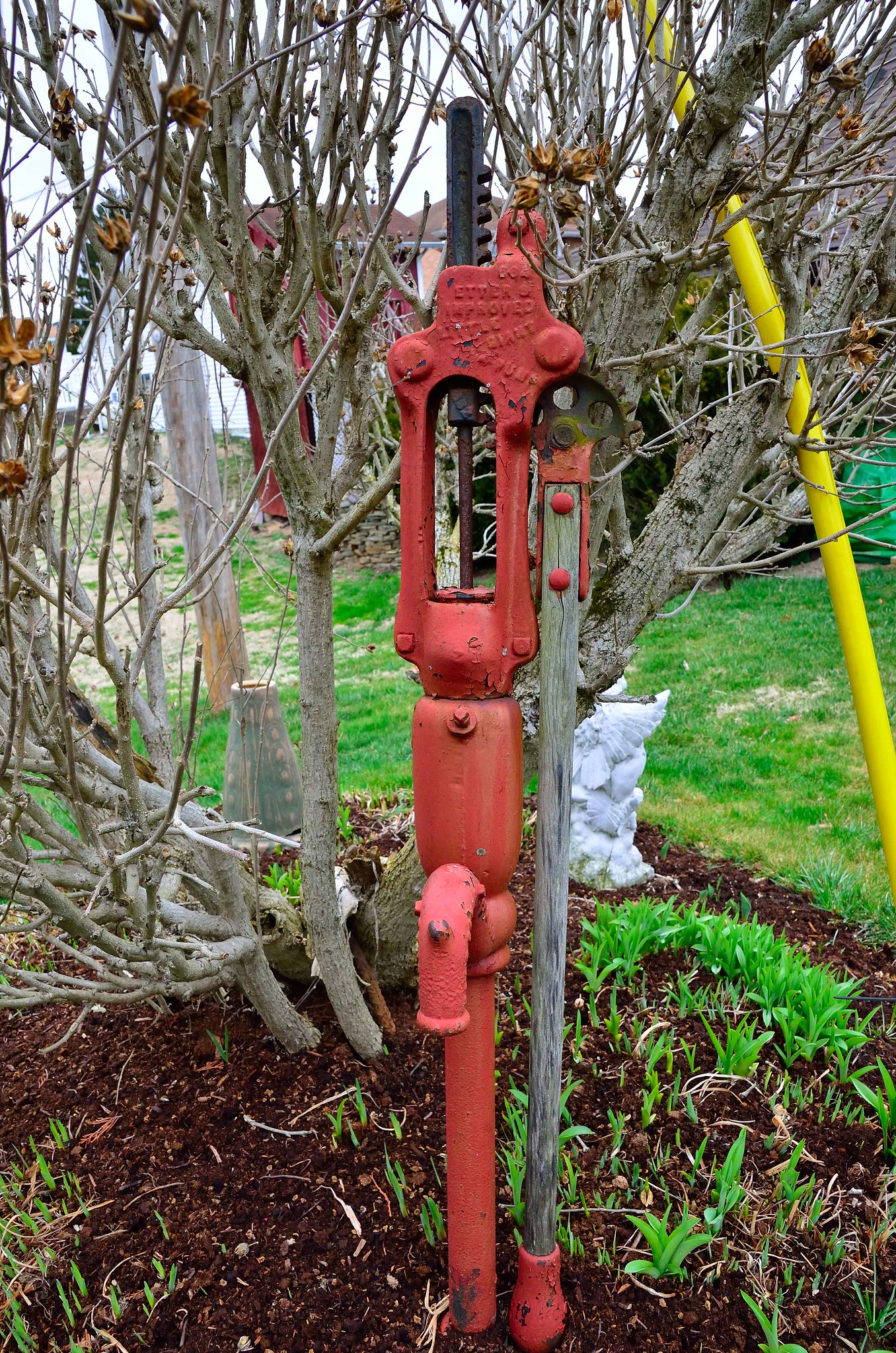 OLD PUMP_ by TOM STRAIGHT, on Flickr
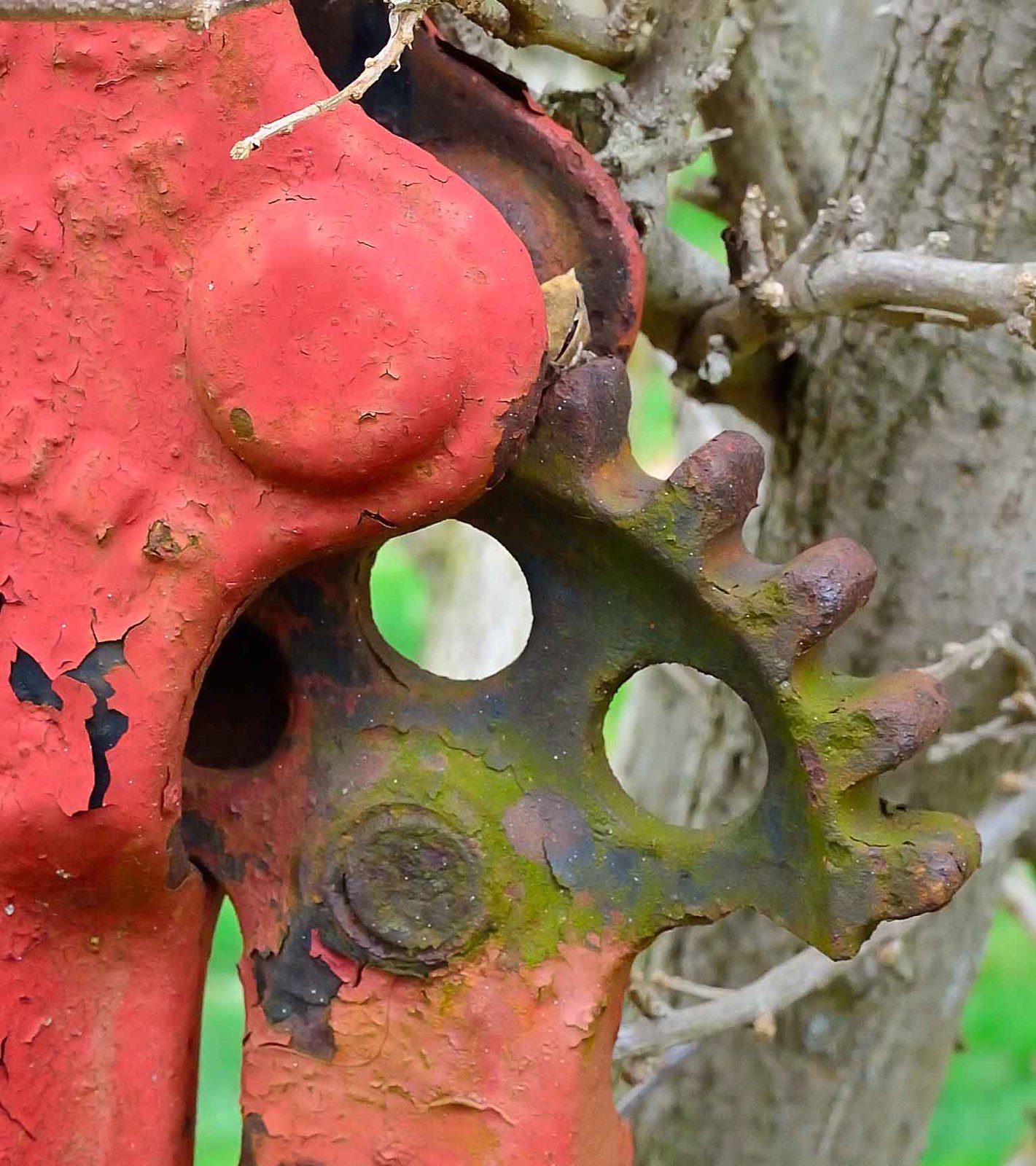 OLD PUMP GEAR by TOM STRAIGHT, on Flickr
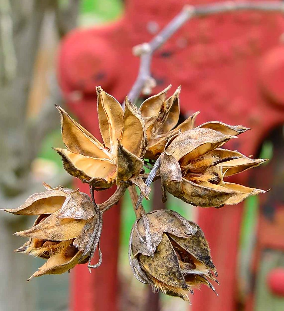 SEEDS IN FRONT OF OLD PUMP_ by TOM STRAIGHT, on Flickr
 SEEDS IN FRONT OF OLD PUMP_-3


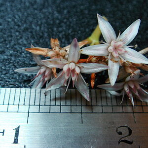


![[No title]](/data/xfmg/thumbnail/37/37091-18fa97e6ac84c47479921254caf164c3.jpg?1619737881)
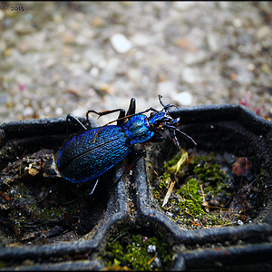
![[No title]](/data/xfmg/thumbnail/32/32806-e16129723fd659a65a21d27ec96c2637.jpg?1619735667)