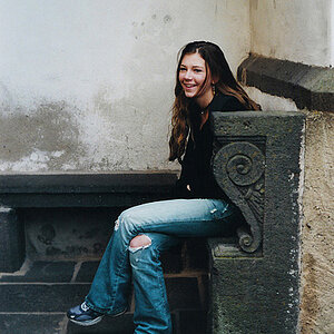
I don't do a lot of portrait work, but I think this shot could be improved if you got rid of the dead space on the right side of the frame. She's looking over towards the left side of the frame, and all that emptyness on the right side isn't doing anything for the shot. I think as far as everything else is concerned, it looks pretty good.
Nice composition, and lighting.
The only thing I'd change is the camera's angle - I don't like to shoot up into the person b/c doing so subject might get double chin. Don't like double chins.
my reason on not talking about framing, is once again back to the camera angle - one step at a time. Once and IF you reshoot it and frame her, cut the wall out. The wall is a double edge sword - to some people it is disgustingly distracting and to others IF IT IS BLURRED out it indicated shallow DoF. My self, I'm in both categories - since full length should be show little bit of the background; however you could crop her to 2/3rd and get rid of great part of that yaki wall
I don't do a lot of portrait work, but I think this shot could be improved if you got rid of the dead space on the right side of the frame. She's looking over towards the left side of the frame, and all that emptyness on the right side isn't doing anything for the shot. I think as far as everything else is concerned, it looks pretty good.
Nice composition, and lighting.
The only thing I'd change is the camera's angle - I don't like to shoot up into the person b/c doing so subject might get double chin. Don't like double chins.
I kind of like the upward angle of this particular shot. You say because the subject might get a double chin. This subject doesn't have one, and the angle doesn't give her one. I'm all for breaking the so called 'rules' if it works. In this shot, I believe it does, but it's all in how the viewer perceives it, and in this case, you don't like the angle, which it totally fine.
The wall was the first thing I looked at when I saw this shot, and therefore I believed was the most obvious thing to fix.
I agree that cropping out some of the right hand side would improve this shot. Her line of gaze is to the left, but the vast amount of negative space on the right hand side of the frame is causing some serious dissonance. The image you stripped in for the window--looks very,very good. That image,combined with the light on her face and her gaze, and her pre-maternal state combine to give a nice sense of hope. I think it's nicely done. No worries about a double chin,since she does not have one.
I think perhaps the light on her could be toned down in brightness just a shade,and the effect overall would be more unified and almost perfect with the window light effect.
When I look at this picture, the first thing I notice is her dress. I think that the bright whites and the sharp contrast distracts too much from her face. I agree that a bit of cropping on the right would help, and I never would have guessed that the clouds are fake.


")


![[No title]](/data/xfmg/thumbnail/31/31980-e5048a424621c7b3cd0d306d63c09d67.jpg?1619735137)