Purity Girl! C&C Please!

littlesandra

TPF Noob!
Joined
Aug 5, 2007
Messages
199
Reaction score
0
Location
Newfoundland
Website
www.sandraleephotography.net
Can others edit my Photos
Photos NOT OK to edit
This is a shoot I did for a friend, Angela, she dances with the local burleqsue group, Purity Girls, which are featured on this weeks local paper, The Current (http://www.currentmag.ca).

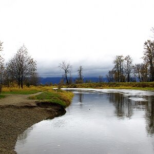
The sun was bright, and she was squinting for alot of the shots but I also got to try out my new Sb600 in the bunkers. It's an old fort, fort amherst, which you had to hop a few fences to get to, but the scenery is fabulous.

Say what you like, but try not to be too harsh. My heart is fragile! :)

1.
angela013.jpg


2.
angela016.jpg


3.
angela020.jpg


4.
angela024.jpg


5.
angela028.jpg


6.
angela009.jpg


7.
angela031.jpg


8. With these, the ground to the left seems a bit empty, I was thinking of cropping these from her waist up. Agree?
a.
angela033.jpg


b.
angela032.jpg


9.
angela015.jpg


Thanks, as always, for looking! :)
 
Dude! Again you have an awesoem style and your composition is perfect! In my own opinion and this could just be the way I personally like to look at things, I think you could add some contrast and make em a teeny but brighter.
With not being allowed to edit to show you it's tough to say what I mean but these are great!
 
The only one I don't like is #2, which looks like a tourist shot, and she has a "muffin top" (belly over the jeans) which isn't flattering.

Your composition of #4 and 5 are perfect and those are my favorite. :)

Both images in #8 could use some cropping, as the perspective and pose make her legs look huge. ;)

I just wish she didn't have that bra strap showing. It's pretty distracting, since that color is nowhere else in the photo.
 
I know #2 is a tourist shot but she's moving to boston and wanted something with the city in the background to remember NL. Haha I just think it's cute.

So I SHOULD crop #8, just to waist up!

And JJM, I always want to brighten them and up the contrast, and usually do, but lower it, because I dont want to over process the photos and lower the picture quality :( It's a personal fear Ha ha, so in the end I always under process.
 
A contrary opinion.

I don't care for these much except as remembrance shots.
The dark shirt is a black hole in the center of every photo and there's a lot of bra-strap, underarm, bulging parts - not-so-pretty items. She has an interesting face and would probably look good in much tighter shots to play up the interest and the angularity.

Sorry.
 
If you want only positive comments, say so.
I respected you enough to spend time and tell you honestly what I thought.
Why not respect me enough to look at what I said and respond to that?
 
I know #2 is a tourist shot but she's moving to boston and wanted something with the city in the background to remember NL. Haha I just think it's cute.

Ha ha...okay, I'll give you that. :) However, this is a section for "Professional Portrait and Wedding Gallery" shots, so I guess that's what I was looking for. ;)
 
I just threw it in for a bit of fun.

I re-did one of the squat down ones, and this is what I did, is it more along the lines of what y'all were thinking?

4d8d4cc7.jpg


and to The Traveler, not all the comments are positive, they suggest how I can make the pictures better, they just didnt say the pictures were unflattering, and they disliked them. Even if these lovely folks disliked them they helped me right my wrongs :)
 
Better, but I would've kept some of the background above her head so that her head isn't cut off. :) Now, with the images more "up close", we can see her bra showing through her shirt. One of the worst things a model can do is to wear a light colored bra under a dark top. It ALWAYS shows through in due to the lighting. :) I have an idea for a great crop on 8b if you'd give me the permission. :)
 
Something more like:

4r8ji13.jpg


Her eyes are more the focus of the piece, your eye travels up her arm, to the beautiful reddish wall, which mimics the color of her hair, and then back down to her eyes again. Too bad the hand was cut off in the original, though. :)
 
There was an unsightly mess where her hand was.... aka SLAYER written in huge black spray paint. The crop is neat, but It makes her body look short. I just may copy if you dont mind and include a bit of her jean skirt.
 

Most reactions

New Topics

Back
Top