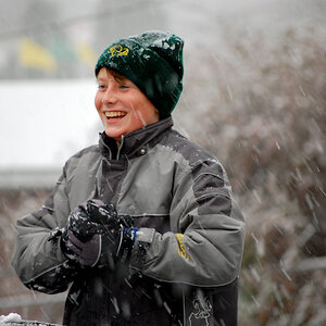
I agree, came down with the bad case of the halo's. The first one I can see random brush marks mid upper left of the picture. The lighting shadow cast on the tree from the subject is crucial...strange lighting. off camera right? In this case on camera would've worked better to not throw the shaddow.
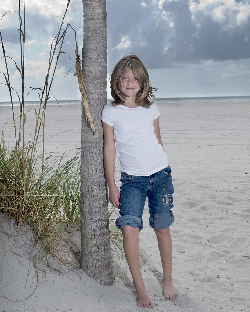
#1 #2 I don't like the composition of the first two. Too centered in the frame, too much useless space on either side and above the girls. You cut the toes off of the first one as well. Not a huge thing, but I tend to like head/shoulder shots, 3/4 shots (might thigh and up) and full body shots.
They also seem a little flat, could probably use some levels and saturation in ps
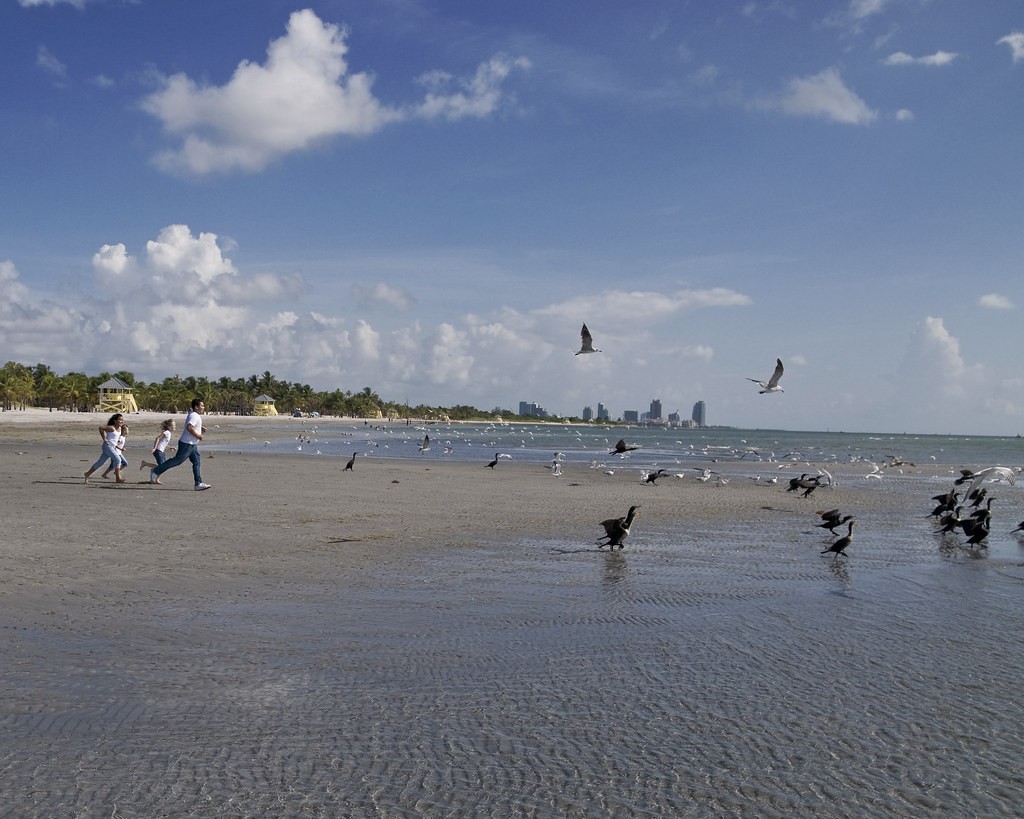
#3 is more interesting as an image, better composed and looks good overall. Would of loved to see her smile more though
#4 I like the crop that Opher did more than the original. Nice image overall though, family on one side, birds/city on the other side.
The shadows would not be so hard if the source was much larger, like bounced from an umbrella or from a softbox. I know that can be tough to do at the beach because of wind.
It is also confusing to the eye when the additional light comes from an angle different from the natural light.
Lastly, the forum requests, "the photo should already be sized down for forum viewing, no more than 600 pixels high, or 800 wide."
They all seem a tad bit washed-out, in my opinion. 2 and 3 have some loose hairs that I find distracting. As mentioned, 4 needs a crop. Centering needs to leave. Other than that, they're good.
(Sorry if all that seemed too blunt or whatever, I'm tired...)


![[No title]](/data/xfmg/thumbnail/38/38742-02271ebbfd9d0efdddfac04f9fde5694.jpg?1619738704)


![[No title]](/data/xfmg/thumbnail/38/38743-ad854d502dddc7f41a927f1731a504cd.jpg?1619738704)