Sister's wedding (beware: lots o' pics!)

TopPop

TPF Noob!
Joined
Mar 23, 2005
Messages
40
Reaction score
0
Location
Bellingham, WA
Hey, everyone.
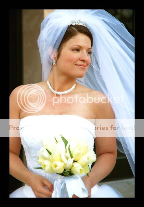
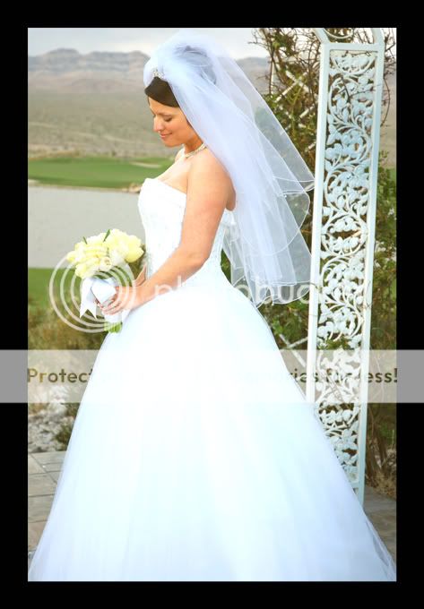
Here are some pics from my sister's wedding that I shot a couple of days ago:
1
jj1-s.jpg

2
jj3-s.jpg

3
jen3-s.jpg

4
jj2-s.jpg

5
jj5-s.jpg

6
jen1-s.jpg

7
jj4-s.jpg


This is only my second wedding that I've shot, and the first that I've done digitally. I have to confess, though, I wasn't the main photographer... I cheated and followed the main photographer around, and used her posing ideas! :mrgreen: However, the lighting (natural and flash) and composition were my own.
Let me know what you think.
Cheers,
Chris
 
The bride & groom are well exposed but the dress looks blown out in all the shots. (Maybe it's my monitor though.) Most all digital cameras have less exposure latitude than print film so it can really be tricky to get just right.

Great poses & composition.
 
Big Mike said:
The bride & groom are well exposed but the dress looks blown out in all the shots. (Maybe it's my monitor though.)
Nope, not your monitor. This is a problem that I'm still trying to work through. Some of the pictures were a bit underexposed, so when I brought up the brightness and the contrast in PS, the dress completely blew out. It's hard to find a balance between good exposure for the dress and for the rest of the shot. With #6 I actually had to use the magic wand and do brightness/contrast for her skin separately!
If anyone knows a better way to deal with this, I would be VERY grateful to hear how! Thanks again for your comments, Mike... and thanks to Mentos, too! :D
Cheers,
Chris
 
It's a problem a lot of wedding photographers face. Fixing it after the fact is tricky, as you have learned! I pretty much follow the same process that you do, select different section and dodge/burn as needed to correct the overexposed areas. It's a lot easier to try and avoid the problem if you can. Shady spots and diffusers are great things to utilize when shooting a weeding. I think that in this case it's not so bad because there didn't appear to be a lot of detail in the dress skirt and you picked up the detail in the bodice of the dress.

You got some very nice shots, I'm sure your sister will be thrilled! :D
 
TopPop said:
Nope, not your monitor. This is a problem that I'm still trying to work through. Some of the pictures were a bit underexposed, so when I brought up the brightness and the contrast in PS, the dress completely blew out. It's hard to find a balance between good exposure for the dress and for the rest of the shot. With #6 I actually had to use the magic wand and do brightness/contrast for her skin separately!
If anyone knows a better way to deal with this, I would be VERY grateful to hear how! Thanks again for your comments, Mike... and thanks to Mentos, too! :D
Cheers,
Chris

I think a dress or two also had a blue tinge look to it.

Instead of using the brightness/contrast tool *according to a couple teacheres of mine these should never be used* you could try curves. This way you can leave the brightness where it is and enhance the darker end of the spectrum. Or use the shadow/brightness tool if you have PS CS to get the shadows up, and the highlights down a bit.
 
GerryDavid said:
Instead of using the brightness/contrast tool *according to a couple teacheres of mine these should never be used* you could try curves. This way you can leave the brightness where it is and enhance the darker end of the spectrum.
Okay, so I've been trying this "curve thing", and I'm pretty sure it's the most confusing task that I have ever tackled. :confused:
I read some tutorials, and I'm thinking that the best way to go for contrast and brightness is to create a curve layer and blend with "luminosity". Am I going about this wrong?
I'll be honest, I have no idea what I'm doing... :scratch:
Cheers,
Chris
 
I find that I use the levels tool a lot and you can adust just the mid tones, etc to adjust. I think it's a little easier to use than the curves.
 
Once you learn curves youll hate to use levels. At least thats what my ps teacher said, and I didint agree, but he was right. It is confusing at first but once you get the hang of it, its not to hard to use. Same for the pen/path tool. Usuually I just start off by hitting auto to see how it looks, if I dont like it I hold down alt and that should change "cancel" to "undo". If its not alt, its ctrl. If there is a nice grey area that is really close to 18% density, like a rock or something, then I may try to use the middle point eye dropper thing and click on it, that can be an easy way to fix whiteballance.

From my understanding, levels still clips some data off, and after seing a side by side comparison of brightness/contrast, levels and curves, curves is much better.

As for contrast with curves, I was taught to create an s curve in it and that creates more contrast. click in the center to keep that constant, click on the right and drag it up, and click on the right and drag it down. The larger the s, the more contrast.
 
GerryDavid said:
Once you learn curves youll hate to use levels. At least thats what my ps teacher said, and I didint agree, but he was right.
Whoa! That makes a difference! :D
Finally got the hang of the curve thing, and you were absolutely right! I compared shot by shot with the originals, and I redid all of the color ones, and will probably redo many of the B&W's, as well. This puts me a bit behind schedule for sending the pics out to family, but they will be much happier in the end, I think!
Thanks for the tip!!!
Cheers,
Chris
 
Have you tried the shadow/highlight tool? I think it was introduced in PS CS. It helps in getting some detail out of the shadows, and the highlights somewhat.
 

Most reactions

New Topics

Back
Top